Unreal Estate
Igniting the real estate revolution
-
Services Brand Strategy, Verbal Identity, Visual Identity, Social Identity
Launch website
Project info
Challenge
In today’s housing marketplace, buyers and sellers are held back by industry gatekeepers, opaque processes, and sky-high fees. But with their first-of-its-kind online platform and unique business model, Unreal Estate is unbelievably uncomplicated and undoubtedly unconventional — and we needed to create a brand strategy, messaging framework, and visual identity that boldly showed why they were different, without sacrificing reliability and trust.
Solution
The real estate industry is in need of a revolution, and there’s a very specific archetype that’s poised to handle the gargantuan task of inciting one. So after a lengthy discovery session with internal stakeholders expressing their desire to put the power back into the hands of buyers and sellers, we landed on their archetype — the Rebel. But more importantly, the rebel with a cause.
Through the insights they shared, we were able to hone in on the three commitments that would serve as their guiding light to future product offerings, marketing messaging, and more: accessibility, transparency, and simplicity. These were then molded into tactical proof points, highlighting the very specific ways they bring them into the marketplace — all while staying true to the distinct attitude, tone, and voice of the rebel.
Throughout the messaging process — which included both external and internal workshops — we recognized the need to steer clear of any implications of a DIY brand. Instead, we were able to walk a delicate balance of empowering consumers while reassuring them there’s no corners cut once the middleman is removed.
With a solid brand strategy in the bag, visual identity was up next.
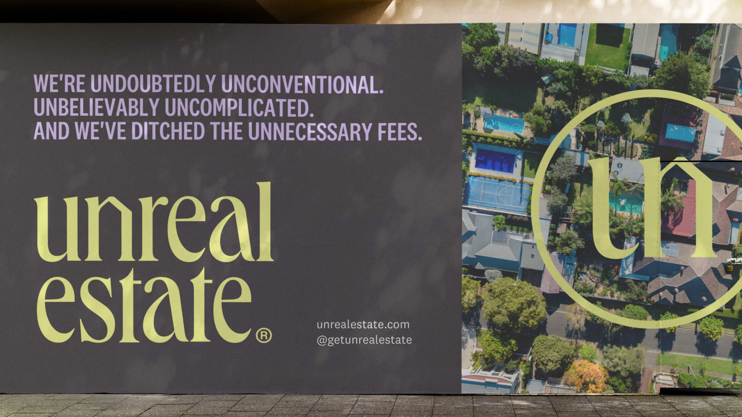
Just like the name implies, it was important for us to get other-worldly with the visual identity. We agreed that the mark needed to feel different, yet approachable, and that Unreal Estate’s colors had to stand apart from the popular reds, blues and yellows that flood our neighborhoods every moving season. It was a challenge to venture outside the box without alienating the brand’s key audience, who (justifiably) cares more about what’s behind the front door than what’s hanging on it.
The wordmark nails that quirky friendliness we were looking for, and the colors definitely invite passersby to look twice. What was even more fun for the team was leaning into the unreal-ness and unlocking our imagination with original illustration and functional iconography. From the details of duplexes and single-family dwellings to the surreal treehouses (with arms and legs exploding from the windows), we made sure to showcase the unexpected for optimistic home-buyers shopping with Unreal Estate.


