Supergut
Harnessing the power of the gut
-
Services Brand Strategy, Verbal Identity, Visual Identity, Packaging Design, Website Design, Website Development, Creative Production
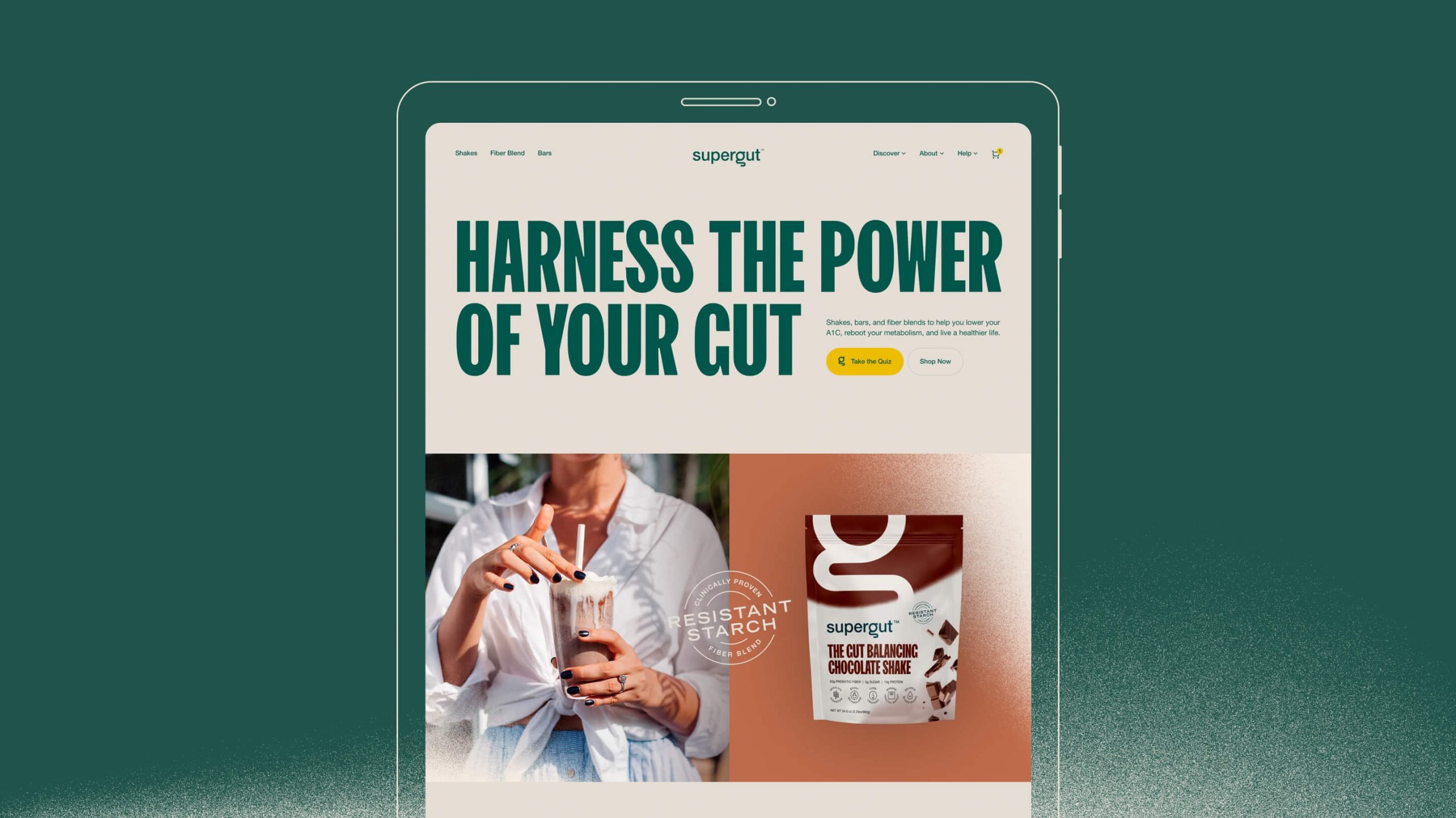
Launch website
Project info
Challenge
Muniq, as they were previously called, had an extremely small but fiercely loyal following amongst those specifically dealing with diabetes. Their gut balancing shakes were like nothing on the market in that they provided a real measurable impact to those struggling with that condition. But with new product lines coming out, and new found traction outside their original audience, they were looking to grow beyond their first incarnation. It was time for them to show a broader market that anybody with any body could deliciously transform their health.
Solution
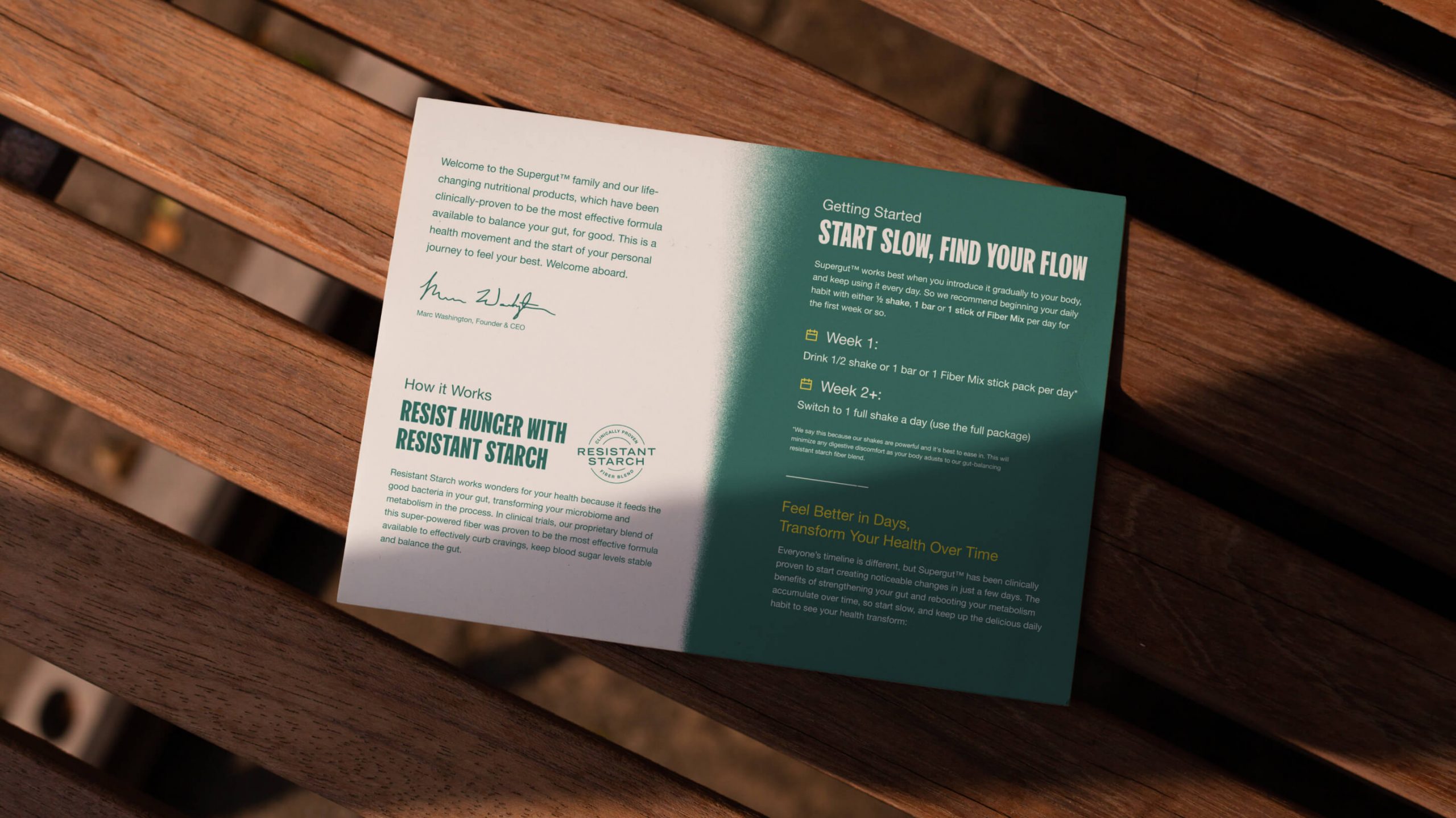
In a functional food industry rife with immensely boastful and misleading health claims, their team was very proud that their products were actually validated by their own self-funded clinical studies.
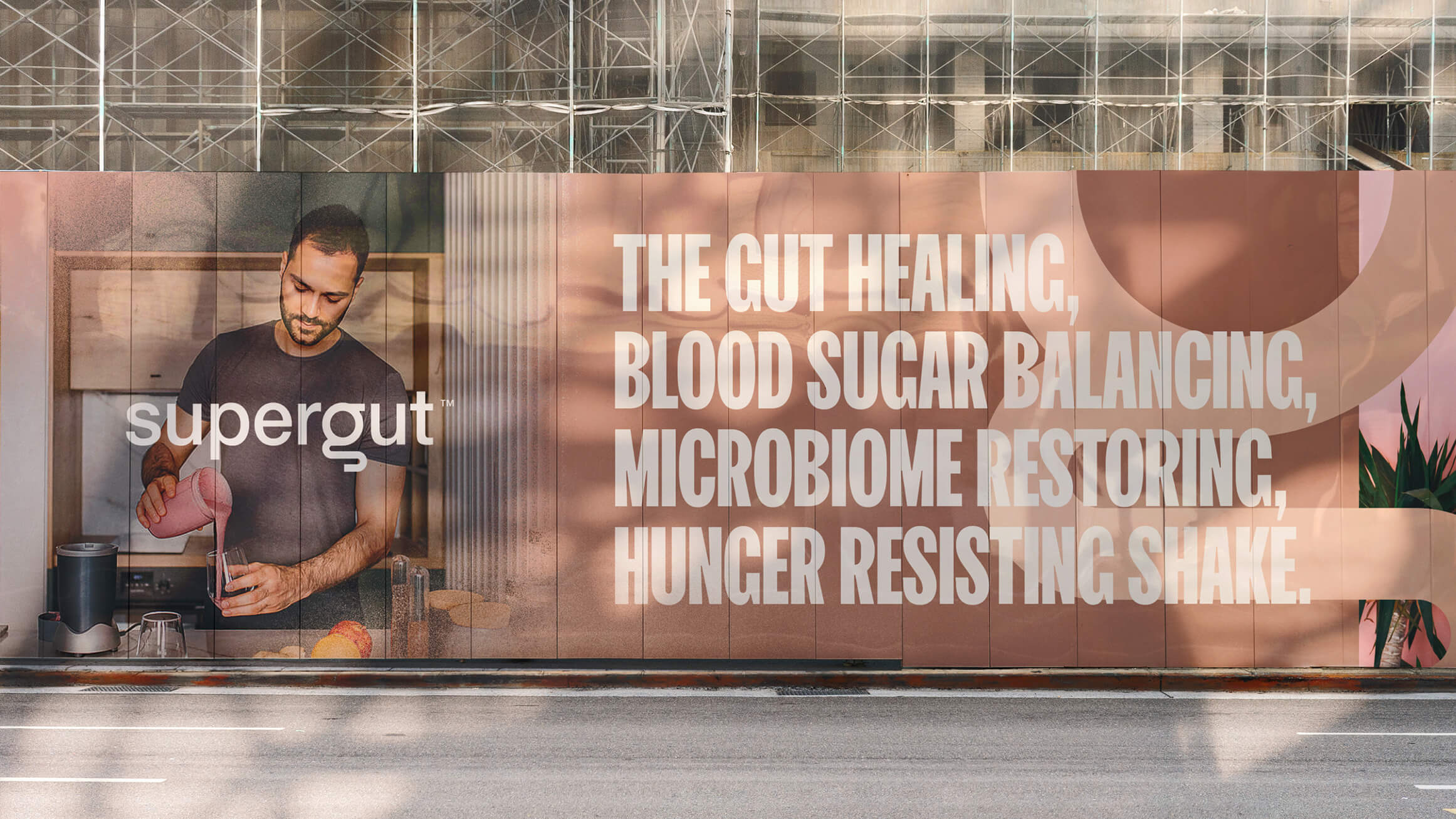
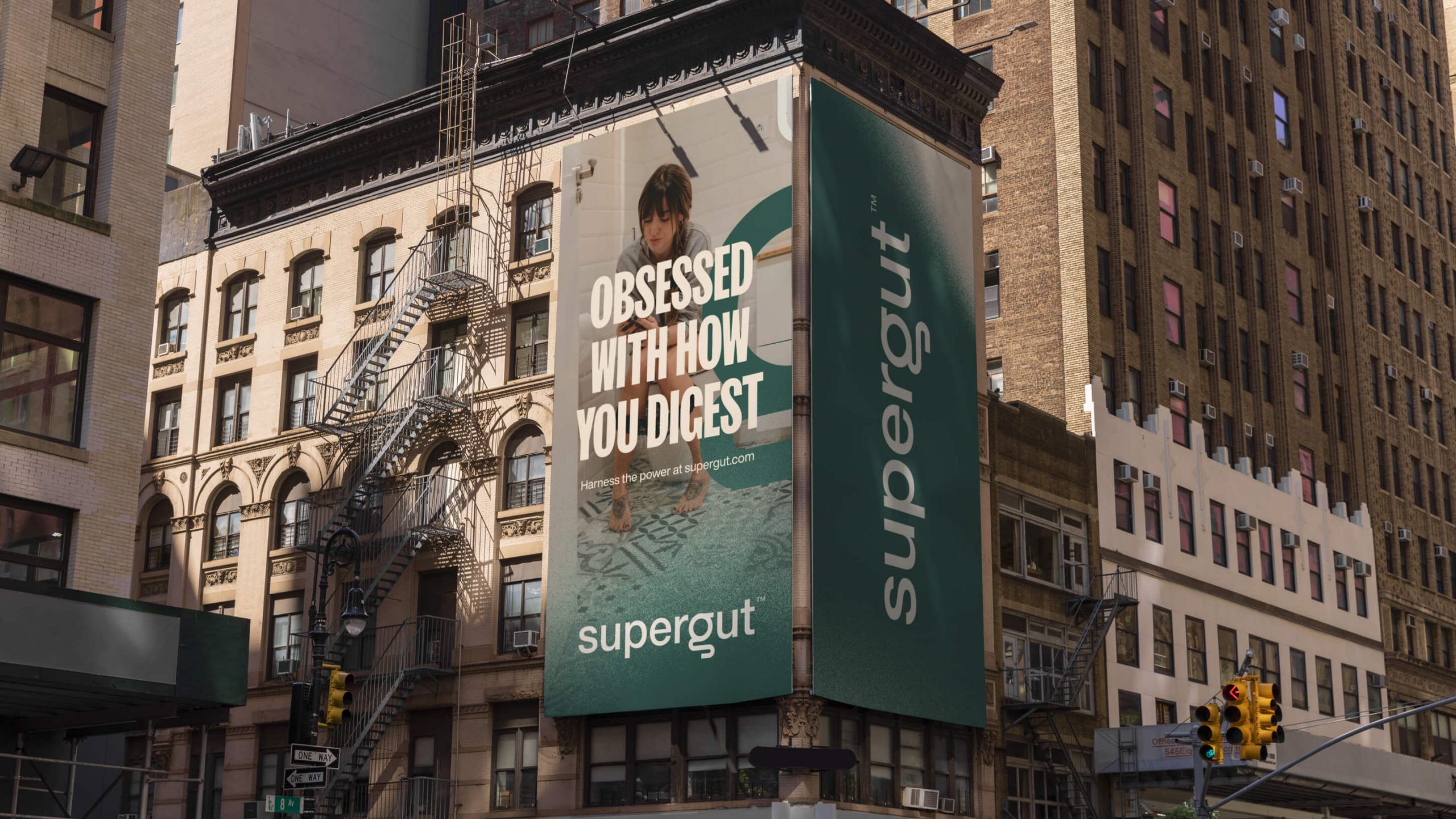
But to capture a larger audience we would have to go beyond science and make an emotional appeal about “harnessing the power of the gut” so that everyone could finally feel their best. We needed to marry the profound health benefits of their products, with the practical way in which you could utilize them in your own way, any time of day. This beautiful mash-up of transformation paired with accessibility allowed us to land on the Everyman-Wizard archetype which would serve as our North Star for both verbal and visual identity.
Concurrently, they had grown out of their Muniq name, and needed something that spoke to the guts it takes for anyone to improve their health, with the science of the gut they were deploying to help people feel better than ever. Our intensive discovery process gave us a name that everyone could rally around - the result was Supergut.
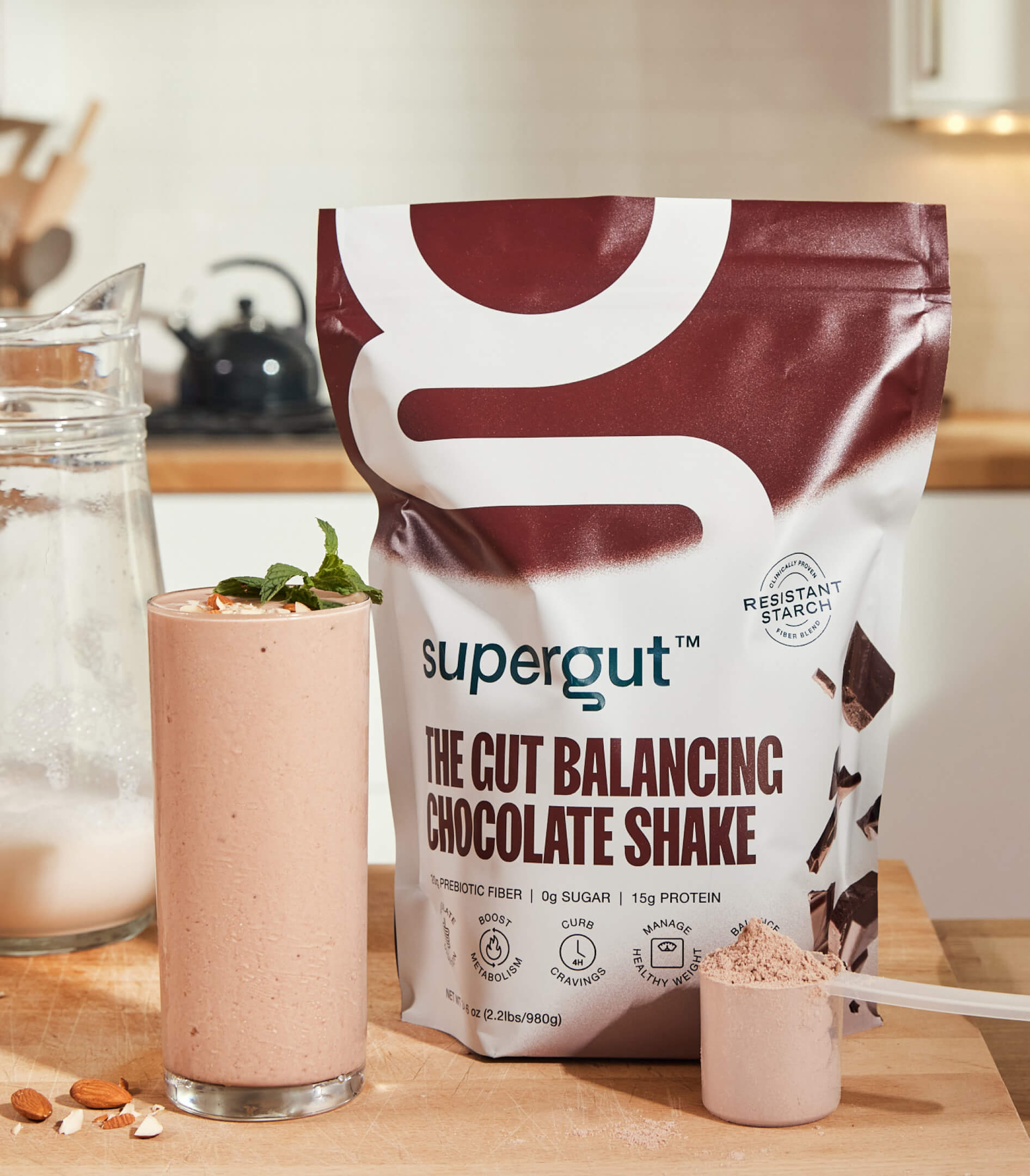
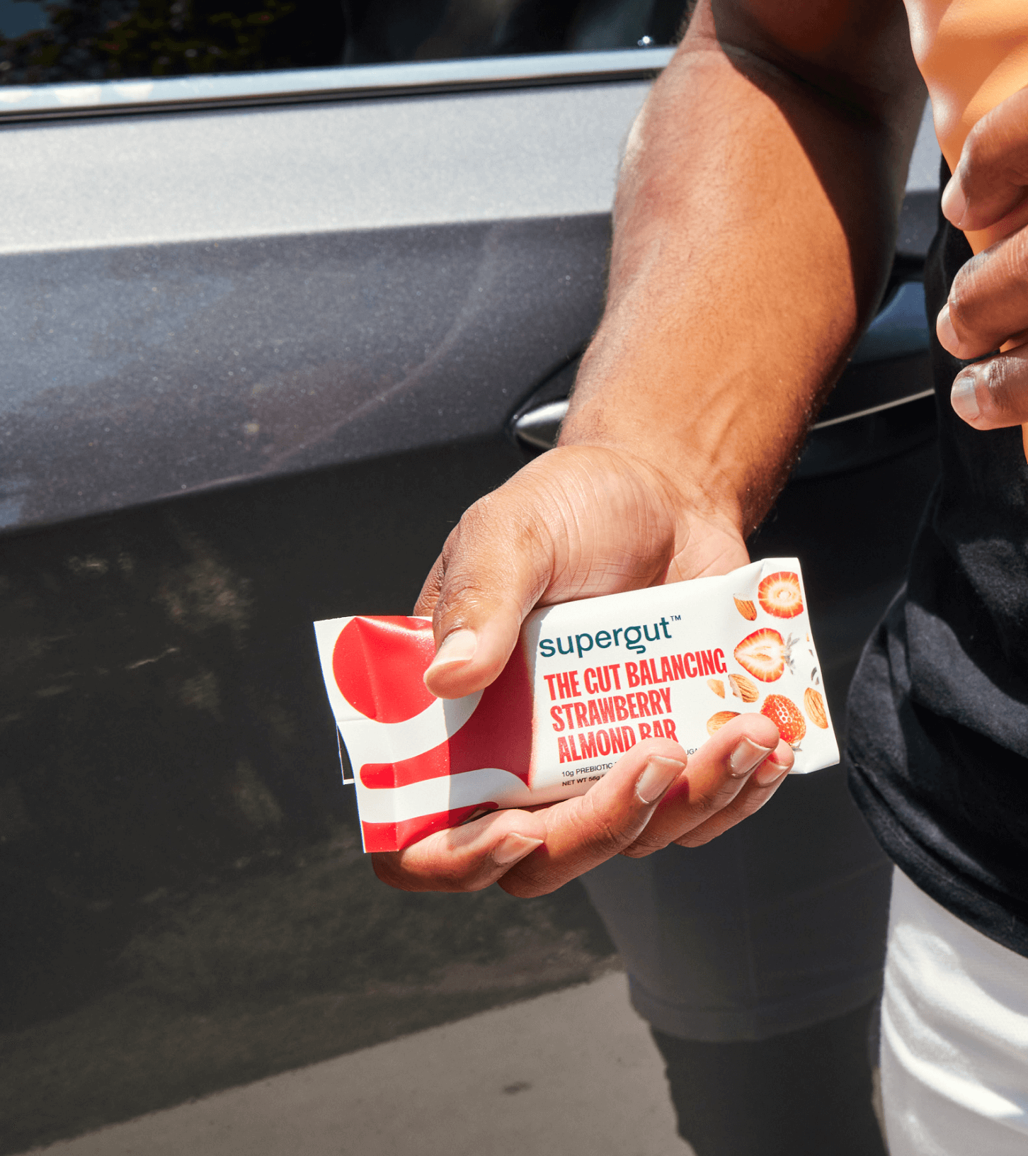
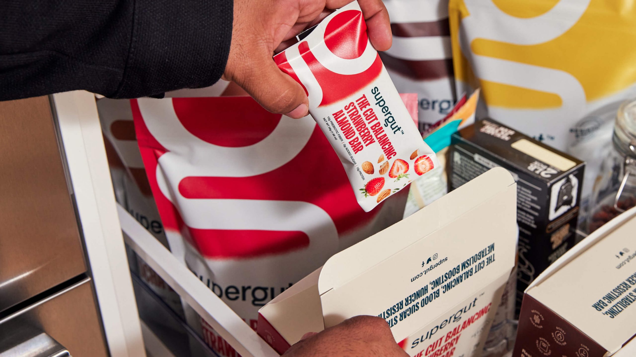
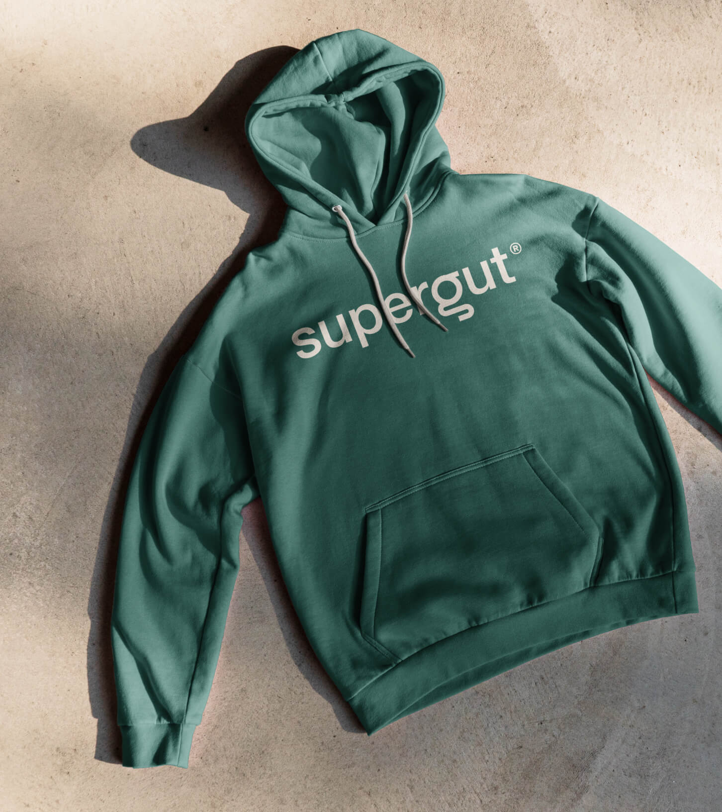
Now armed with a great name and a resonant strategy, it was imperative for us to rebrand Supergut with sparkling new packaging and visual assets that could help propel their brand into future relevancy. This meant executing photo and video shoots that modernized the look and feel they were looking for while not alienating the audience that had originally grown to love them.
