Flowcarbon
Opening the carbon market to everyone
-
Services Brand Strategy, Verbal Identity, Visual Identity, Website Design, Web3 Innovation
Project info
Challenge
The bright folks at Flowcarbon understood that in the urgent race against climate change more needed to be done, and fast. So they set their sites on the voluntary carbon market - a system where ideally corporations and people could offset carbon emissions and thus financially power the nature saving projects that could help reverse climate change. Unfortunately, this marketplace has long been opaque, inaccessible and bloated by inefficiencies for even the most sophisticated actors. The challenge faced was to erase the skeptism of the past and communicate that a more accessible, transparent, and efficient carbon market was now possible by harnessing the power of blockchain technology.
Solution
In our spirited meetings with the Flowcarbon team, it was clear that they were hungry to change a system that they viewed as outdated and ineffective, yet provided our best chance at reversing the harmful effects of climate change. During our initial conversations, the word “transformation” kept coming up and the need to open the voluntary carbon market so it could be accessible to everyone. This fusing of these two ideals led us to the combined archetype of the Everyman Wizard that would speak to this transforming of the carbon market, while also empowering all of us to be part of the change we want to see in the world.
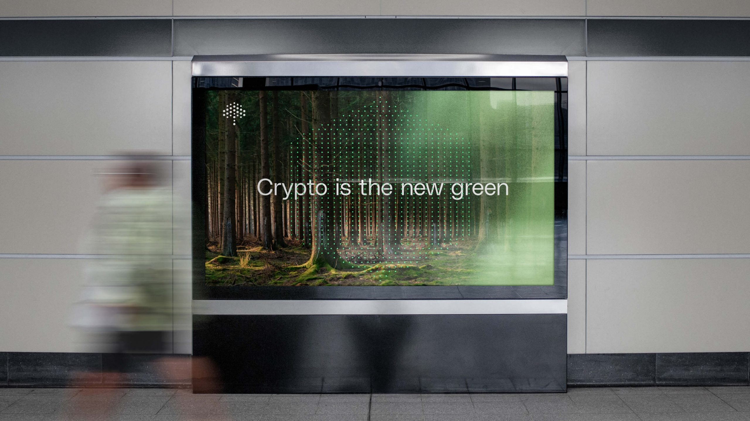
Once equipped with this powerful persona, it was time to create messaging that was palatable to both individuals unfamiliar with this marketplace, yet sophisticated enough to reach a highly discerning corporate audience. This involved telling an aspirational story that could resonate with anybody who cared about our planet, but was still pragmatically grounded in real solutions, that while not perfect, were objectively better than any other option available.
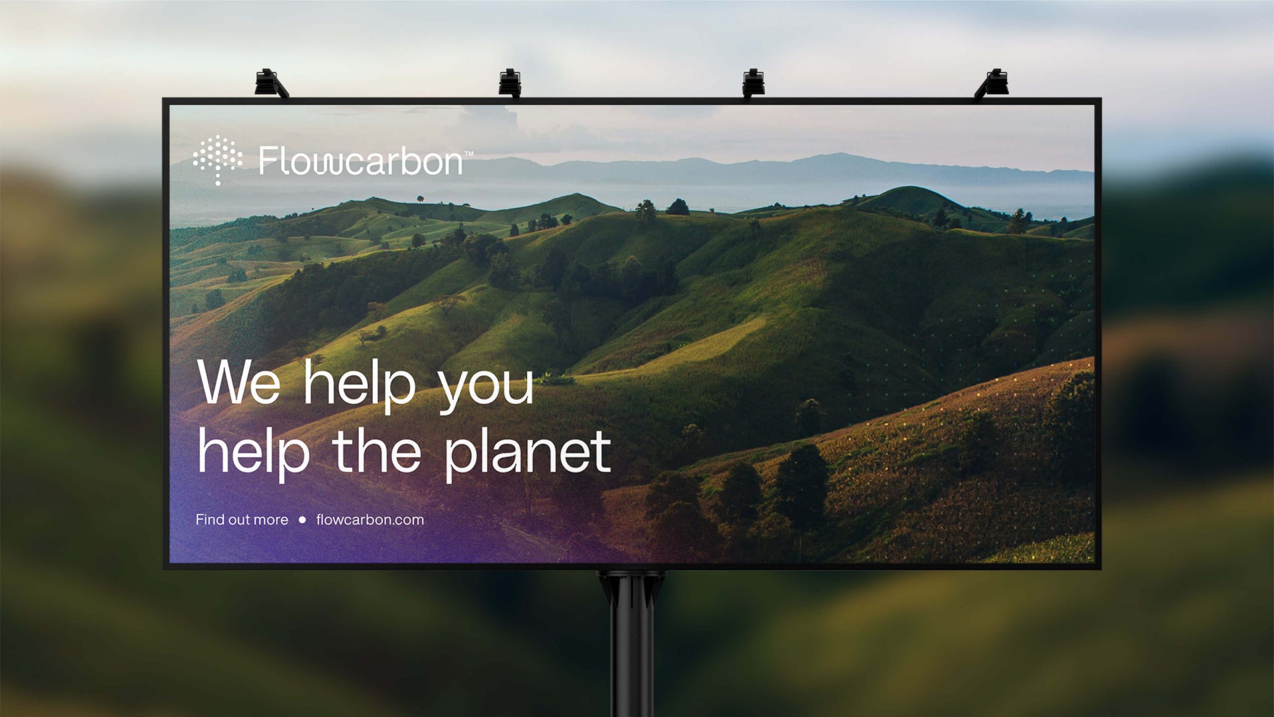
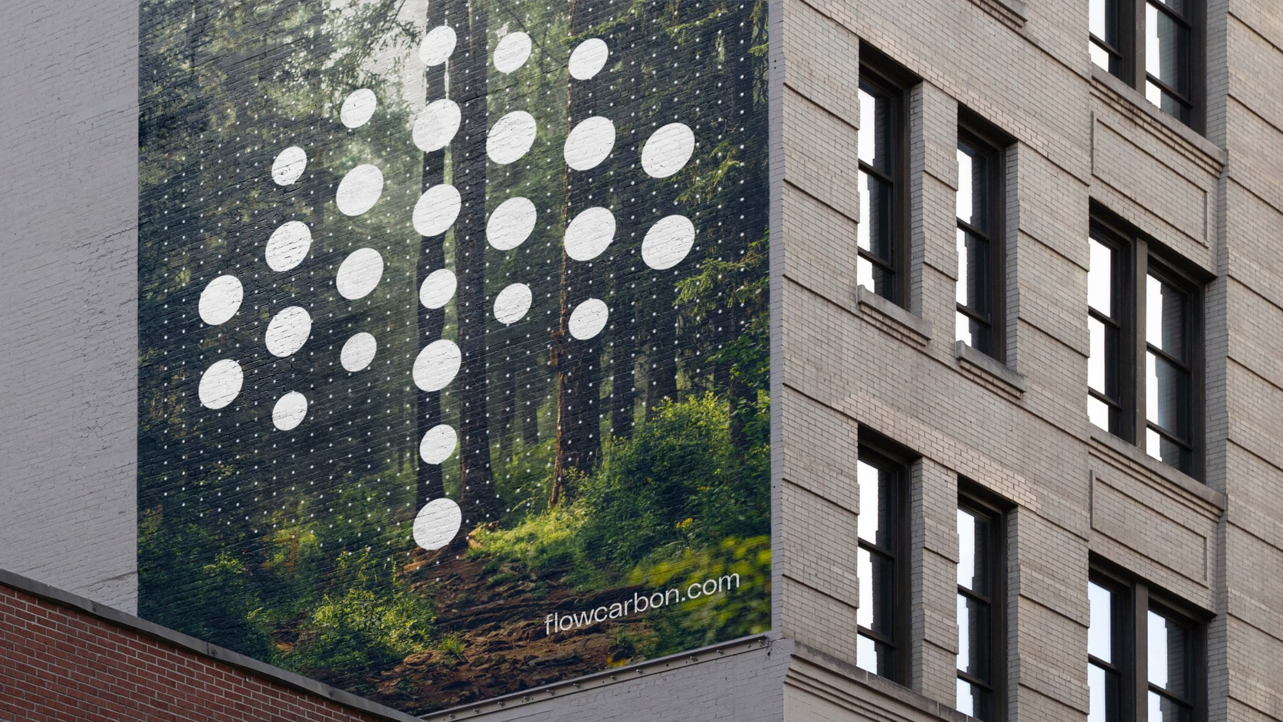
While we treat every visual identity with due respect, this particular assignment hit close to home for our design team. We embraced the challenge of balancing digital and natural as we explored various approaches to the branding. The final wordmark leaned into the digital with unique letterforms and a subtle nod to web3. Just as important as the logotype, the icon distilled Flowcarbon’s ethos into a single mark; atoms, flora, arrows — no matter what you recognize first, the mark is representative of all things working together.
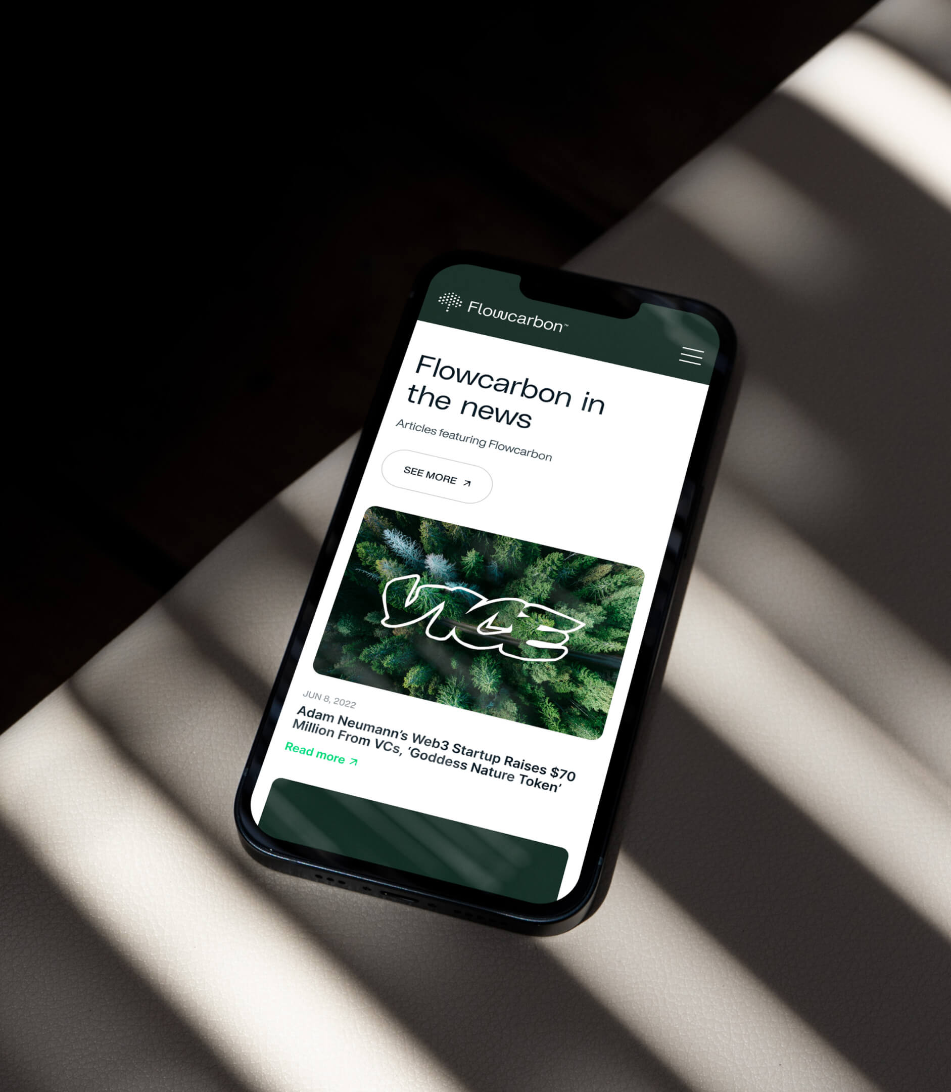
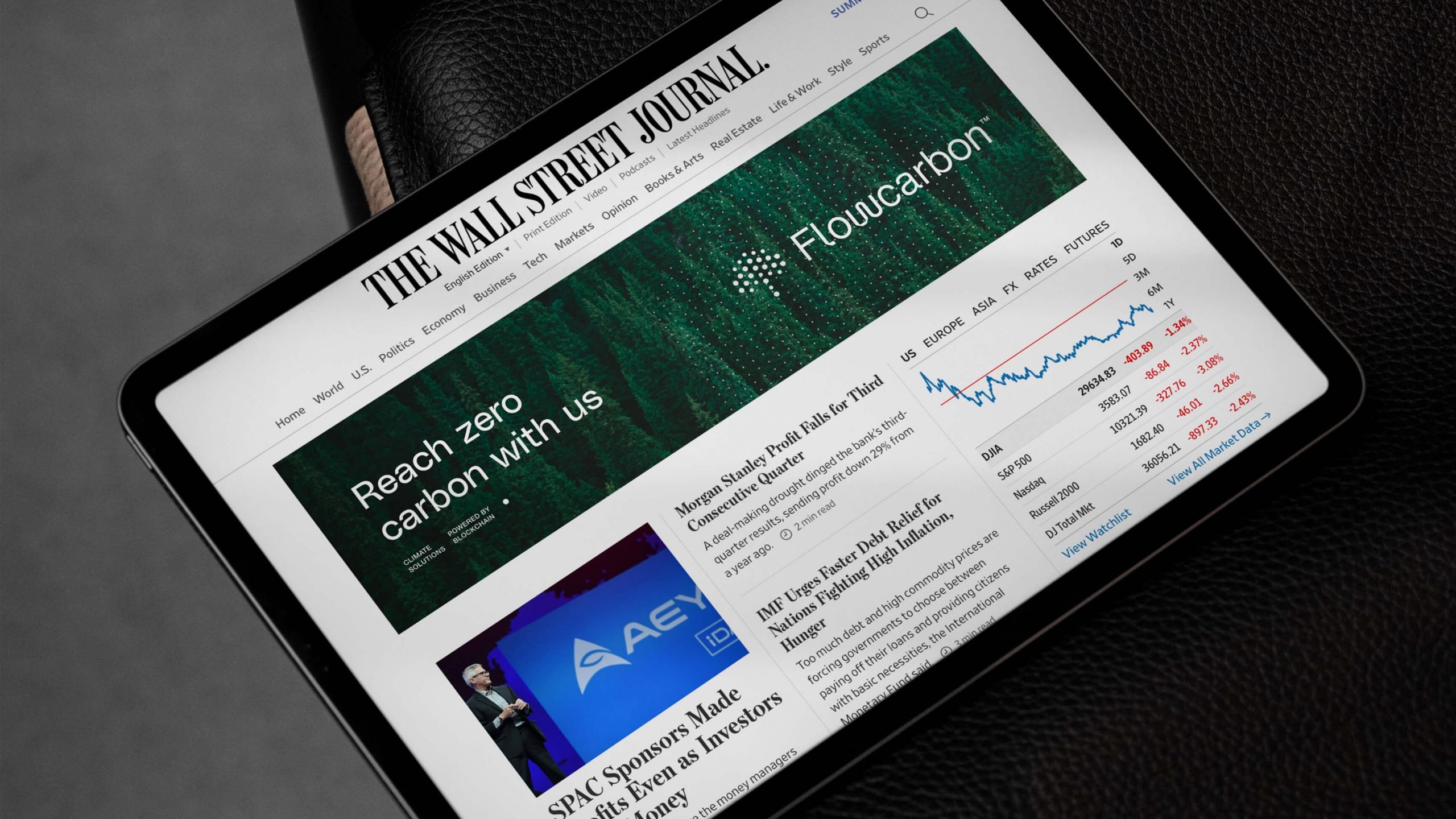
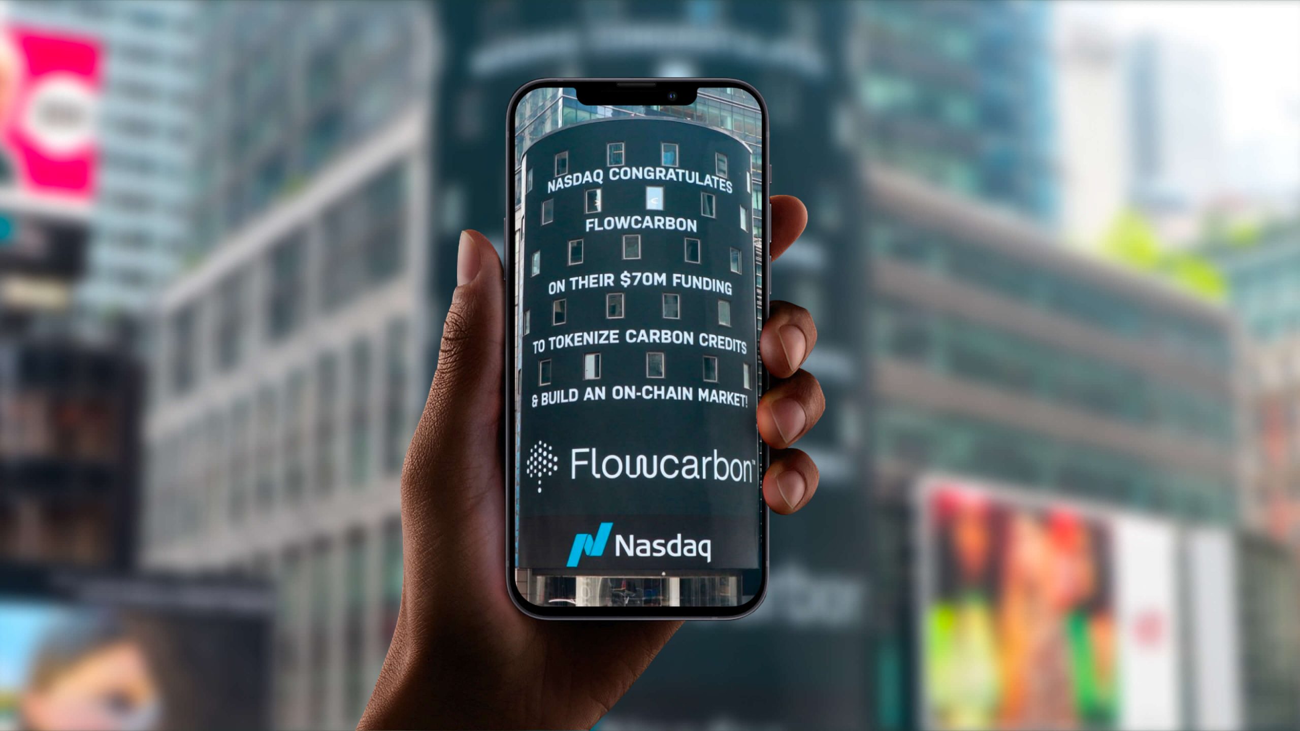
After wrapping up the visual identity, we moved on to additional brand touchpoints, including merchandise, experiential design and the Flowcarbon website. It was important for the site to be eye-catching, yet simple enough that users wouldn’t become overwhelmed with the complexity of what technology can do for the environment. The messaging that our strategy team helped write with Flowcarbon made it easy to design a well-intentioned and thorough digital experience.
