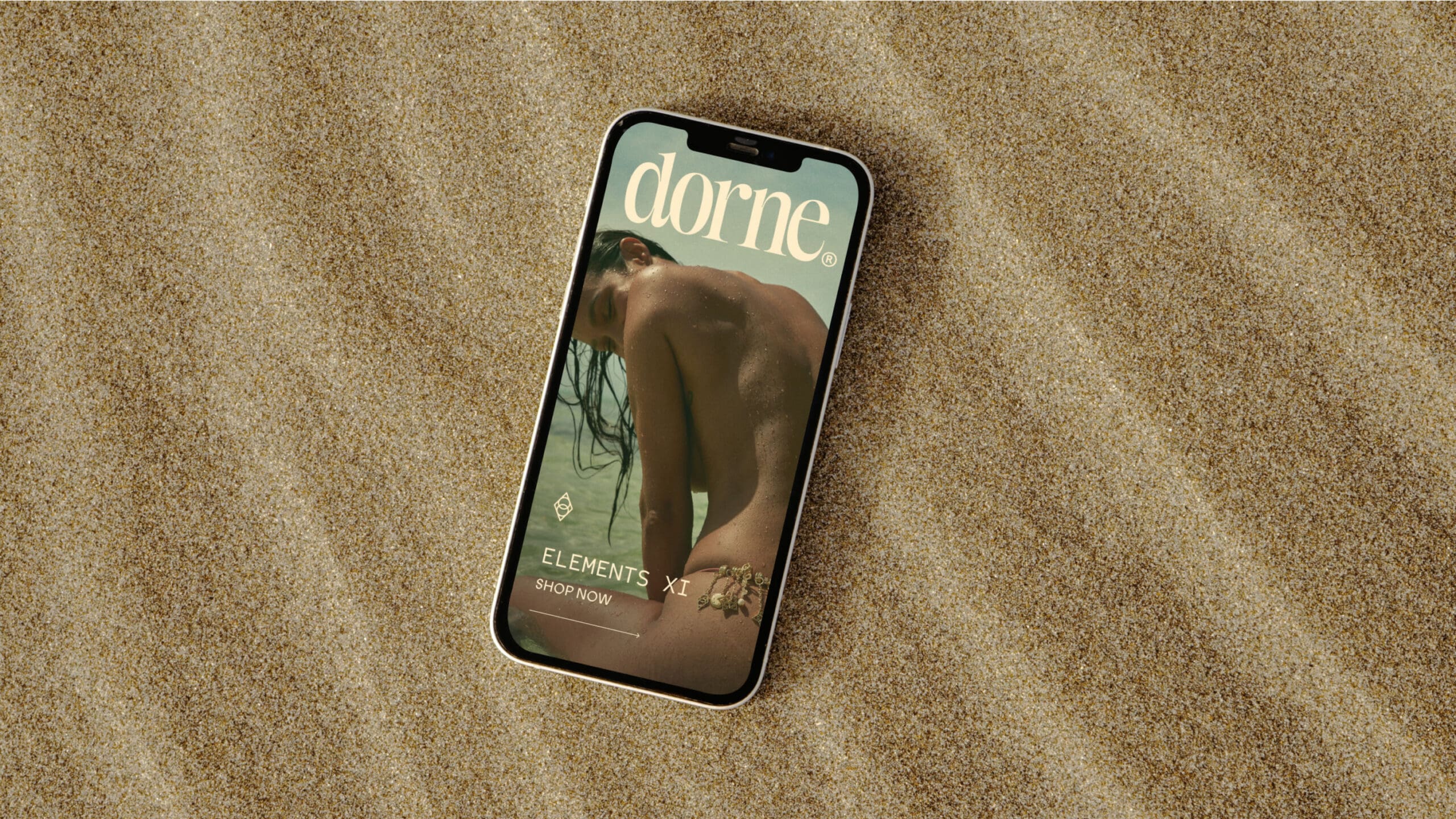
Dorne
Embodying paradise
-
Services Brand Strategy, Verbal Identity, Visual Identity, Website Design (eCommerce), Website Development (eCommerce), Social Identity, Creative Production, Packaging Design
Project info
Challenge
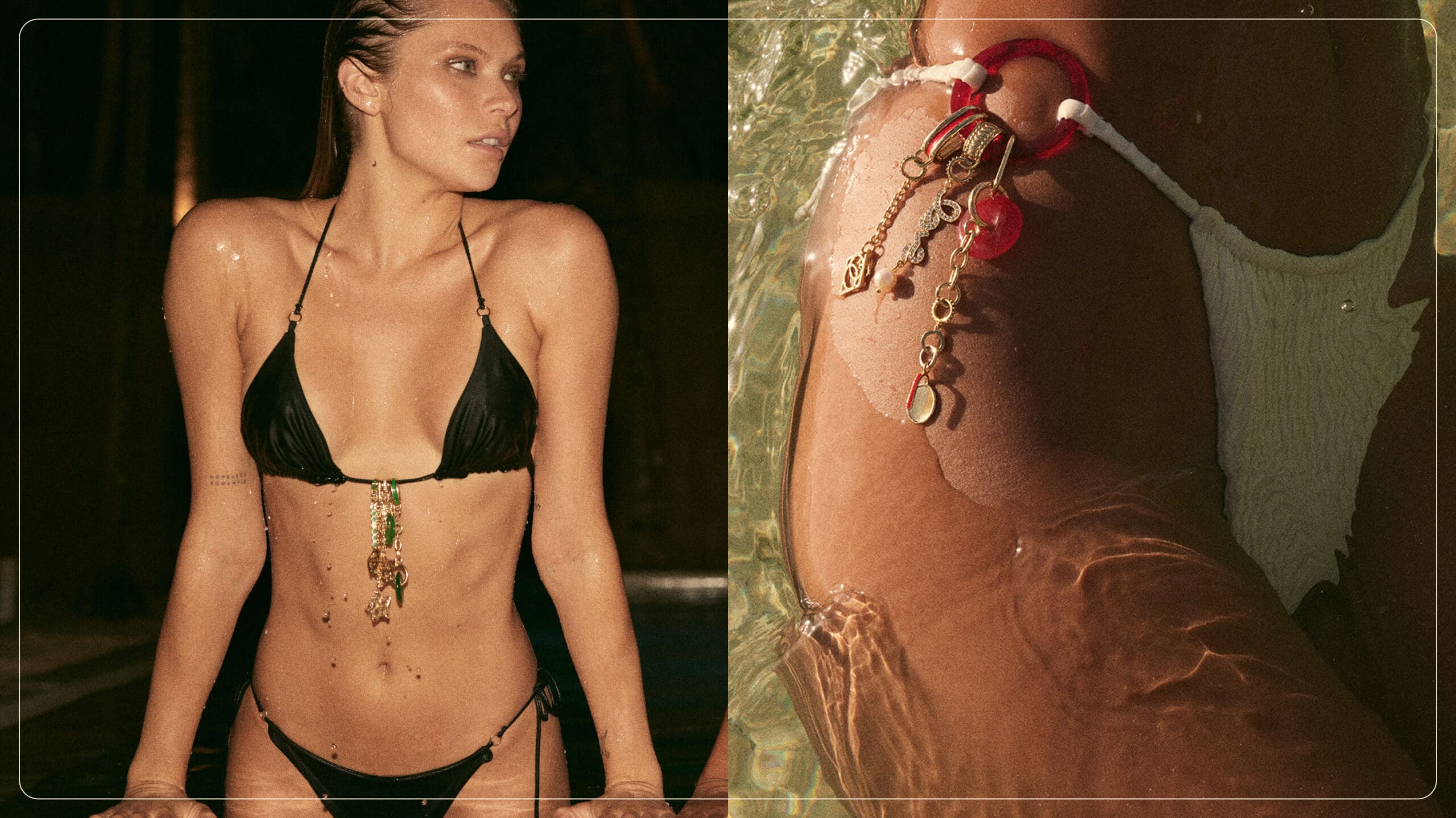
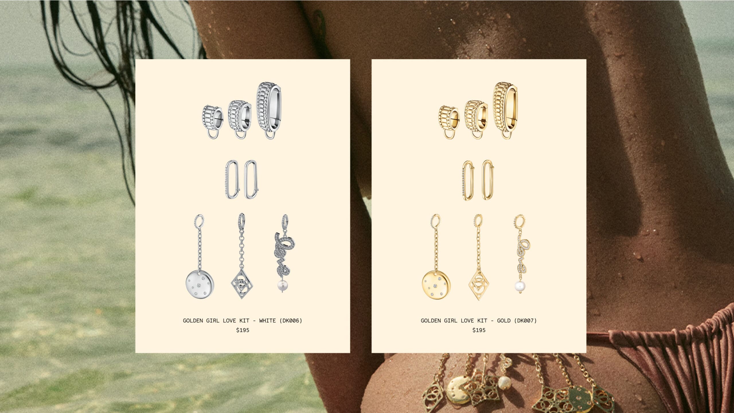
Dorne, formerly Raye Rocks, came to us with an idea: high-end swimsuit jewelry that could turn even the simplest black bikini into a form of self-expression. But with nothing more than a vision and aesthetic in mind, we had a long way to go before they could officially launch. With brand strategy, naming, messaging, visual identity, packaging, and digital site design on our list of to-dos, we needed to make sure all the details came together for a cohesive, high-end feel and look once they hit the market.
Solution
Starting with strategy and external messaging, we captured the brand's main emotional driver: to find bliss and embody your paradise — in the water, in the simplicity of the moment, and in wearing what you love. This placed them firmly in the Innocent archetype, one that finds joy and meaning in simple pleasures and naturally draws on the nostalgia of memories past.
With a strategy locked, we moved into naming and messaging. After exploring a variety of avenues, we landed on “Dorne,” roughly meaning to “decorate” or “adorn” in French. Then, without any clear competition and a limited amount of clarity on what the final design and offering would be, external messaging became more about capturing the brand ethos and the story behind it. This created some much-needed guardrails as the project moved into the visual and product design phase.
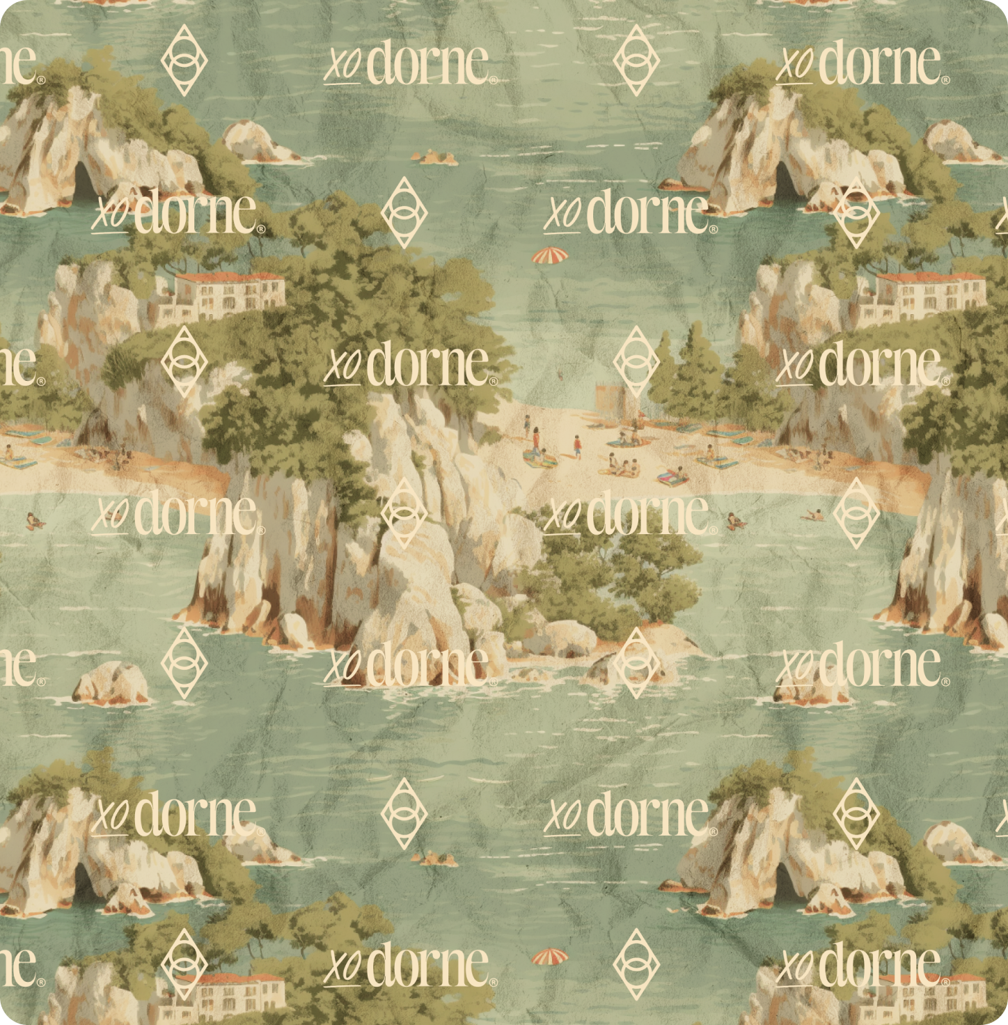
When it came to building a visual identity, we wanted to create something that could lead the way in creating their product line and potentially show up as an actual piece of jewelry. Leaning into the brand strategy, we were able to create a mark that did exactly that, serving as the foundation to their product line and packaging going forward.

