OnTrac
Delivering what matters
-
Services Brand Strategy, Naming, Visual Identity, Website Design
Project info
Challenge
When a merger brought Lasership and OnTrac — two long-established brands — together, they were faced with a new challenge: establishing a verbal and visual identity that paid homage to the past while making way for the future. From creating a strategy and messaging framework to landing on a name and building out an extensive website, we were tasked with merging differing opinions to create a cohesive brand with complete team buy-in. Instead of revealing an already established brand personality — as we do with most clients — this required building one almost from the ground up.
Solution
While shipping and logistics may feel like a very straightforward, right-brain industry, there was a common thread between both Lasership and OnTrac that felt very human. They were committed to being the best at handling everything behind the scenes so, in return, their retail customers could create a better experience for their customers. They wanted to go above and beyond, delivering what matters when it matters most.
This led us to their archetype, the Lover — but more specifically, one we call The Wedding Planner. The Wedding Planner is the port in the storm, the one handling all the details so you can enjoy life’s biggest moment. They may not get all the accolades, but nothing would run as smoothly without them.
From there, we worked to establish the external proof that established them as the most equipped for the job, bridging the logistics element of OnTrac and the proven shipping chops of Lasership. And, after extensive naming workshops and brainstorming sessions, they opted to use “OnTrac” as their new — but already established — name.
Next, it was on to building a visual identity that could elevate the new OnTrac verbal identity, while artfully weaving in elements of the old Lasership brand.
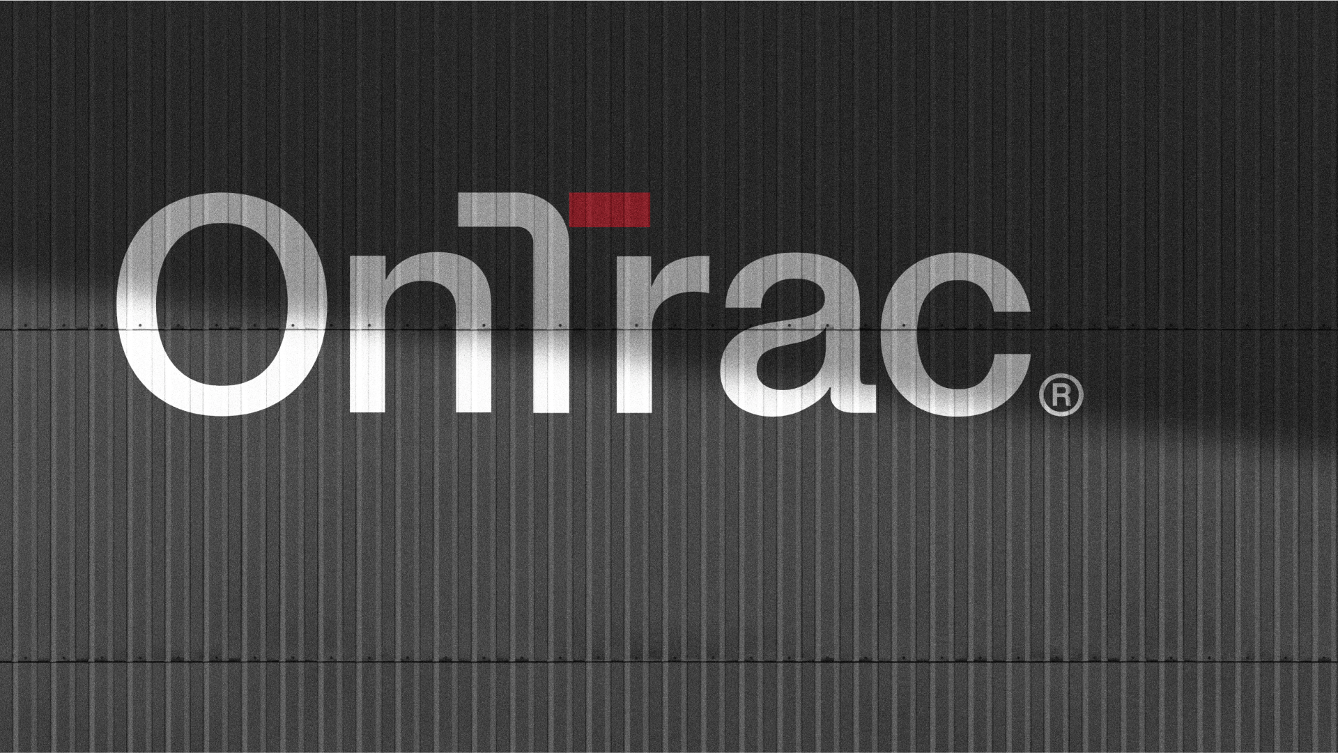
When sketching the new logo, we made sure to incorporate the most recognizable elements in the wordmark — the capital O and T. Like most of our custom wordmarks, it was important to us that we leveraged something ownable about the brand. Specifically, we wanted to highlight the expertise of both OnTrac and Lasership. Everything we needed, it turns out, was there all along.
The custom T shape incorporates a “right turn” which reminds us of GPS directions, not unlike what the drivers at OnTrac use when accurately transporting packages for its customers. The more we leaned into this direction, the more we saw other opportunities to use it. The T also resembled a wink, so we added a half circle below to complete the icon. It perfectly fit with the overall demeanor of the OnTrac team, who genuinely enjoyed going to work each day.
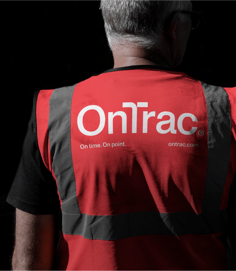
The last big piece was color, which ended up being a direct nod to Lasership. The red, black, and white palette keeps things simple, legible and familiar. In addition to a complete site redesign and the traditional asset suite — business cards, letterhead, etc — it was time to officially ship the visual identity for final delivery.


