Joby
Taking flight to new heights
-
Industry Aviation
-
Services Brand Strategy, Verbal Identity, Functional Copywriting, Visual Identity, Website Design
Launch website
Project info
Challenge
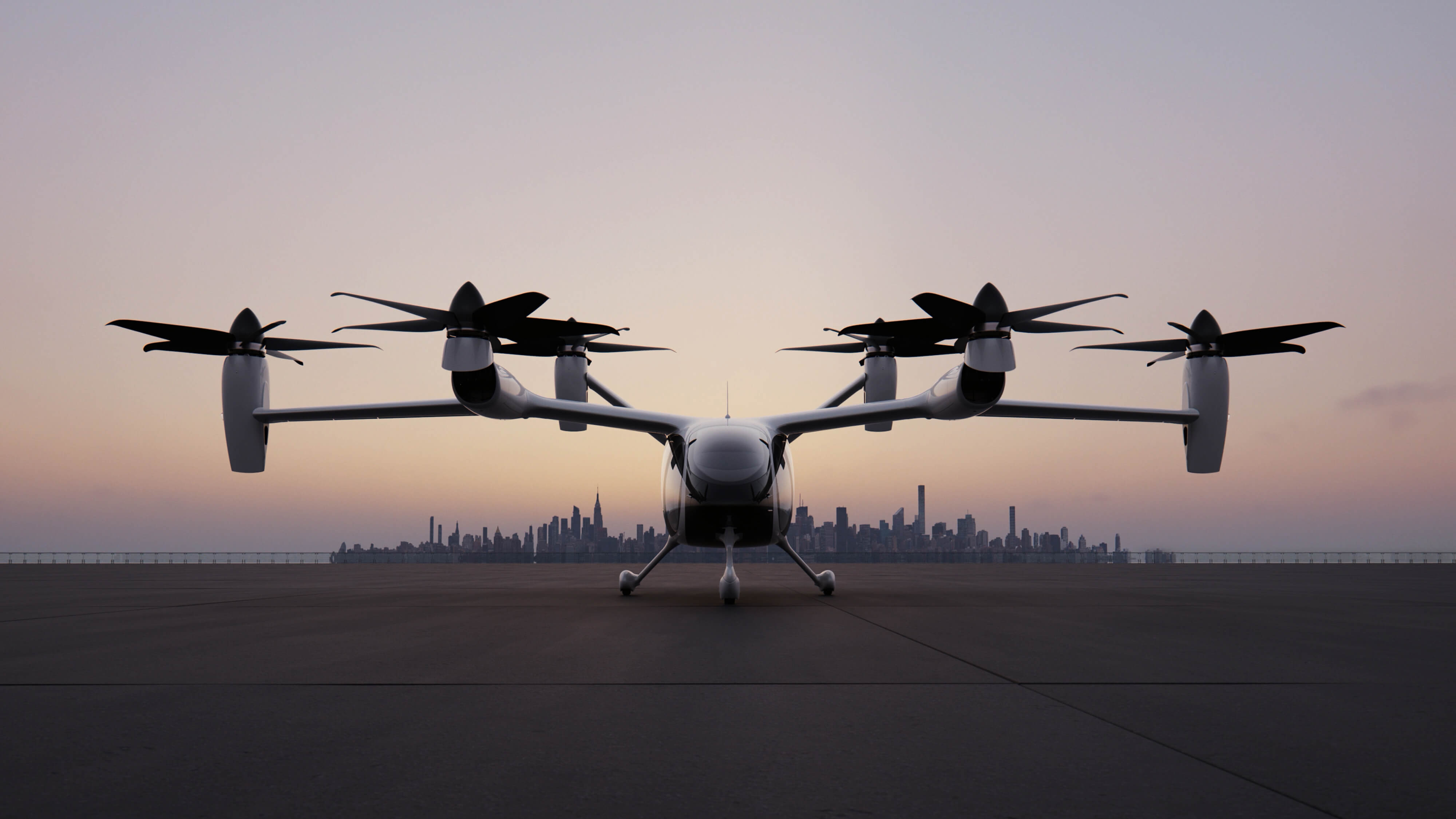
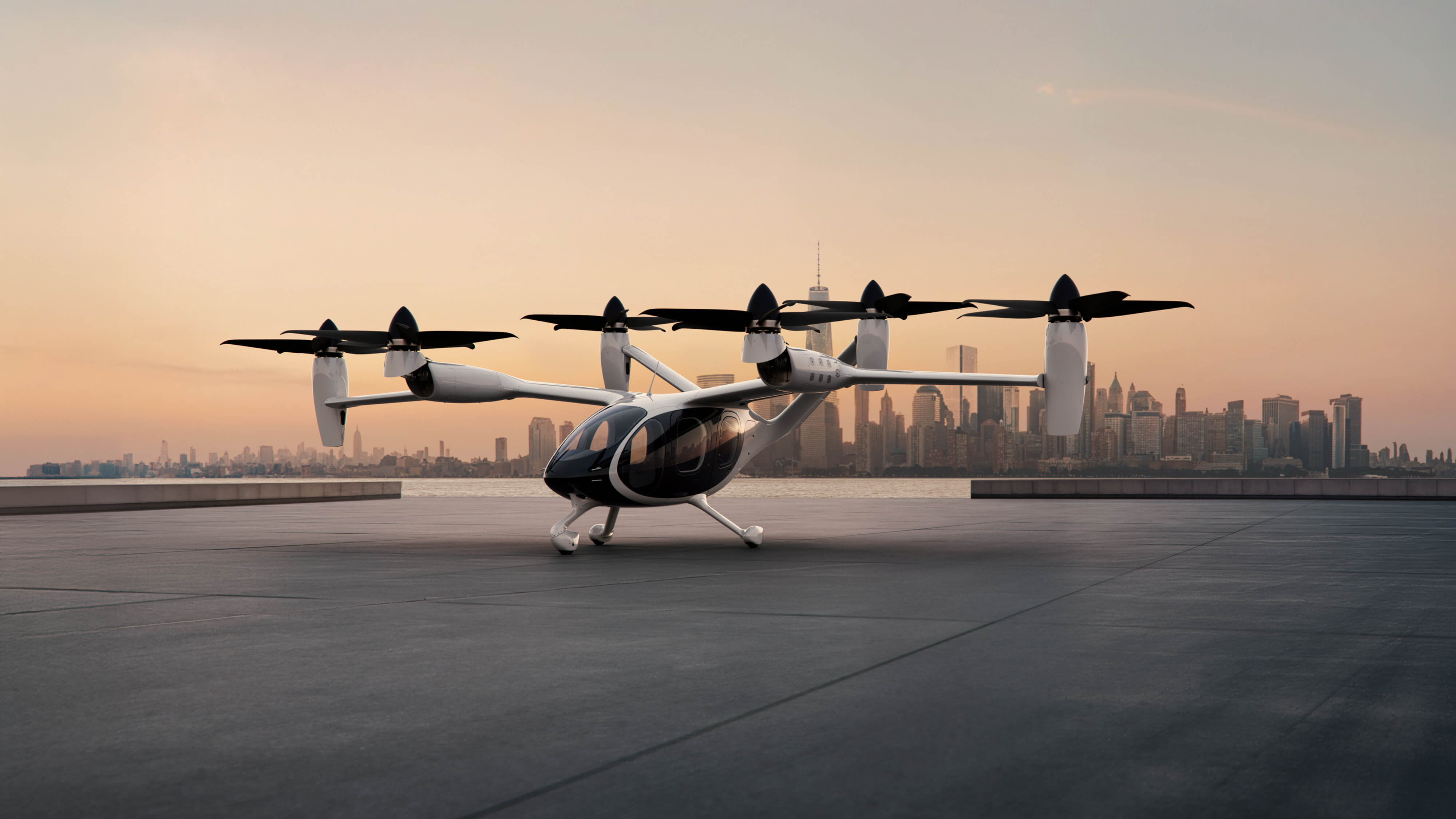
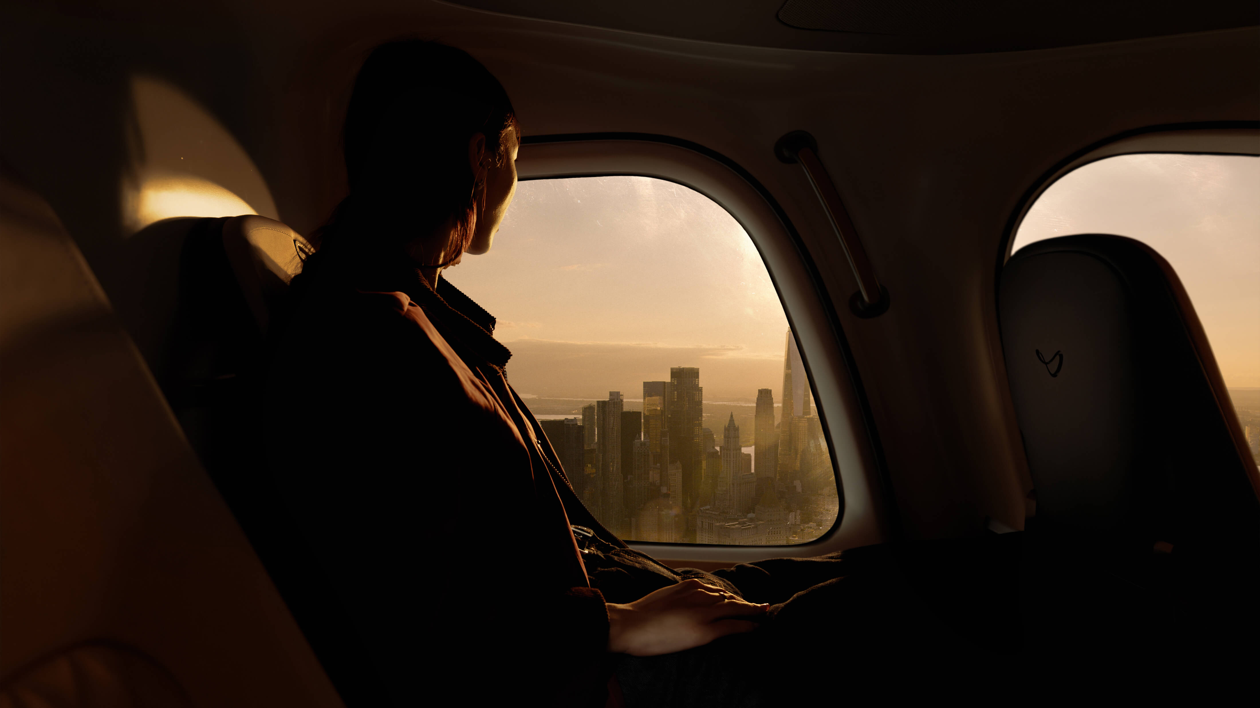
Flying once felt magical. In the golden age of aviation, it represented optimism, progress, and the thrill of possibility. Over time, that sense of wonder gave way to congestion, friction, and routine—turning flight into something endured rather than enjoyed.
As Joby prepared to introduce eVTOL travel to the world, the challenge wasn’t just launching a new aircraft—it was restoring the dream of flight itself. Joby needed a brand that could balance cutting-edge engineering with emotional resonance, making a new category feel intuitive, trustworthy, and human across every touchpoint—from aircraft to app to skyport.
As Joby prepared to introduce eVTOL travel to the world, the challenge wasn’t just launching a new aircraft—it was restoring the dream of flight itself. Joby needed a brand that could balance cutting-edge engineering with emotional resonance, making a new category feel intuitive, trustworthy, and human across every touchpoint—from aircraft to app to skyport.
Solution
Together with Joby we built a future-ready brand rooted in the emotional legacy of flight—reimagined for a new era.
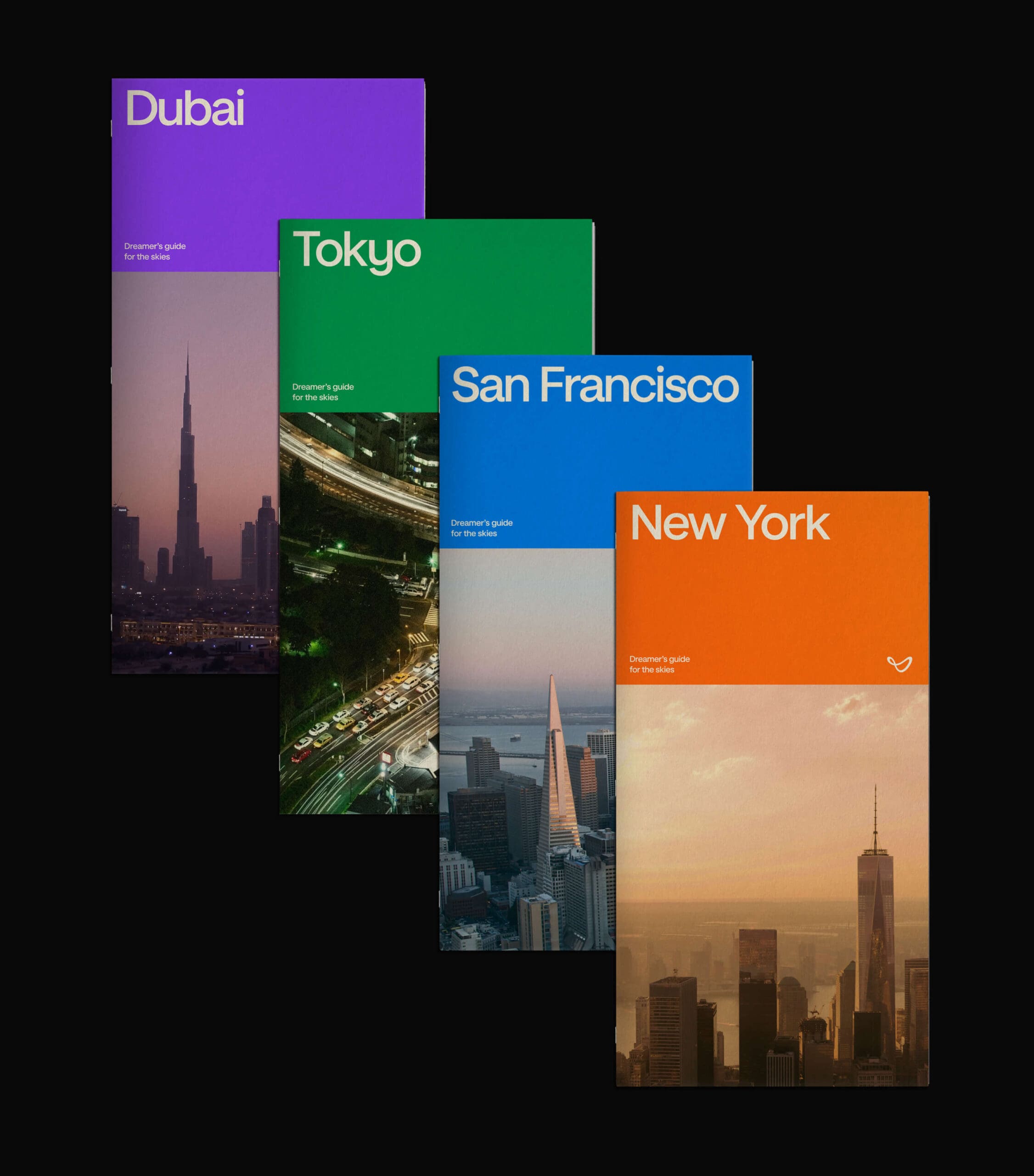
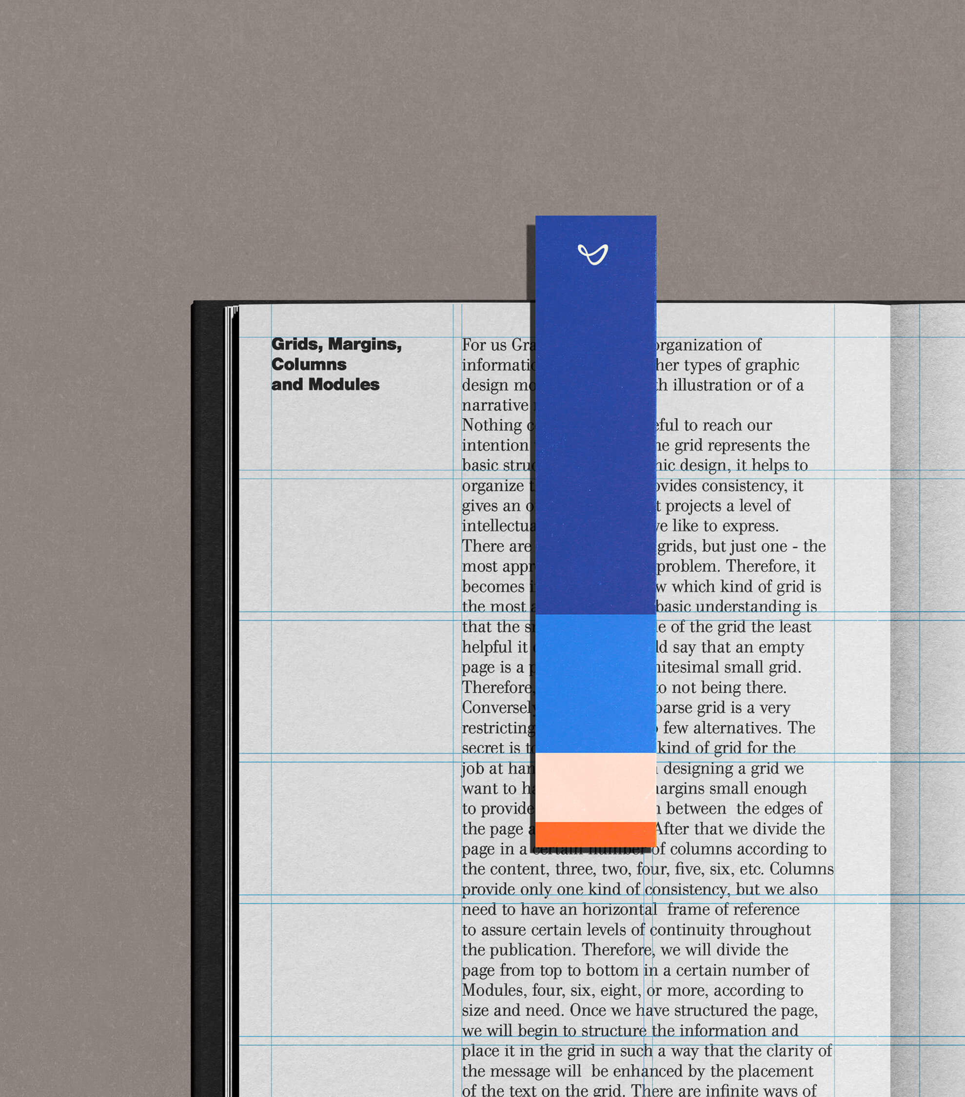
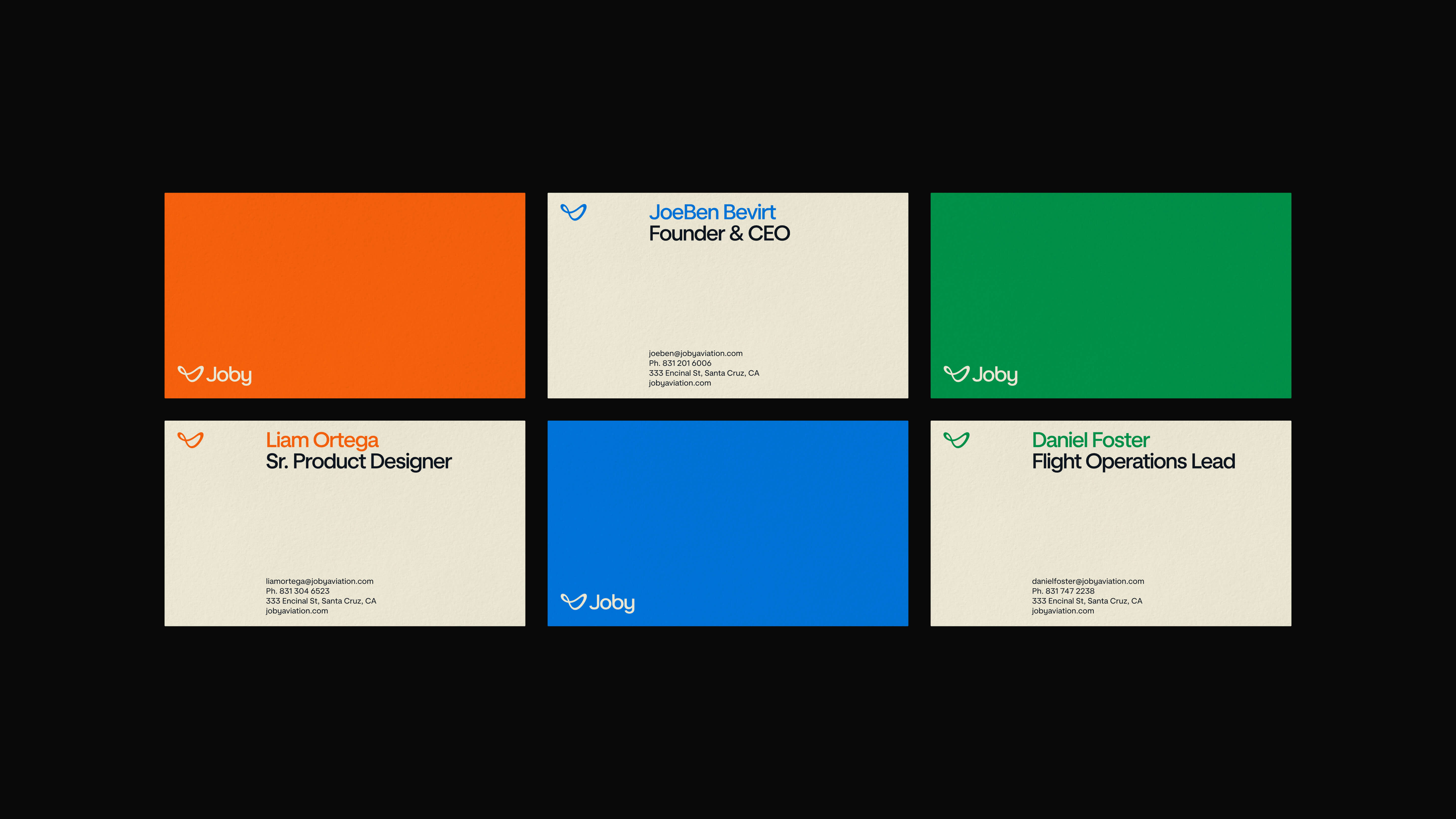
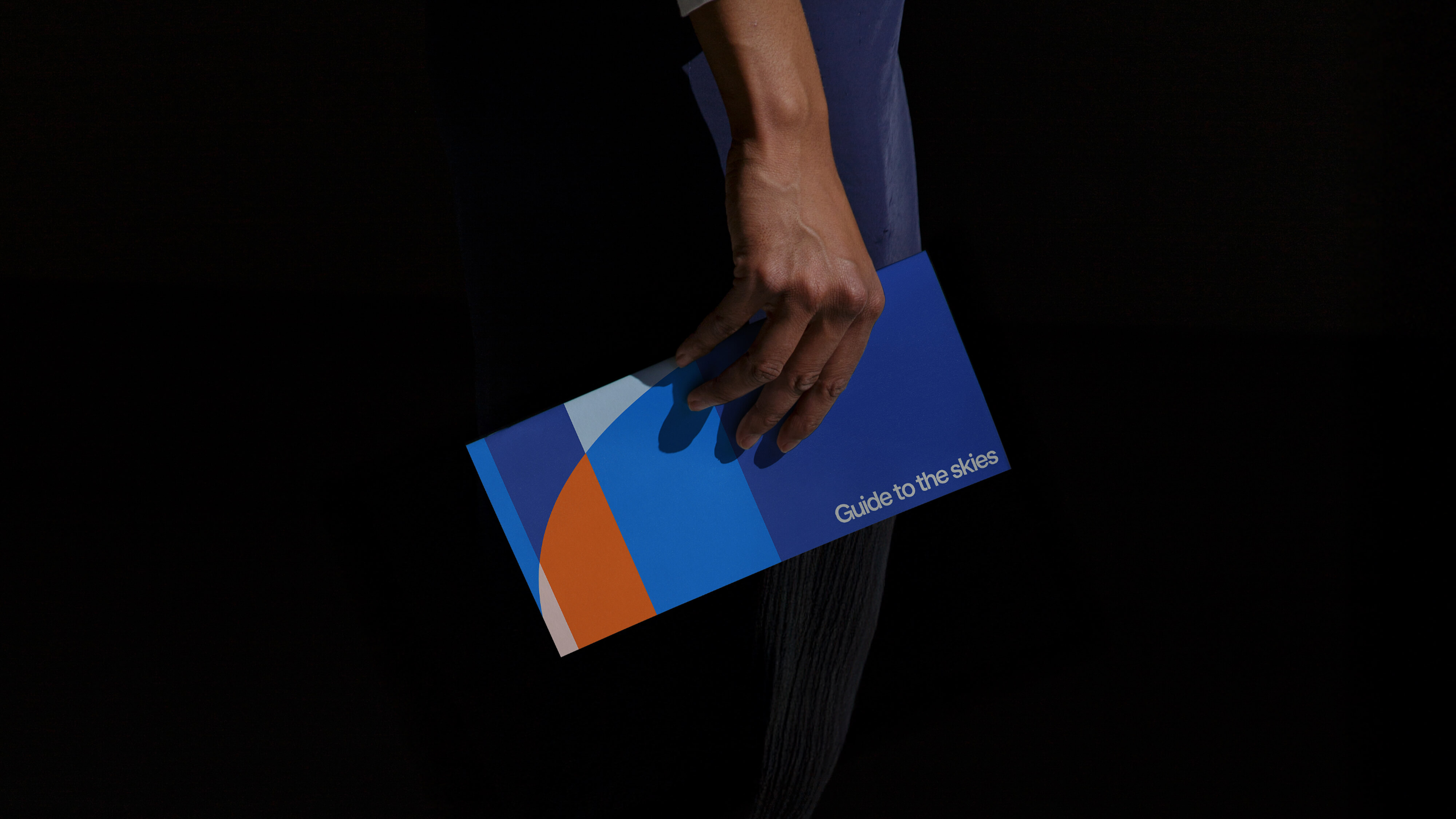
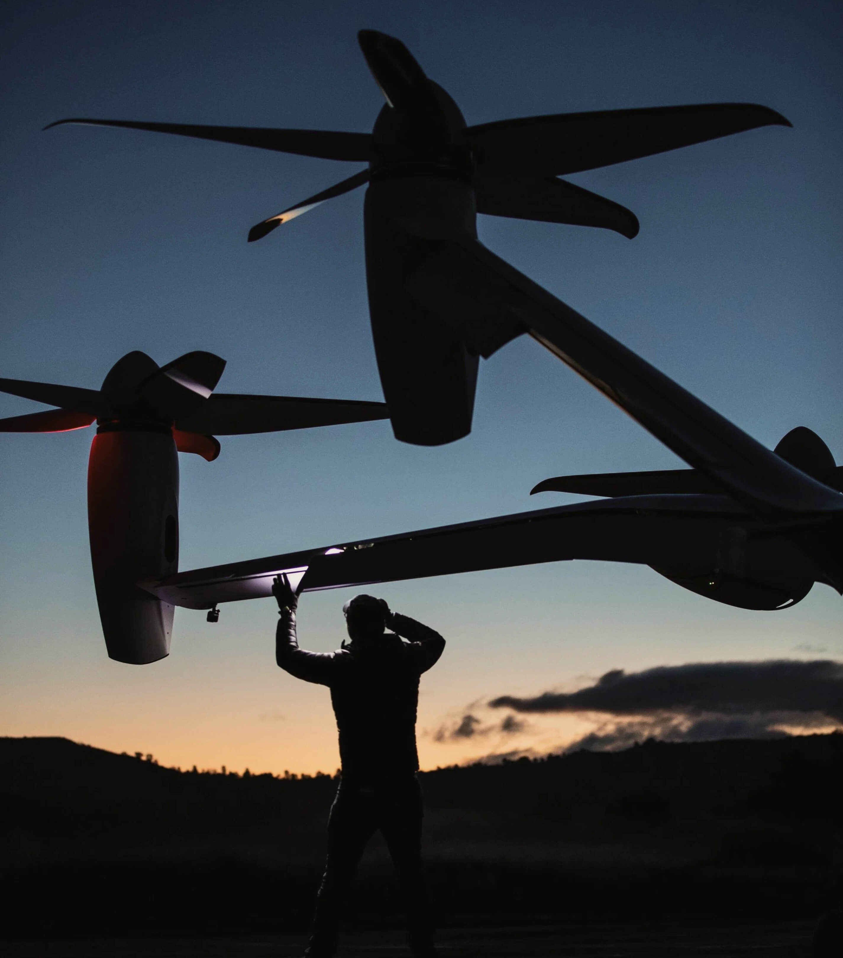
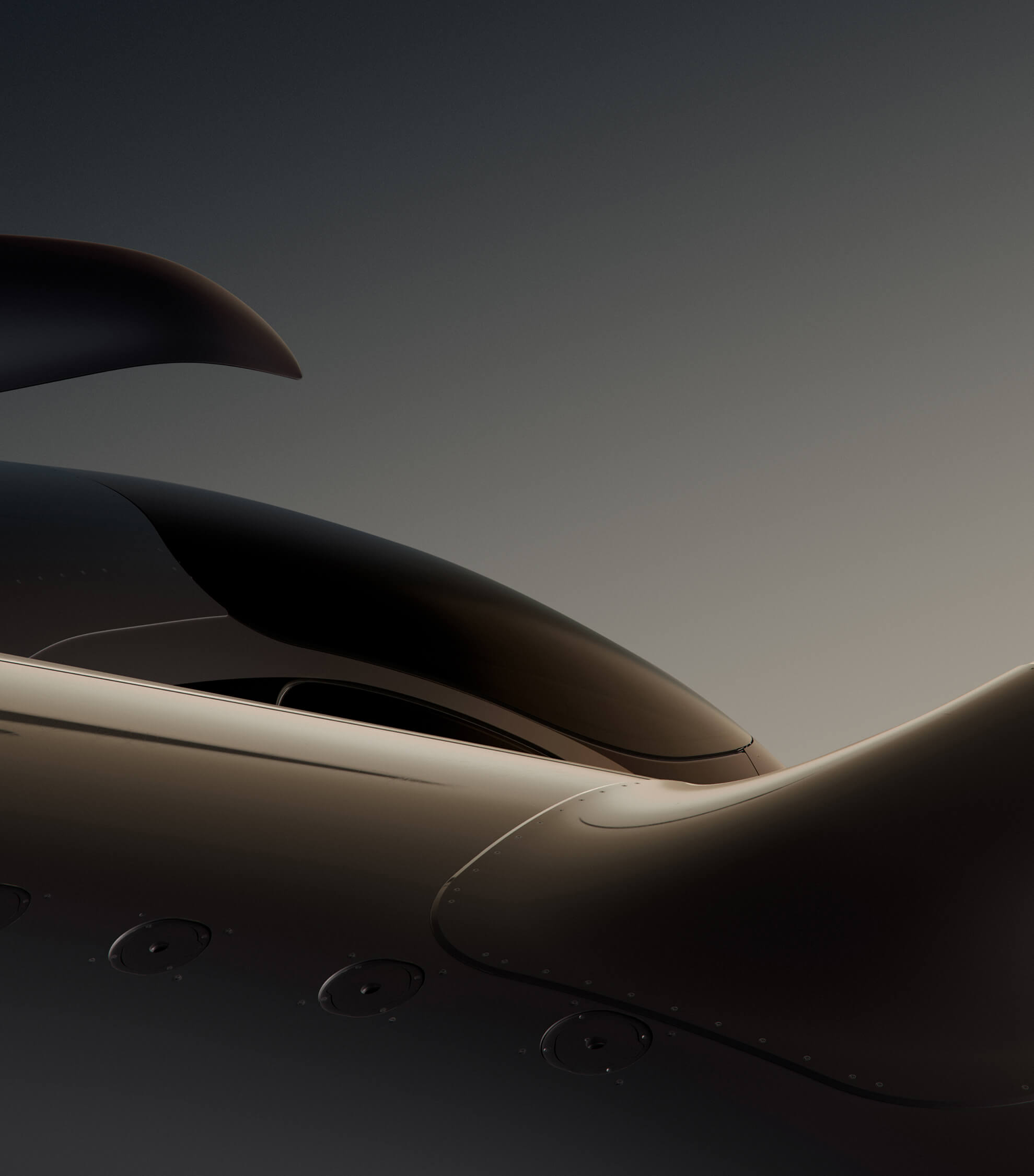
The identity draws inspiration from the golden age of aviation, where design was expressive, optimistic, and human. Custom typography, developed with Family Type, echoes the aerodynamic curves of the aircraft while taking cues from historic aviation typefaces—adapted for clarity, legibility, and motion across modern applications, from livery and skyport signage to digital interfaces.
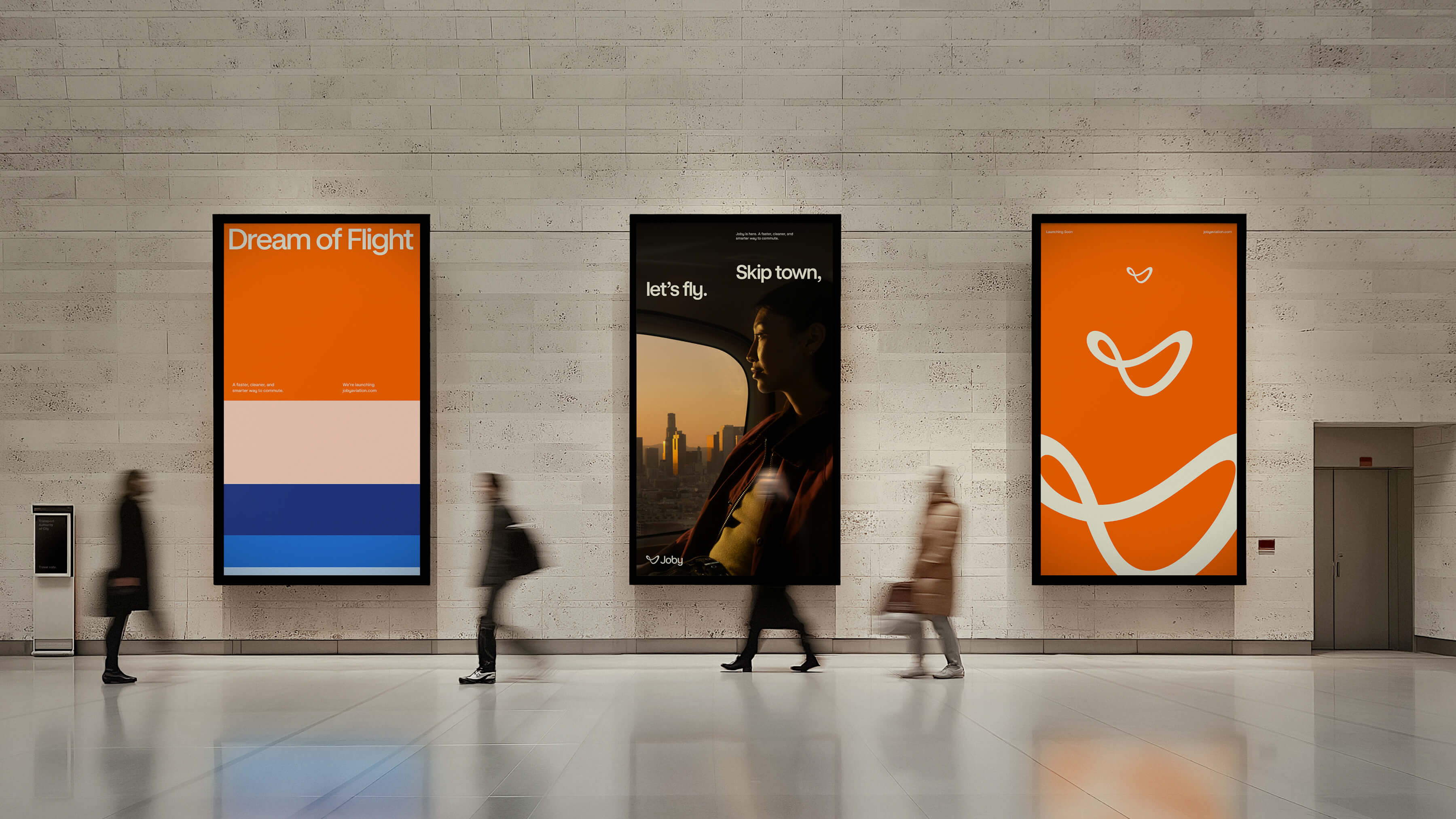
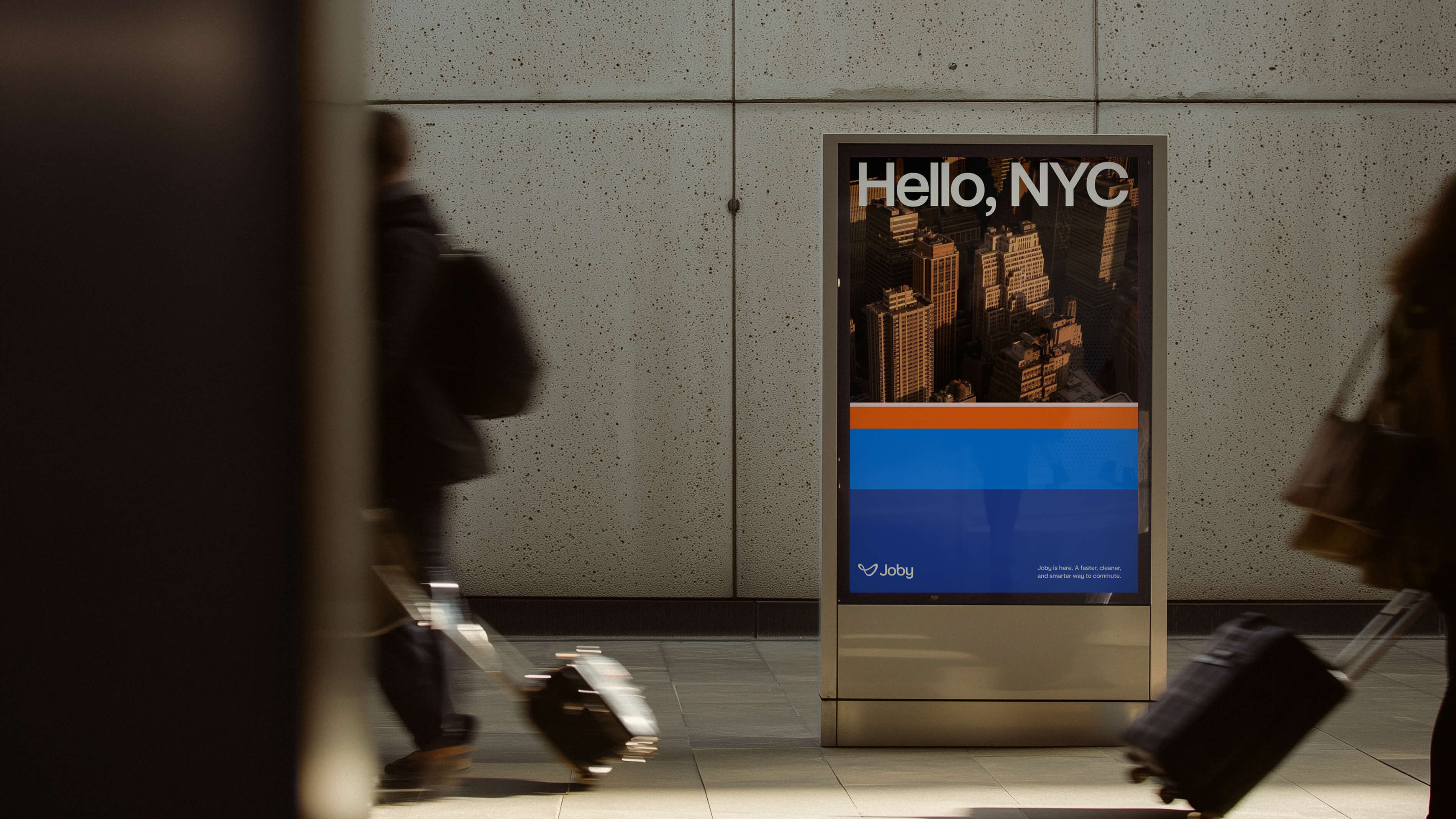
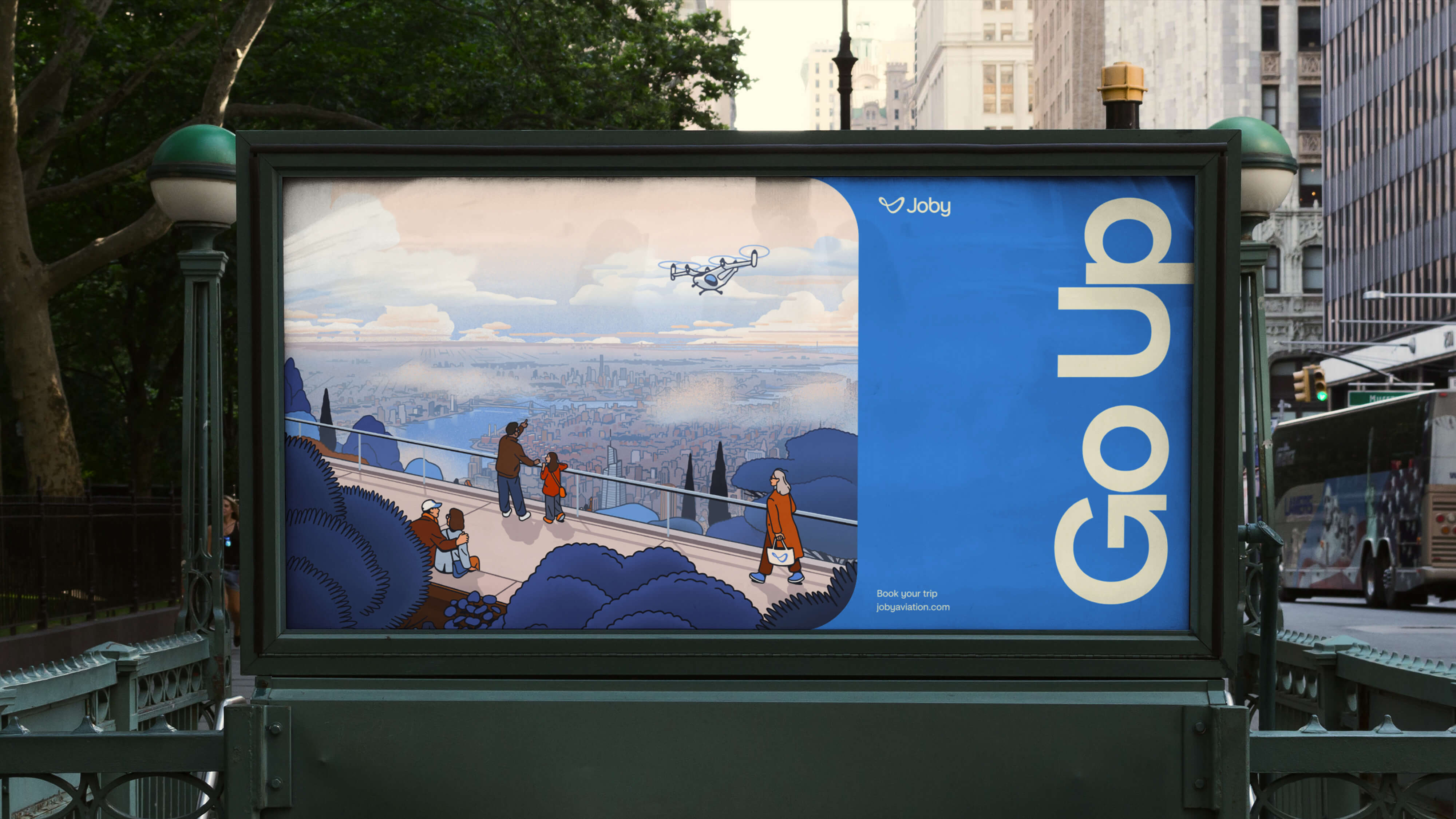
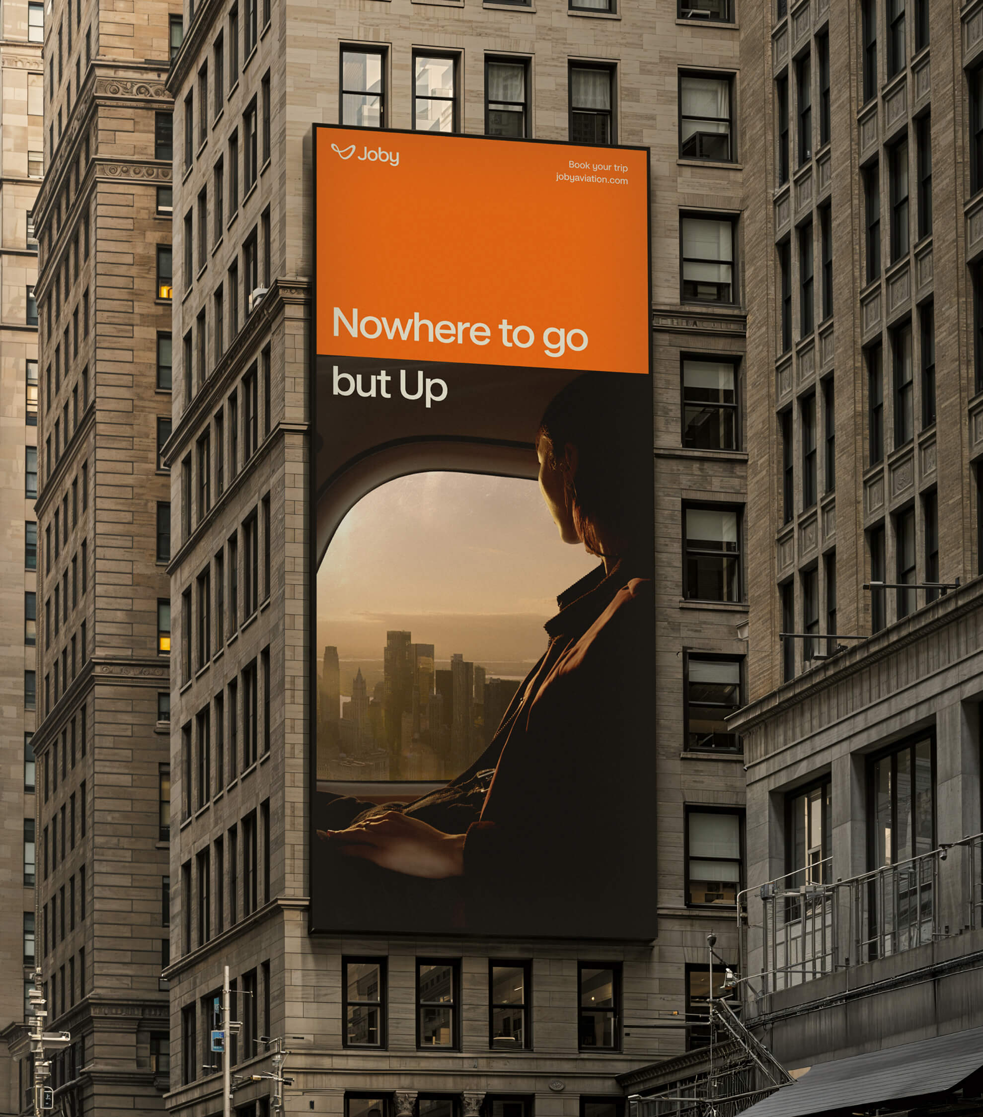
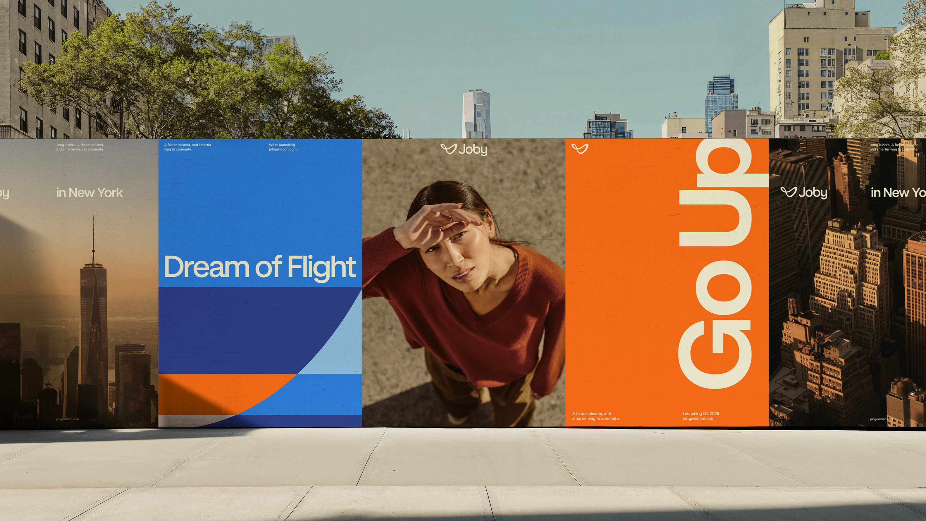
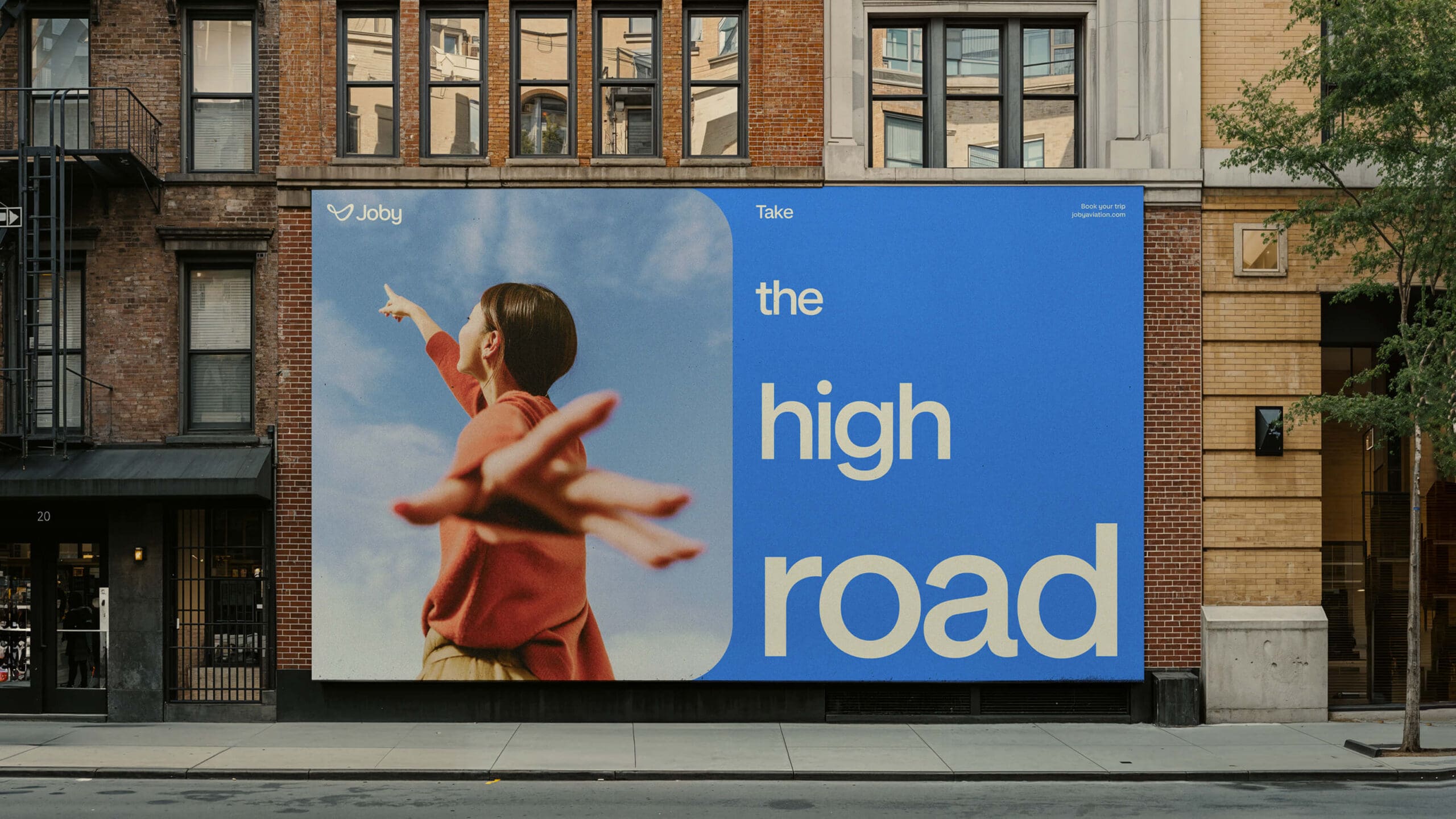
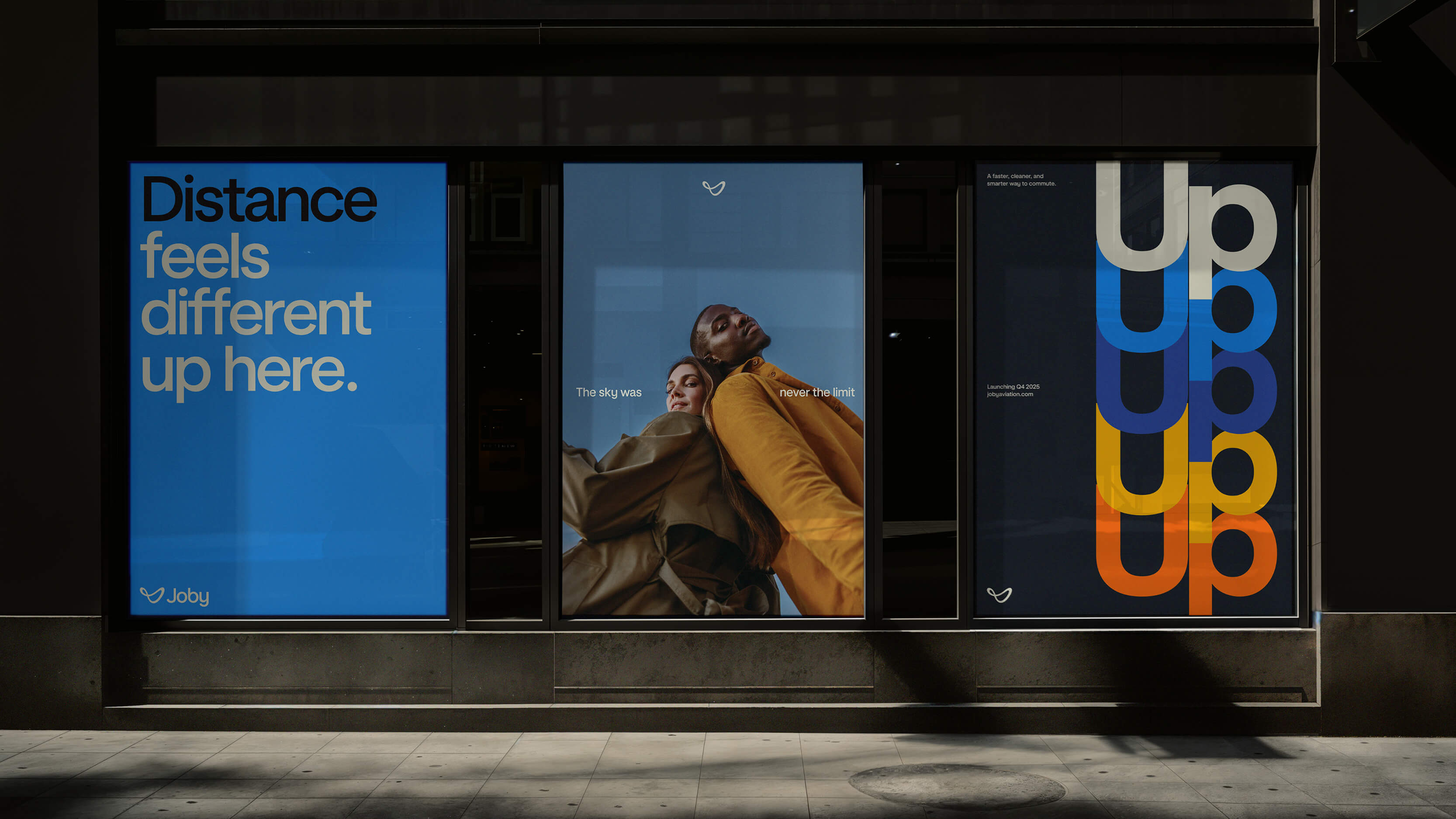
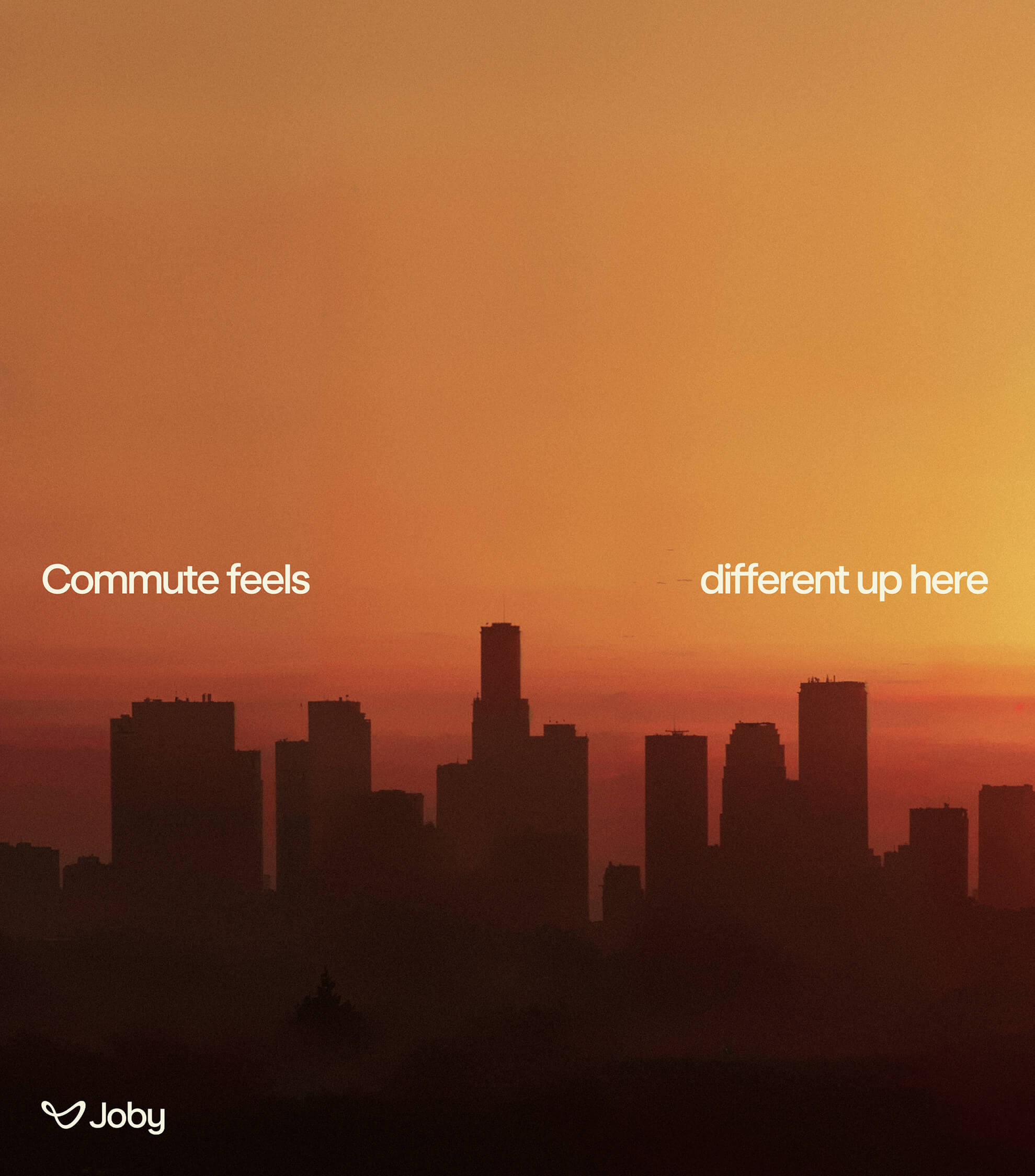
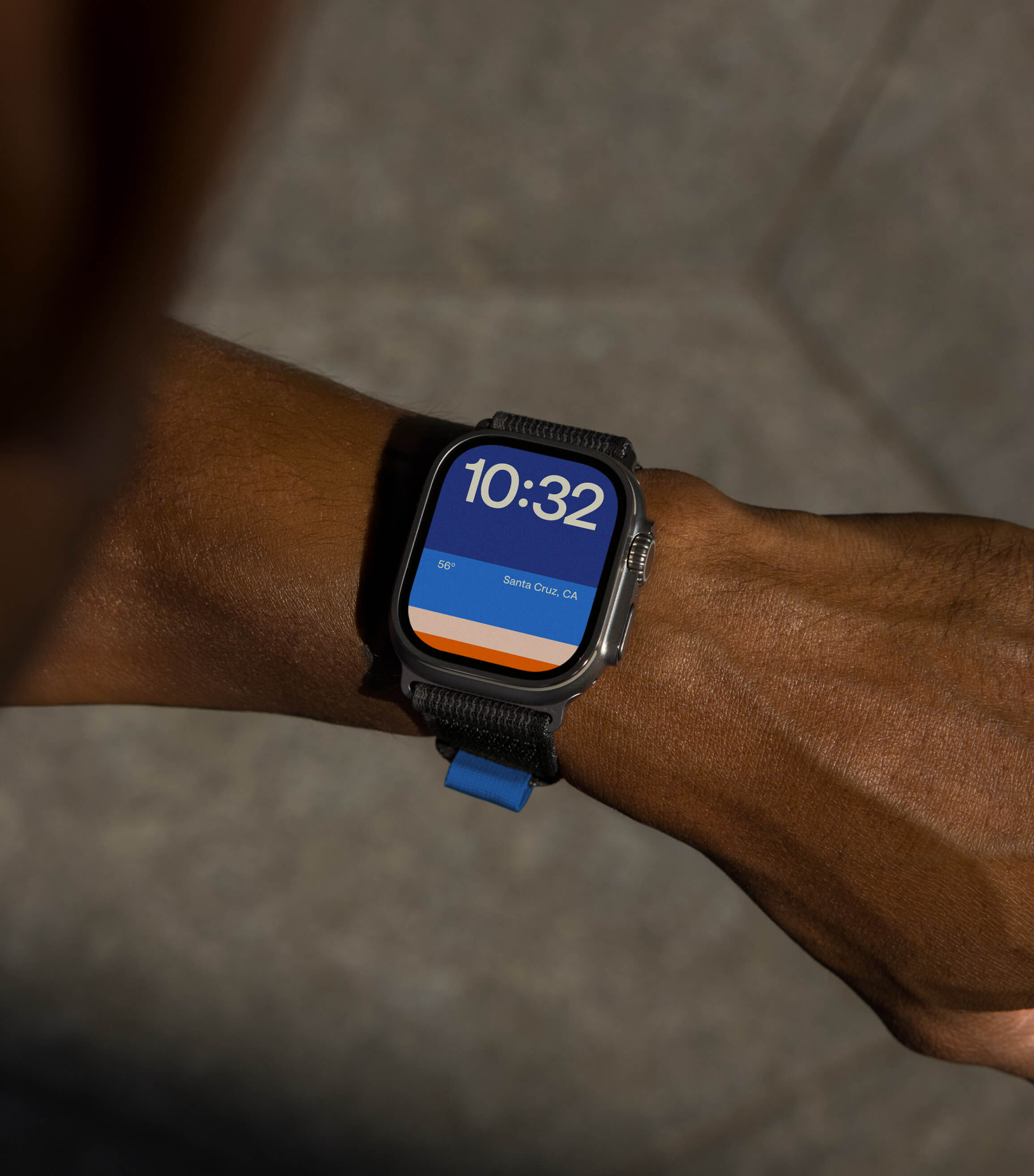
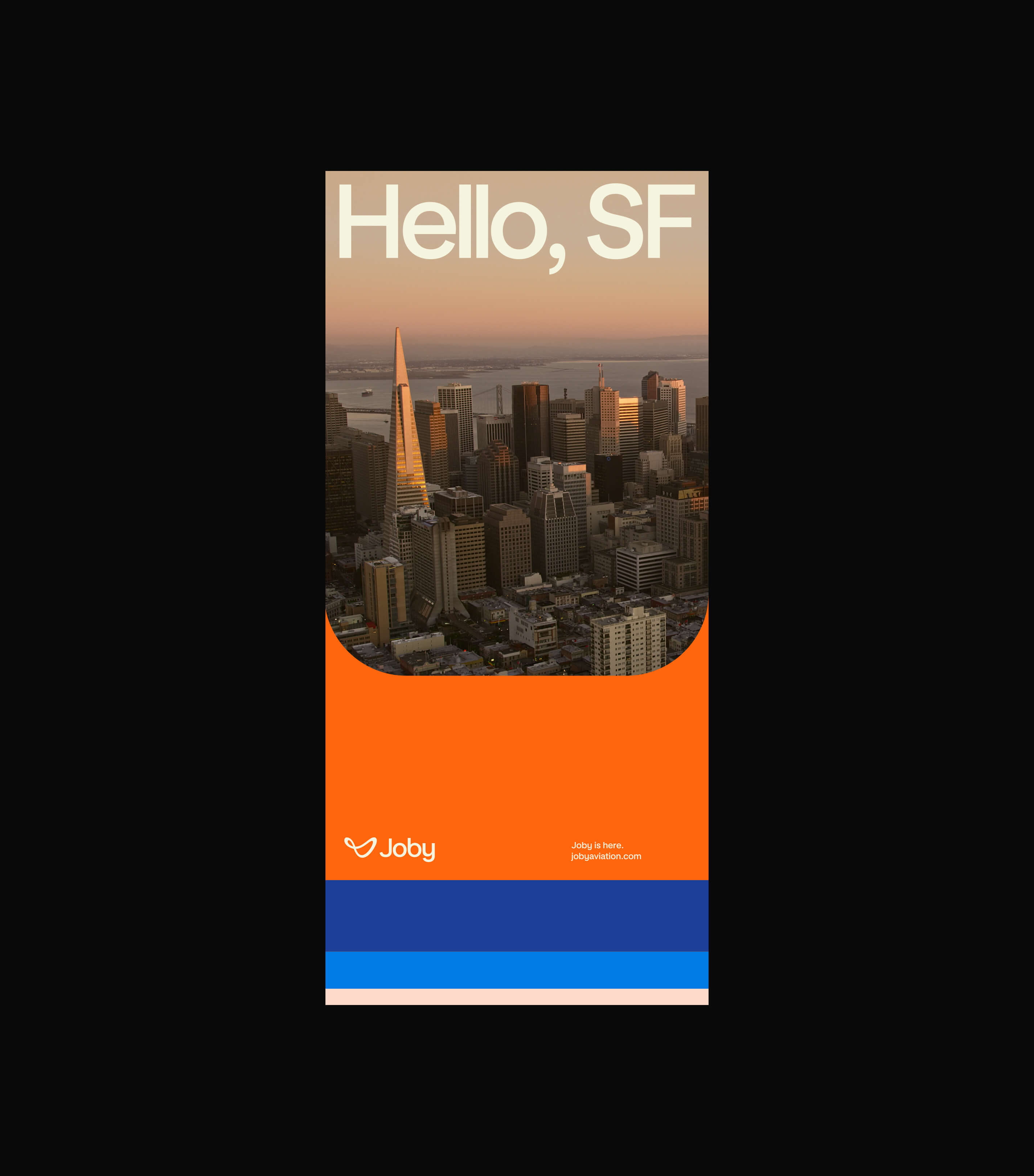
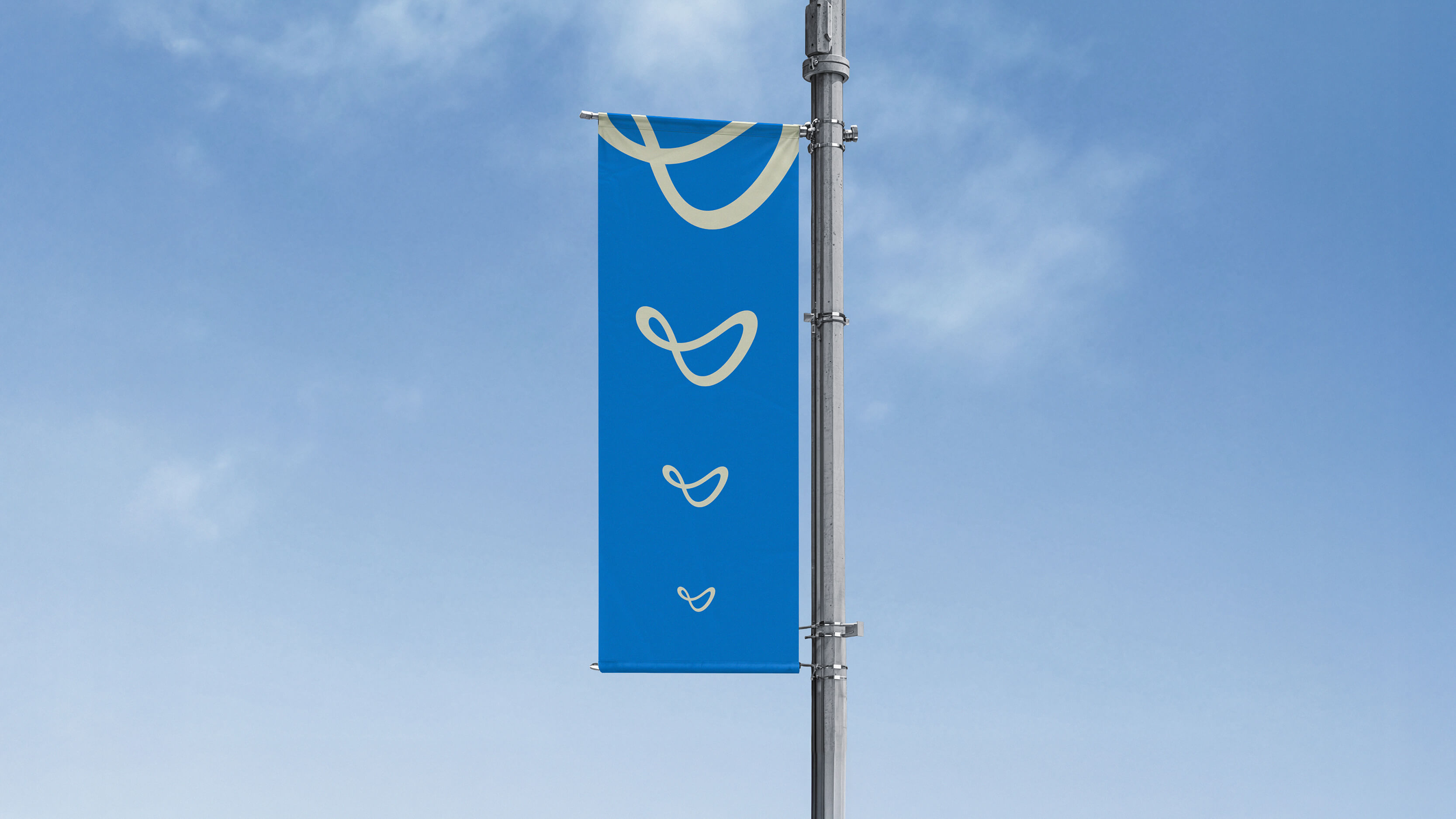
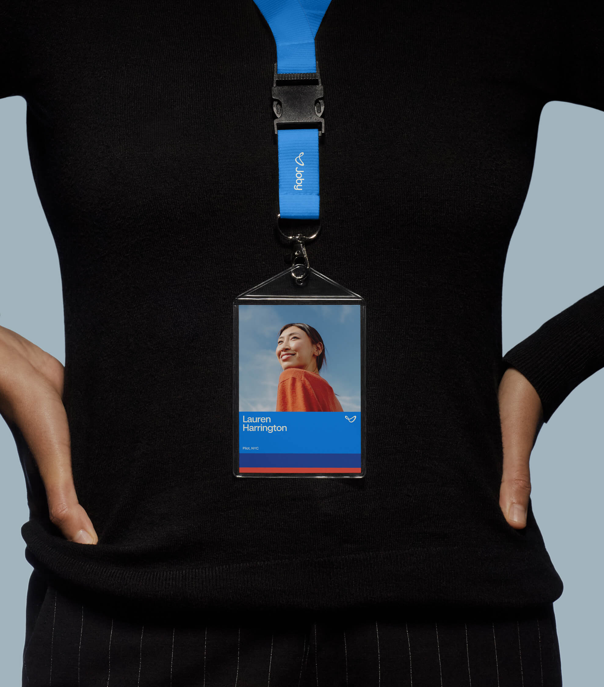
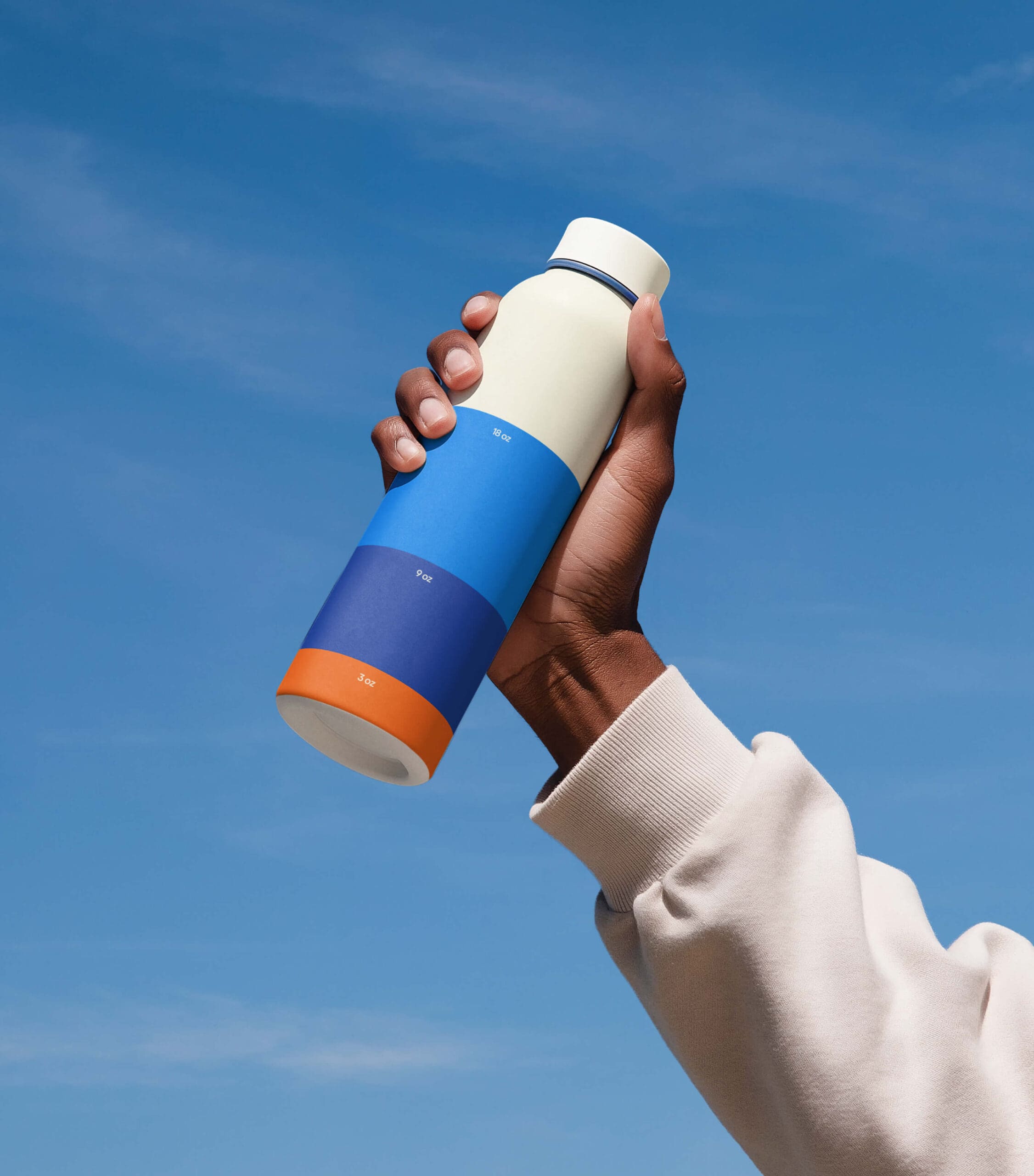
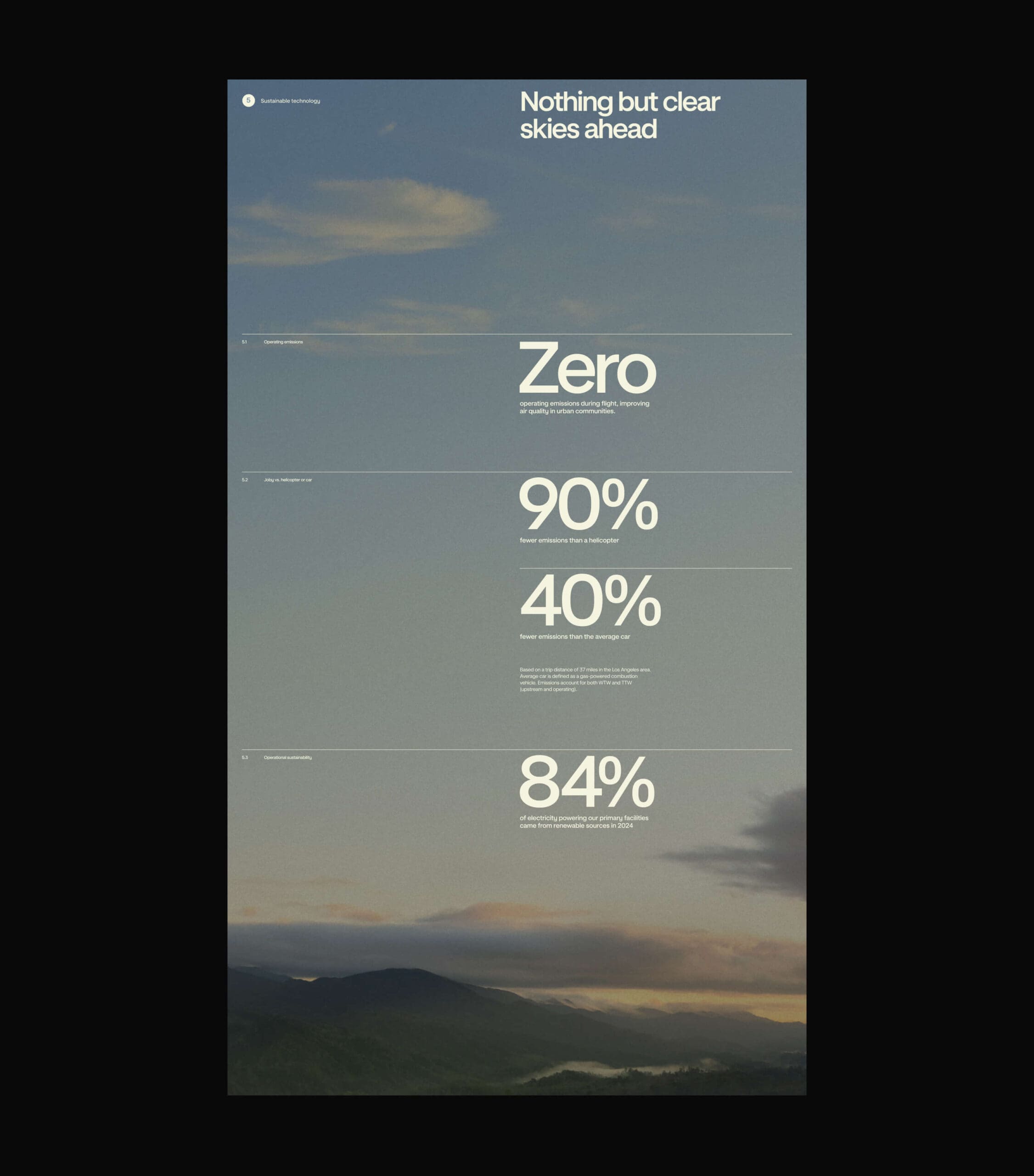
A flexible color system bridges past and future. Core blues evoke open skies and the promise of what’s ahead, while sun-washed oranges reflect Joby’s Californian roots and the warmth of early aviation. Supporting hues extend the system, allowing the brand to adapt across environments, footage, and moments without losing cohesion.
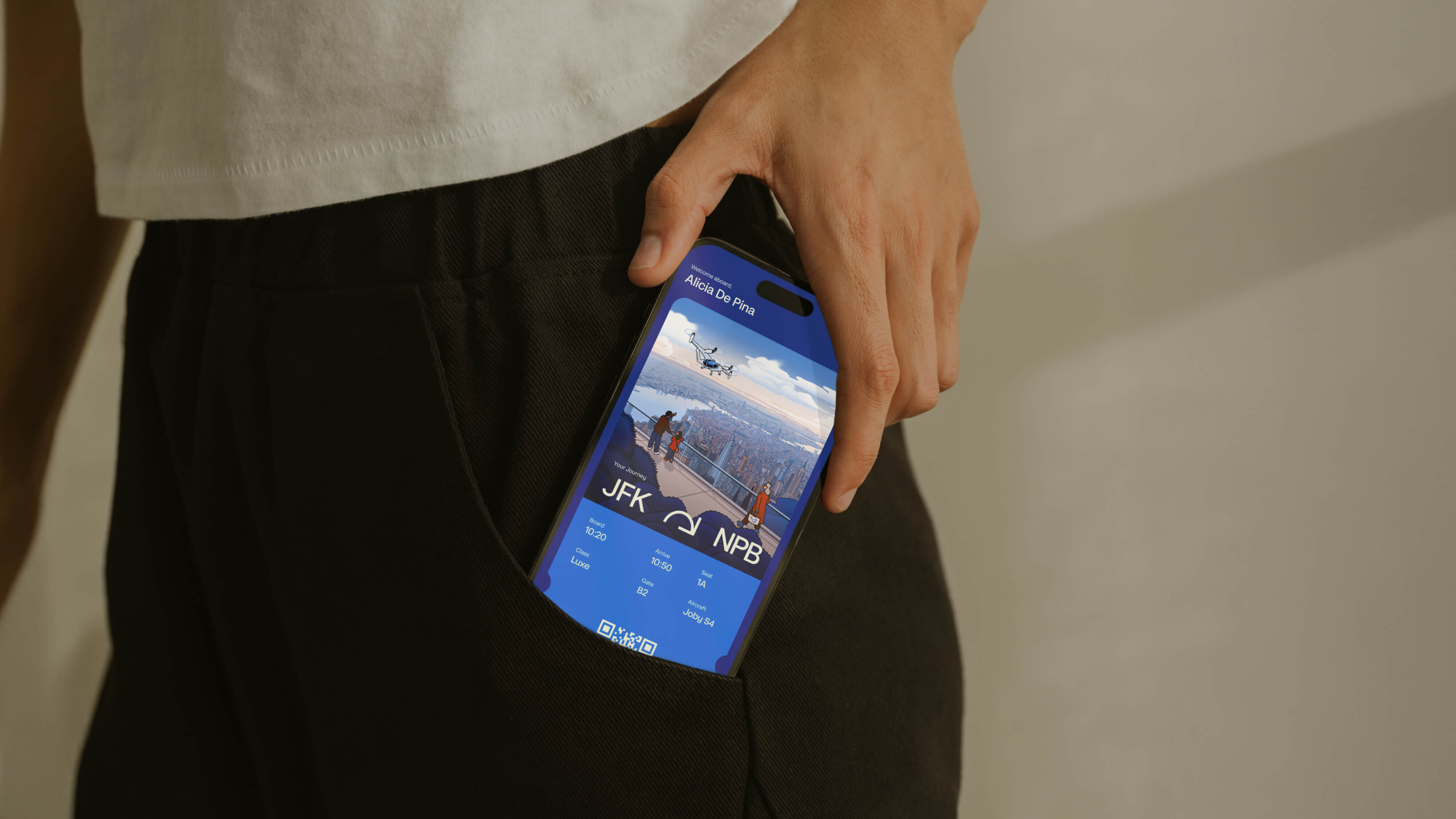
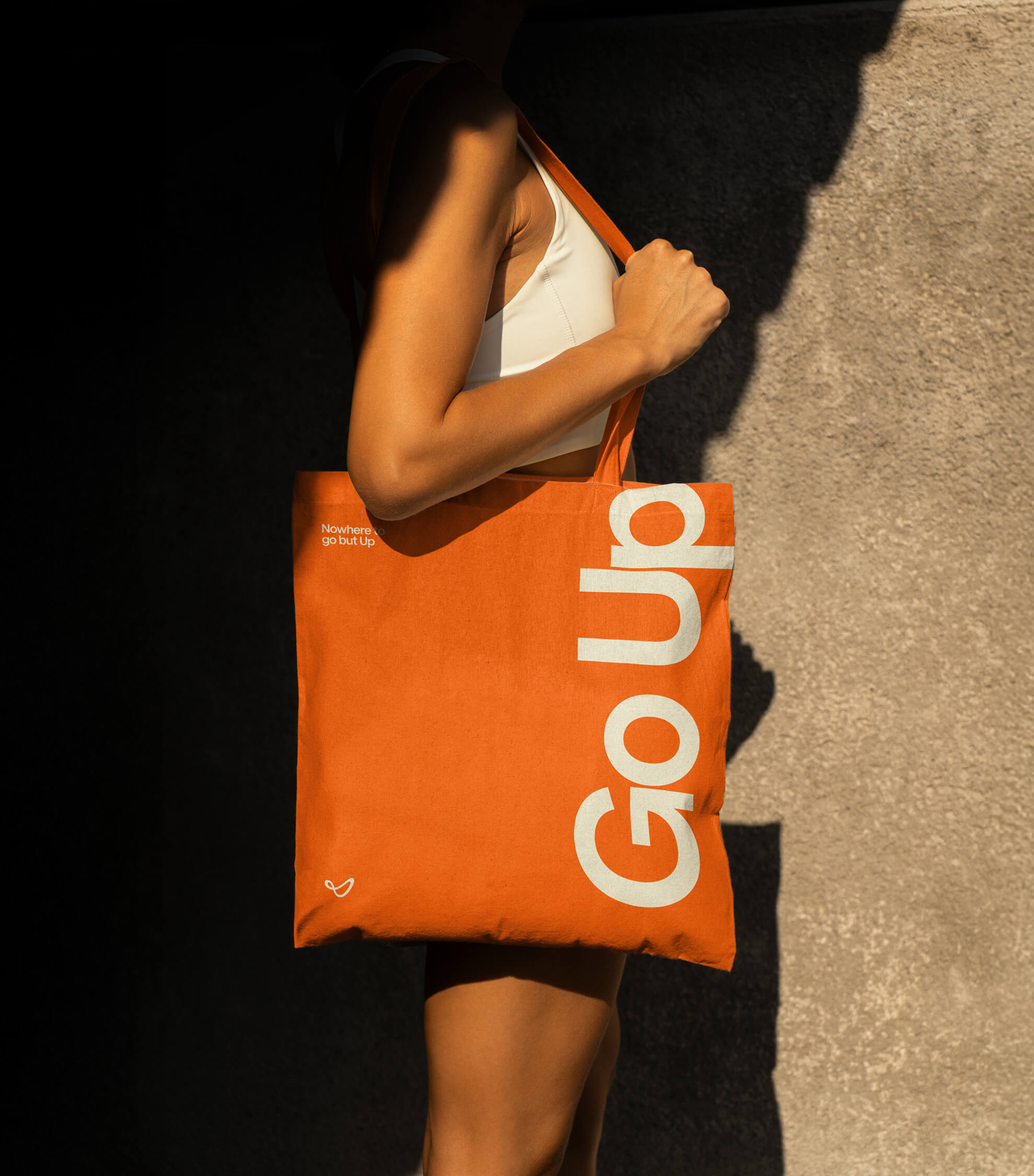
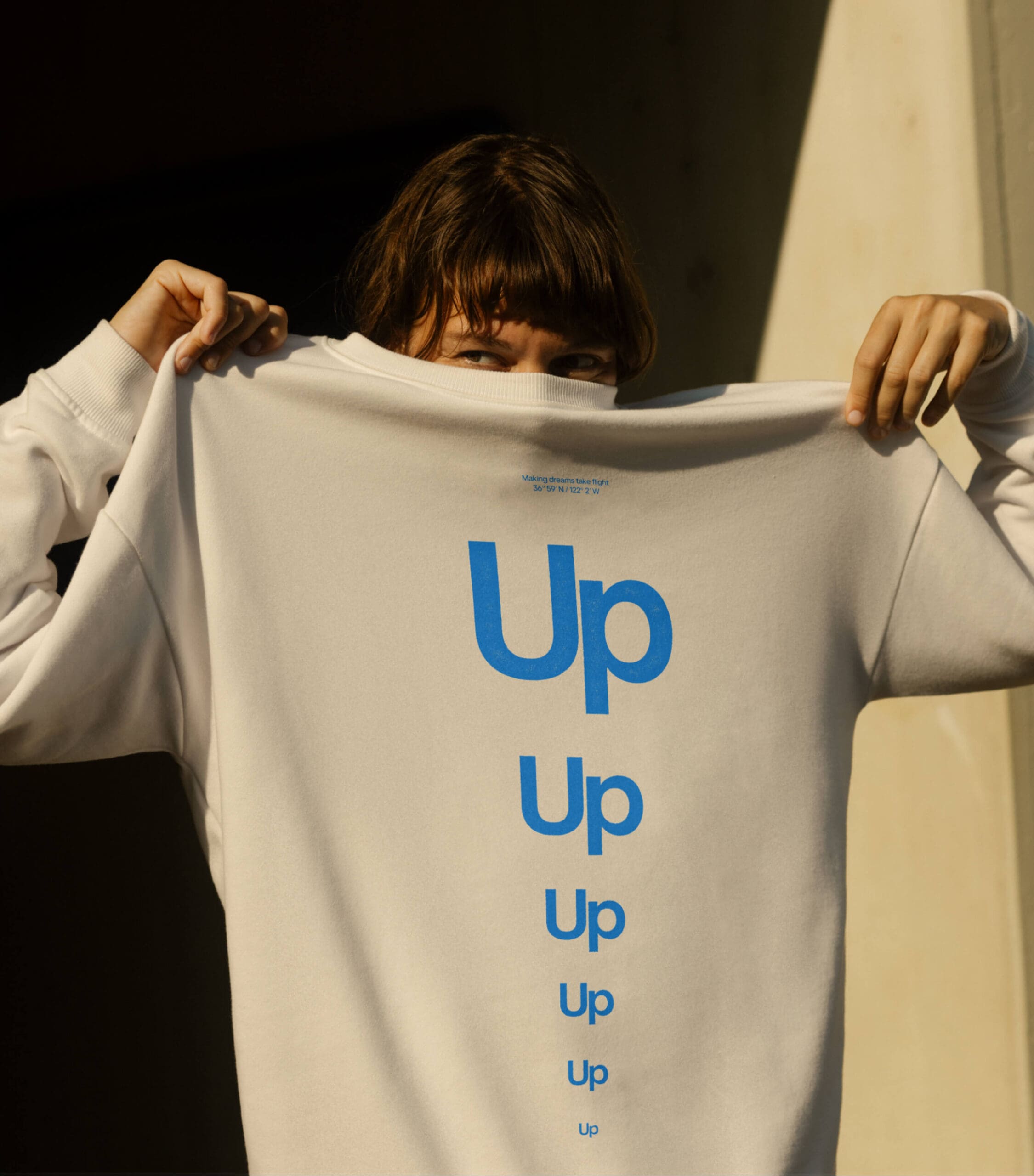
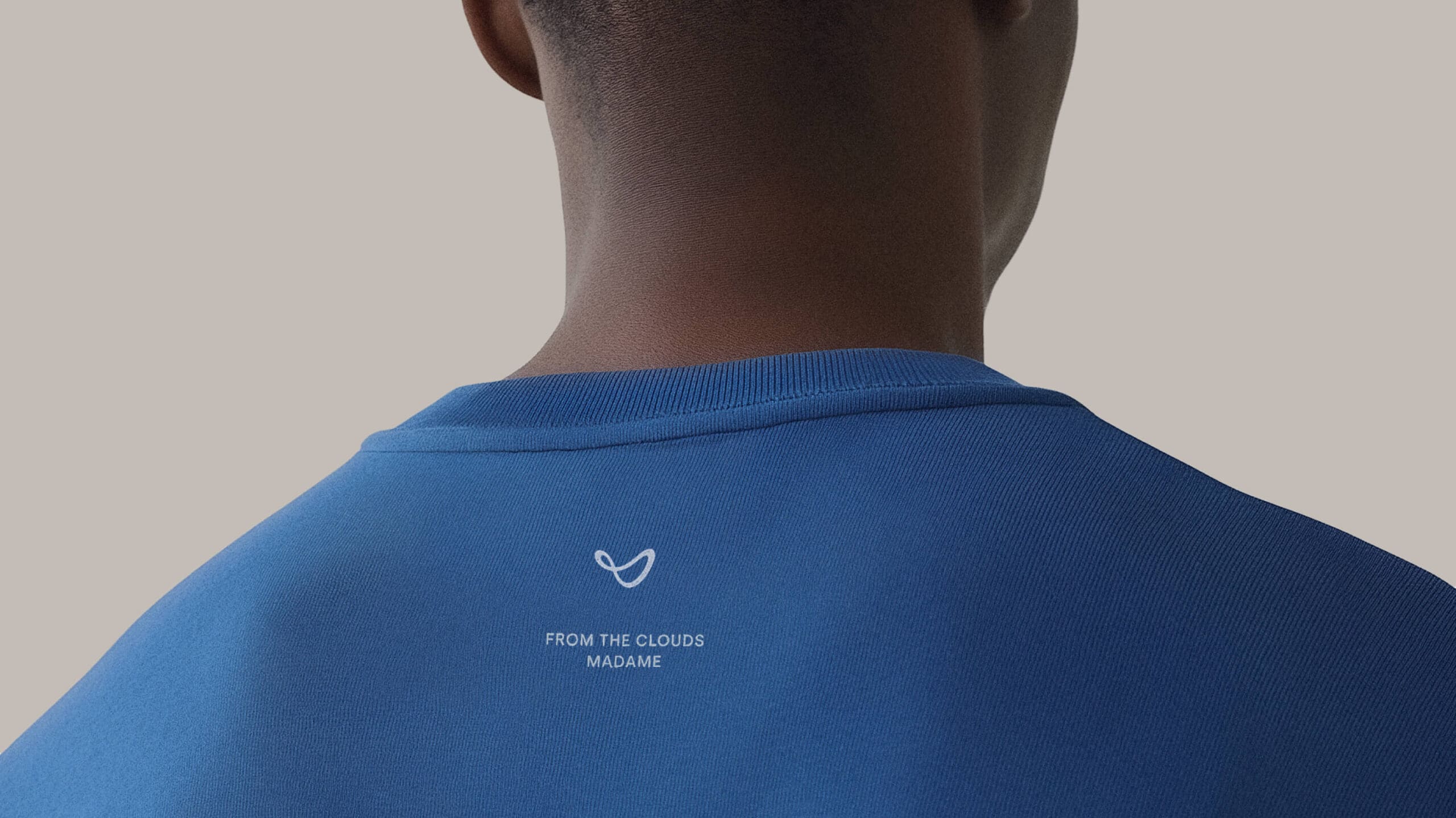
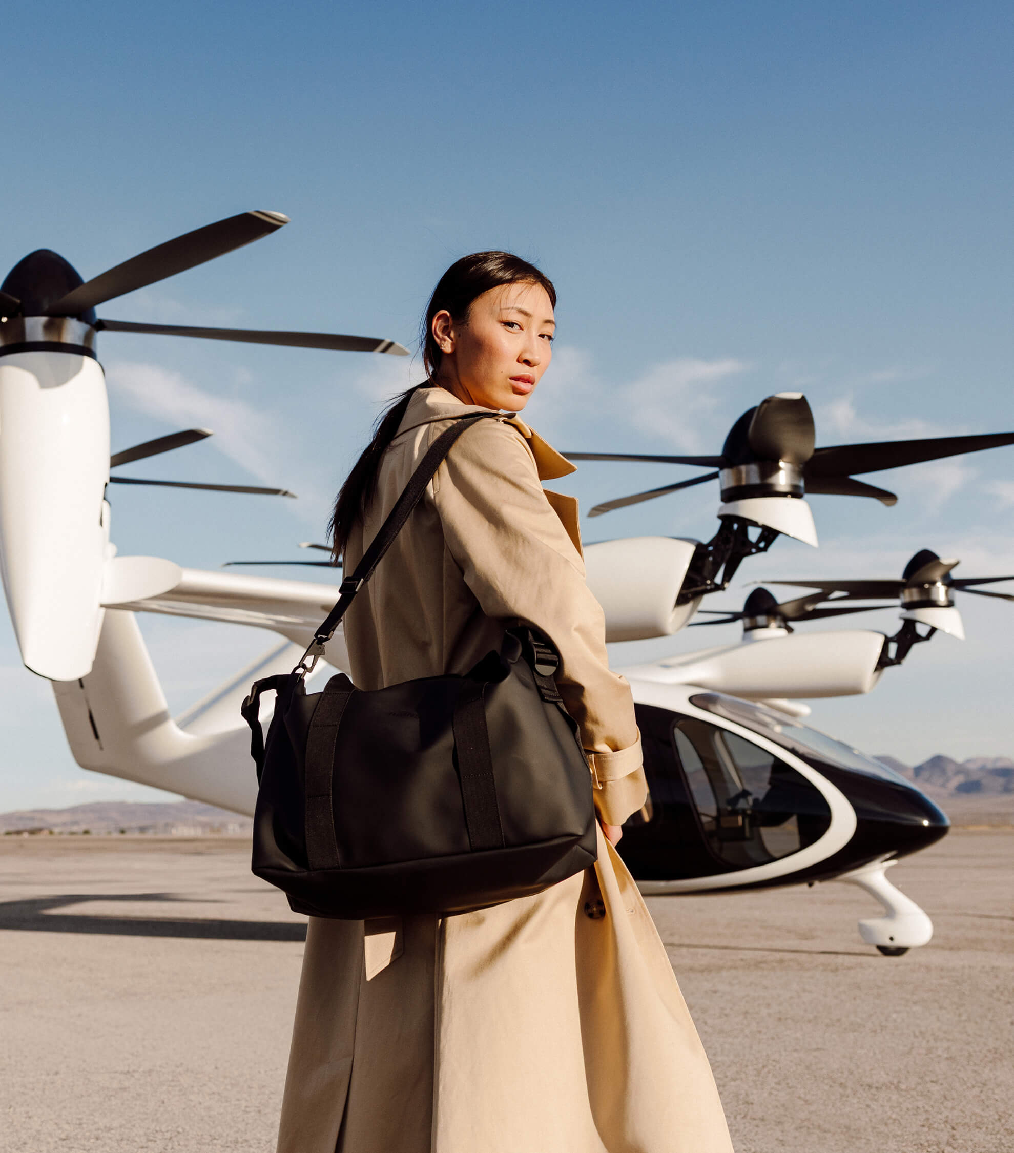
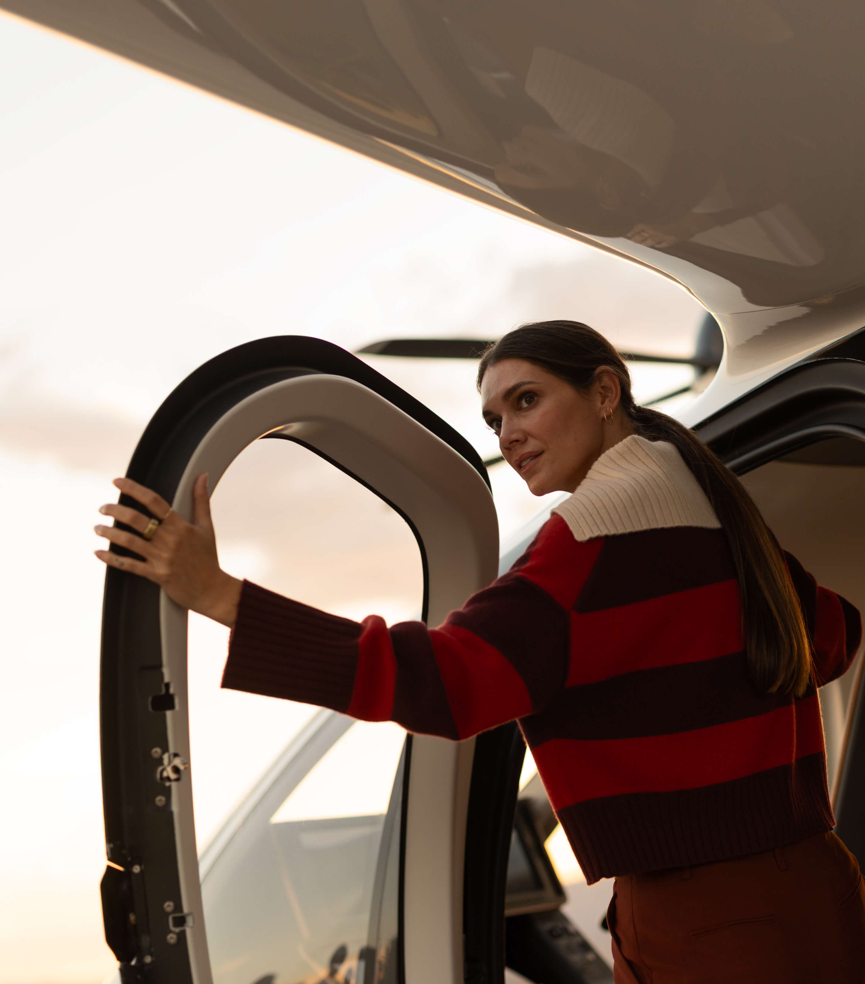
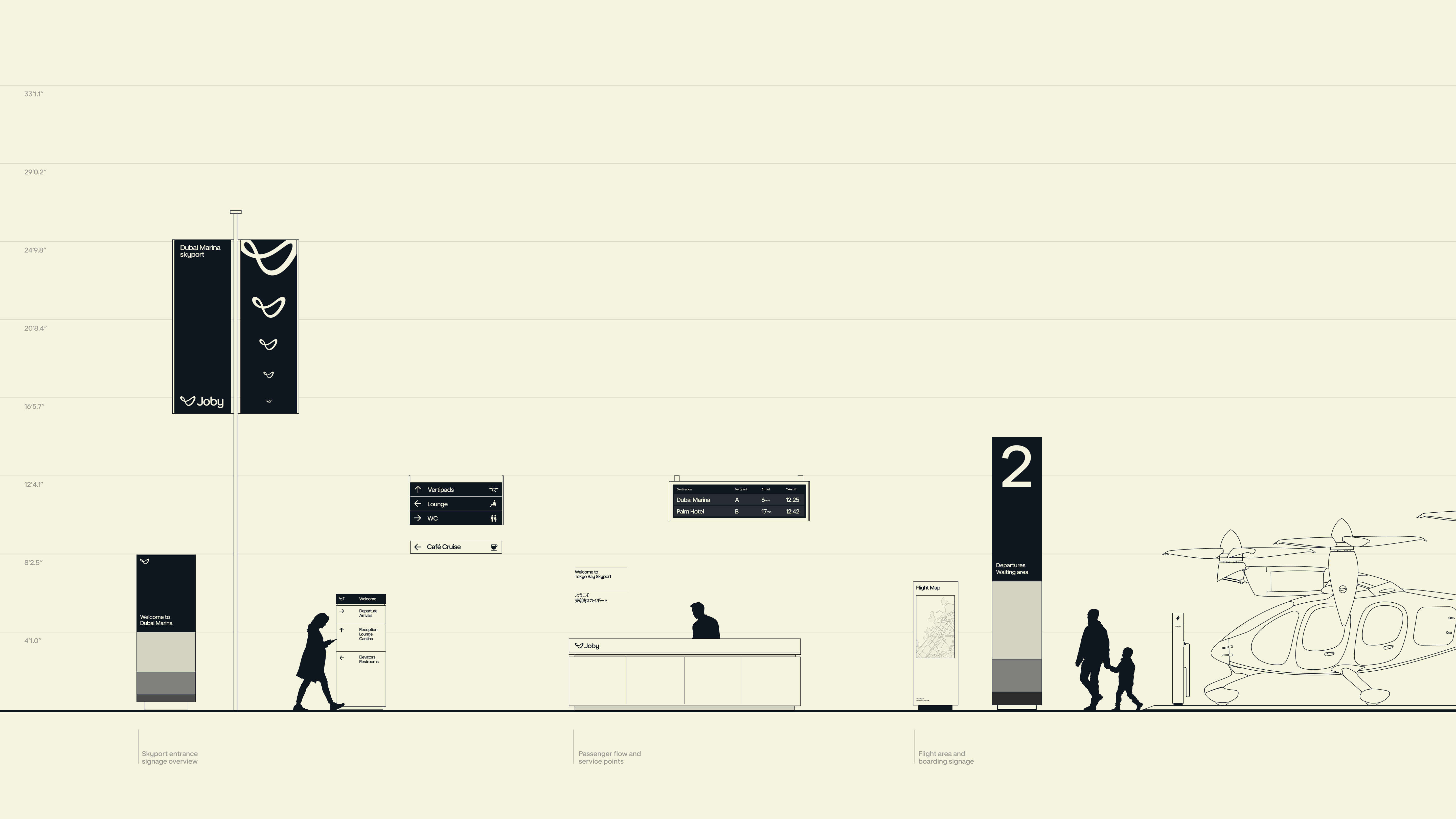
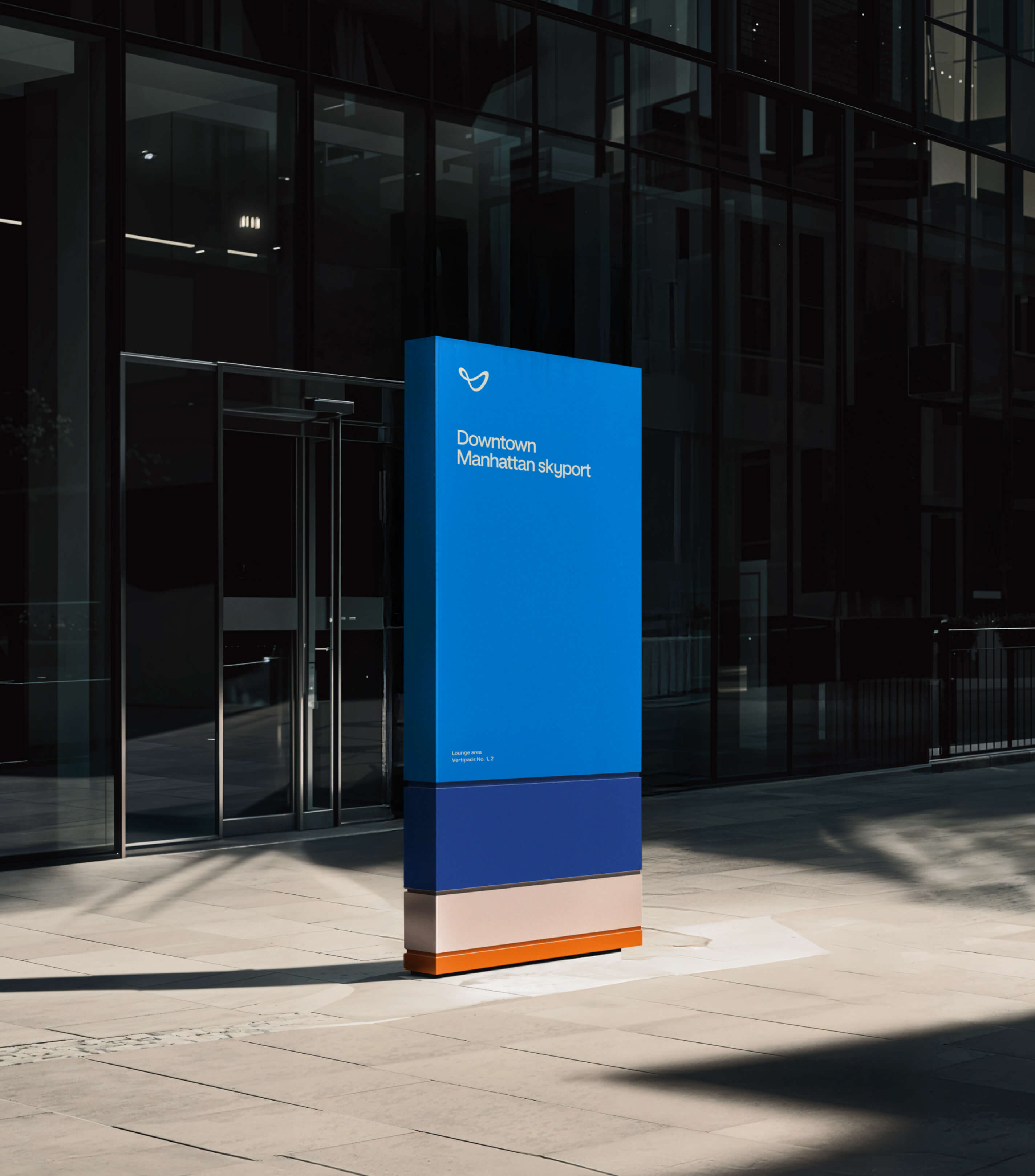
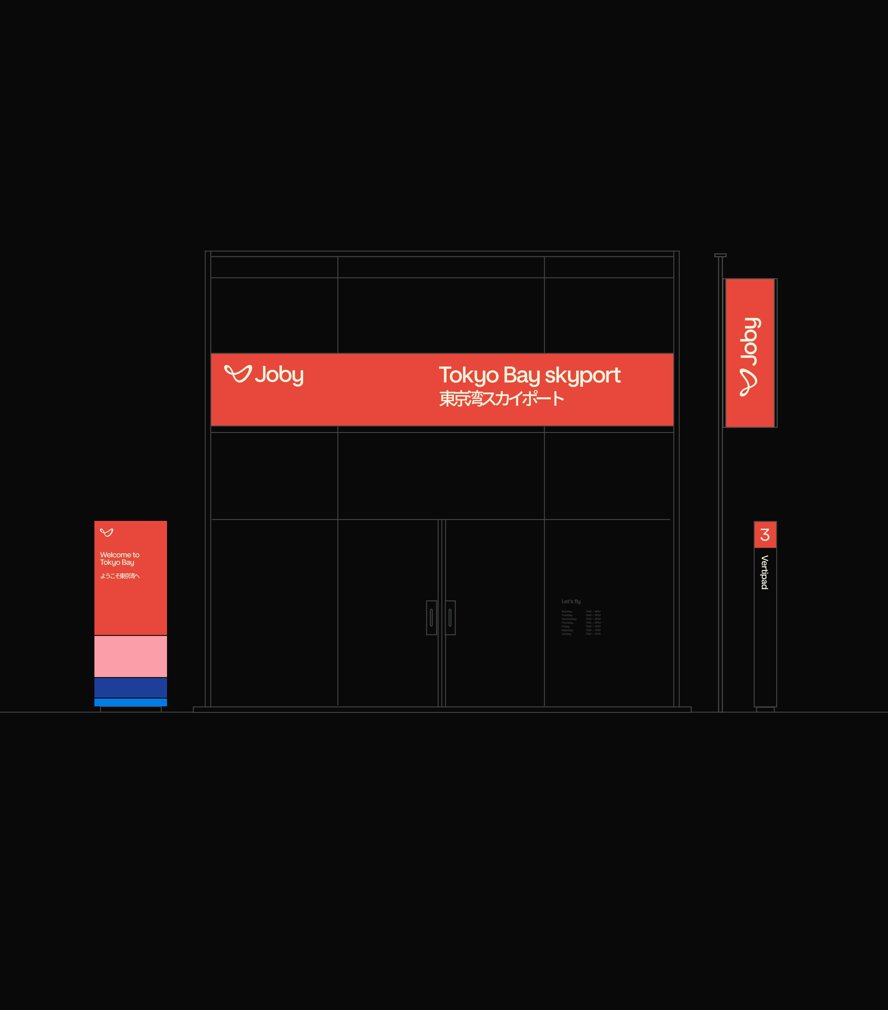
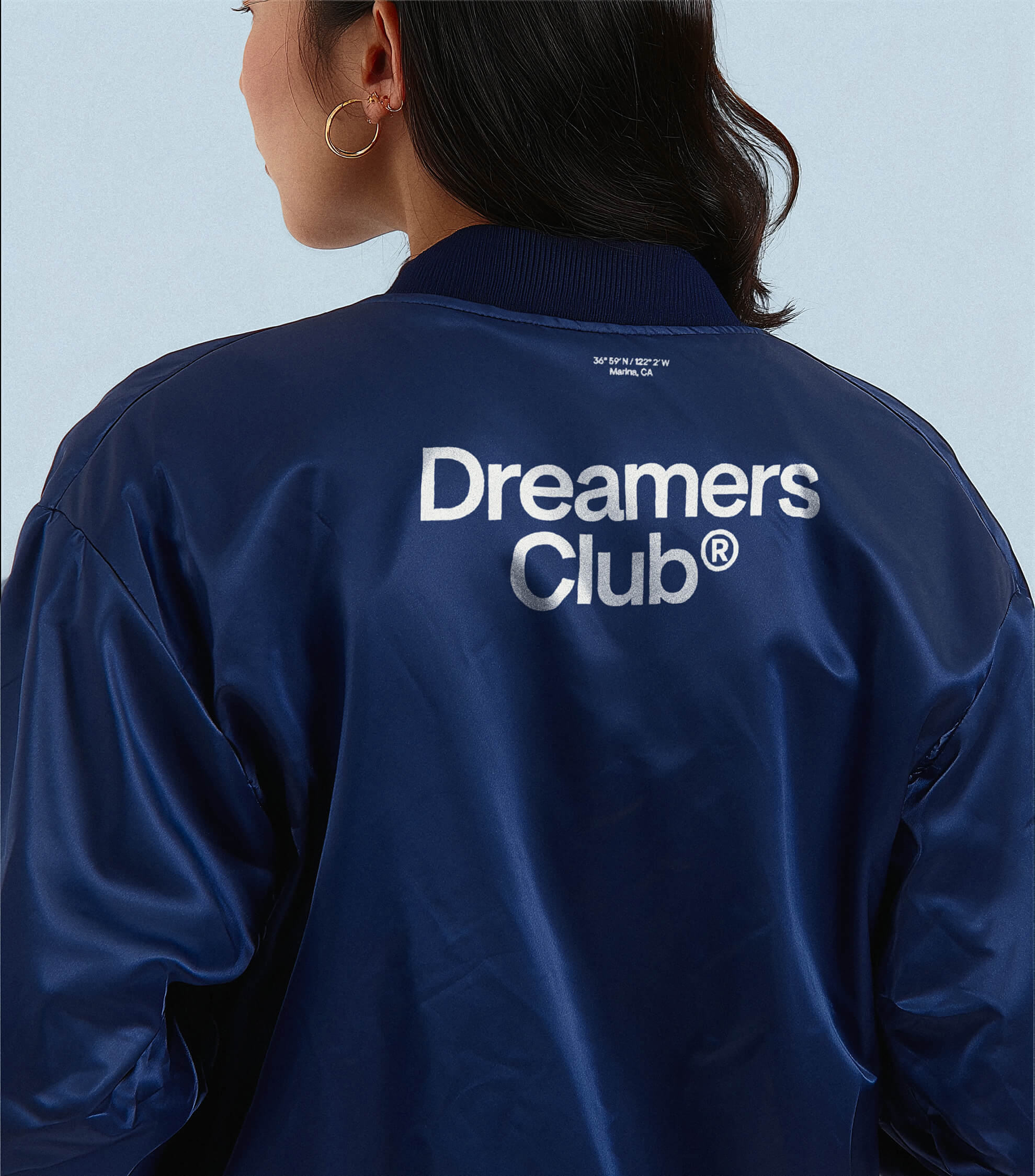
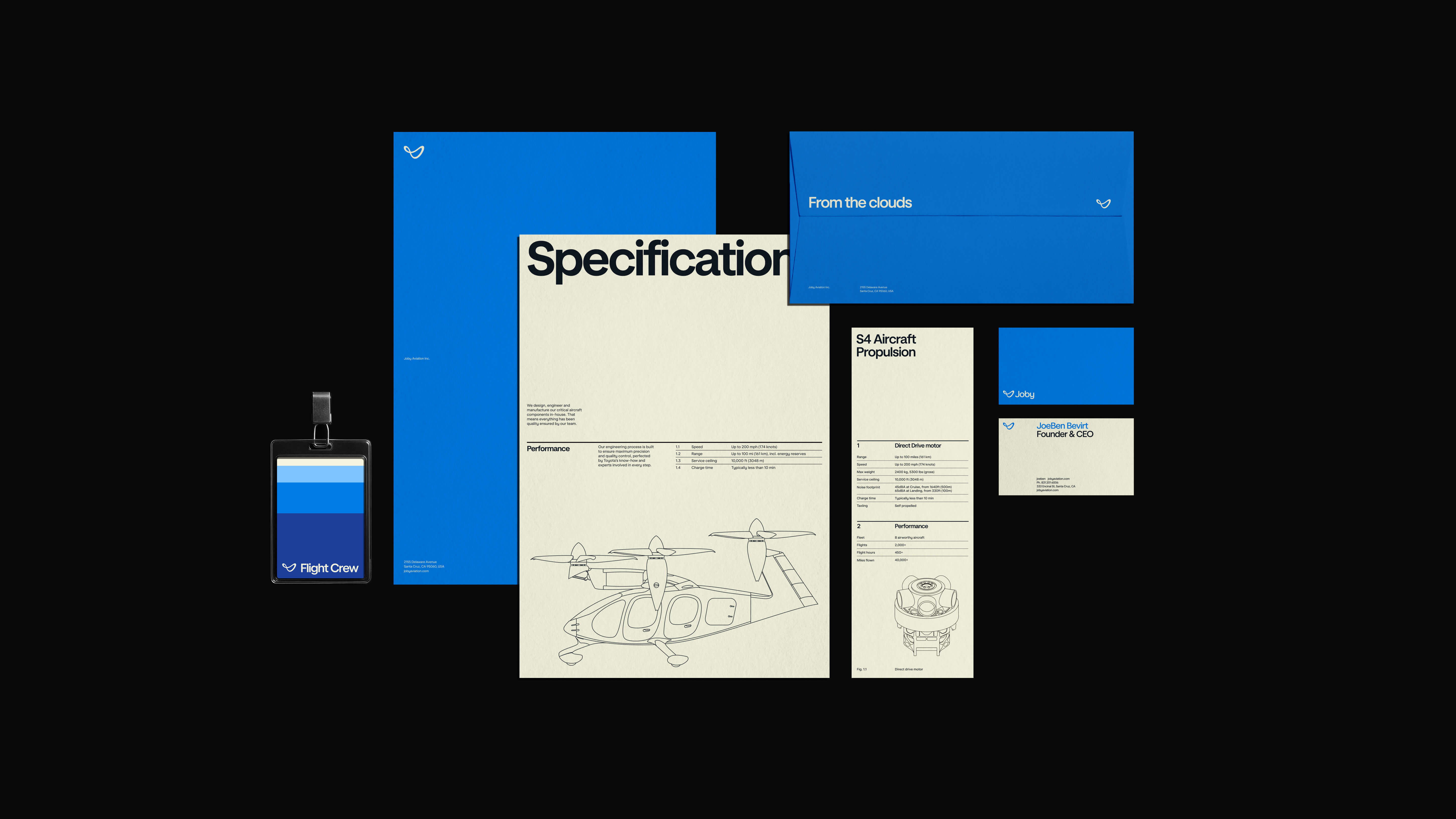
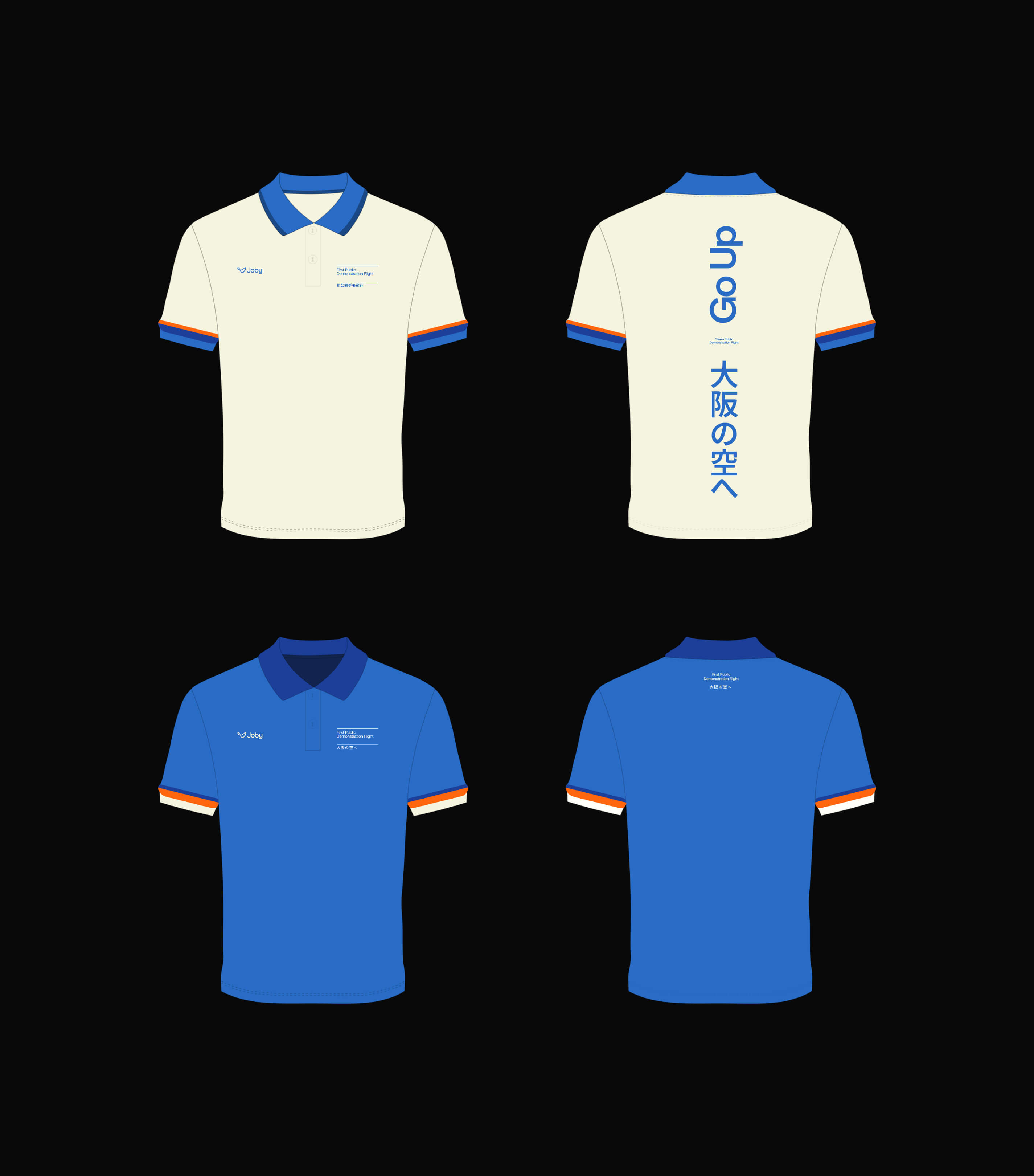
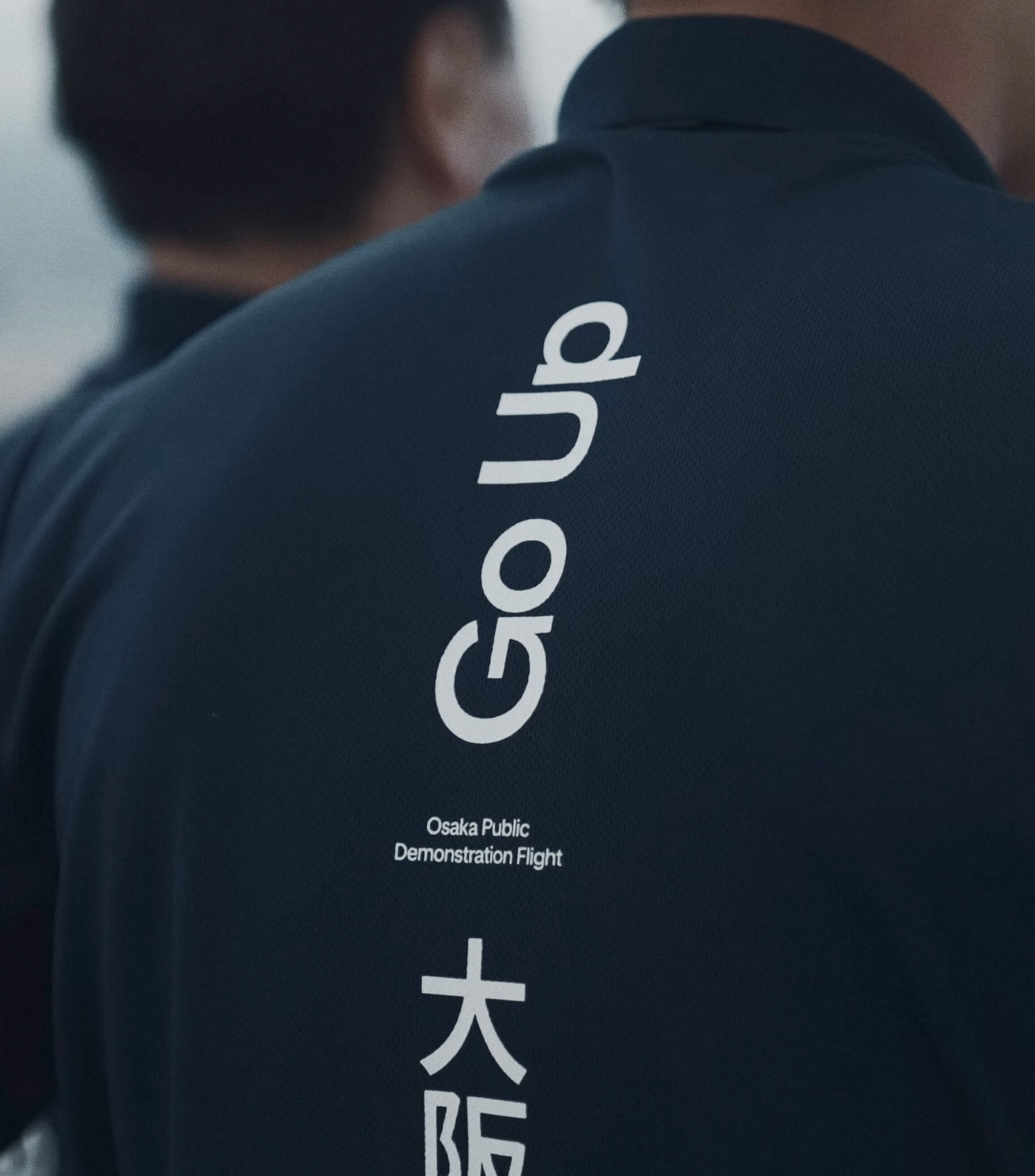
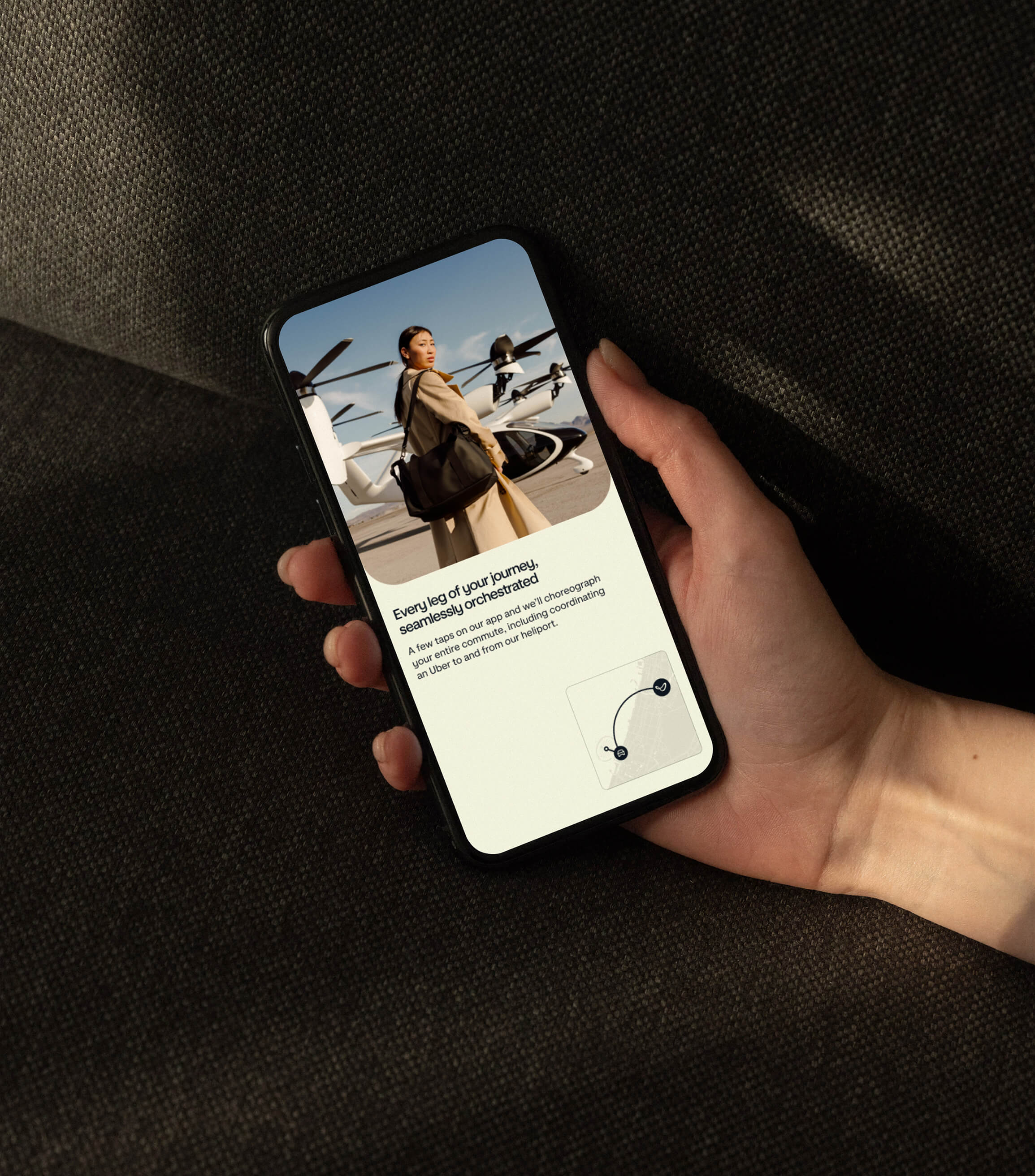
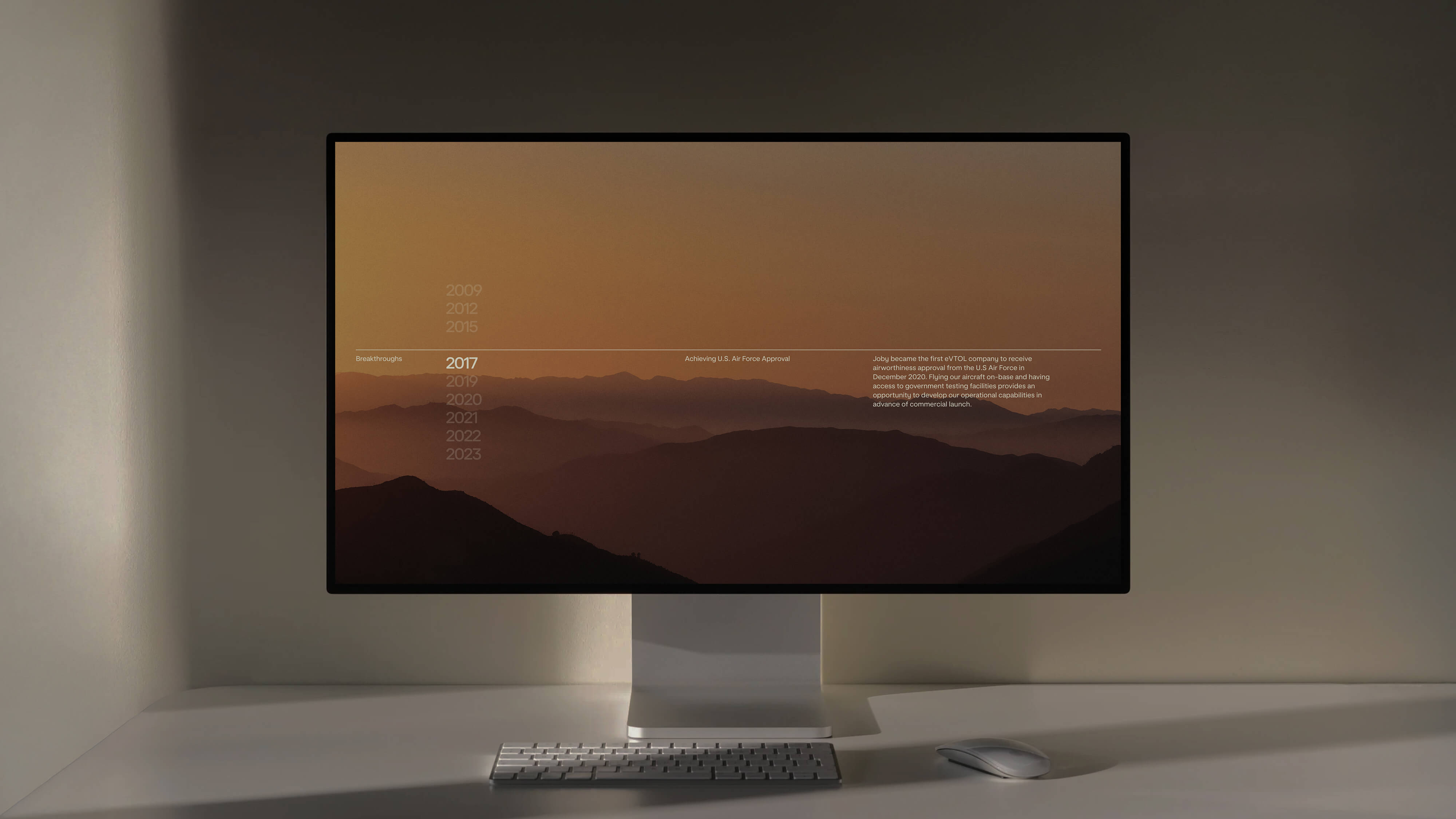
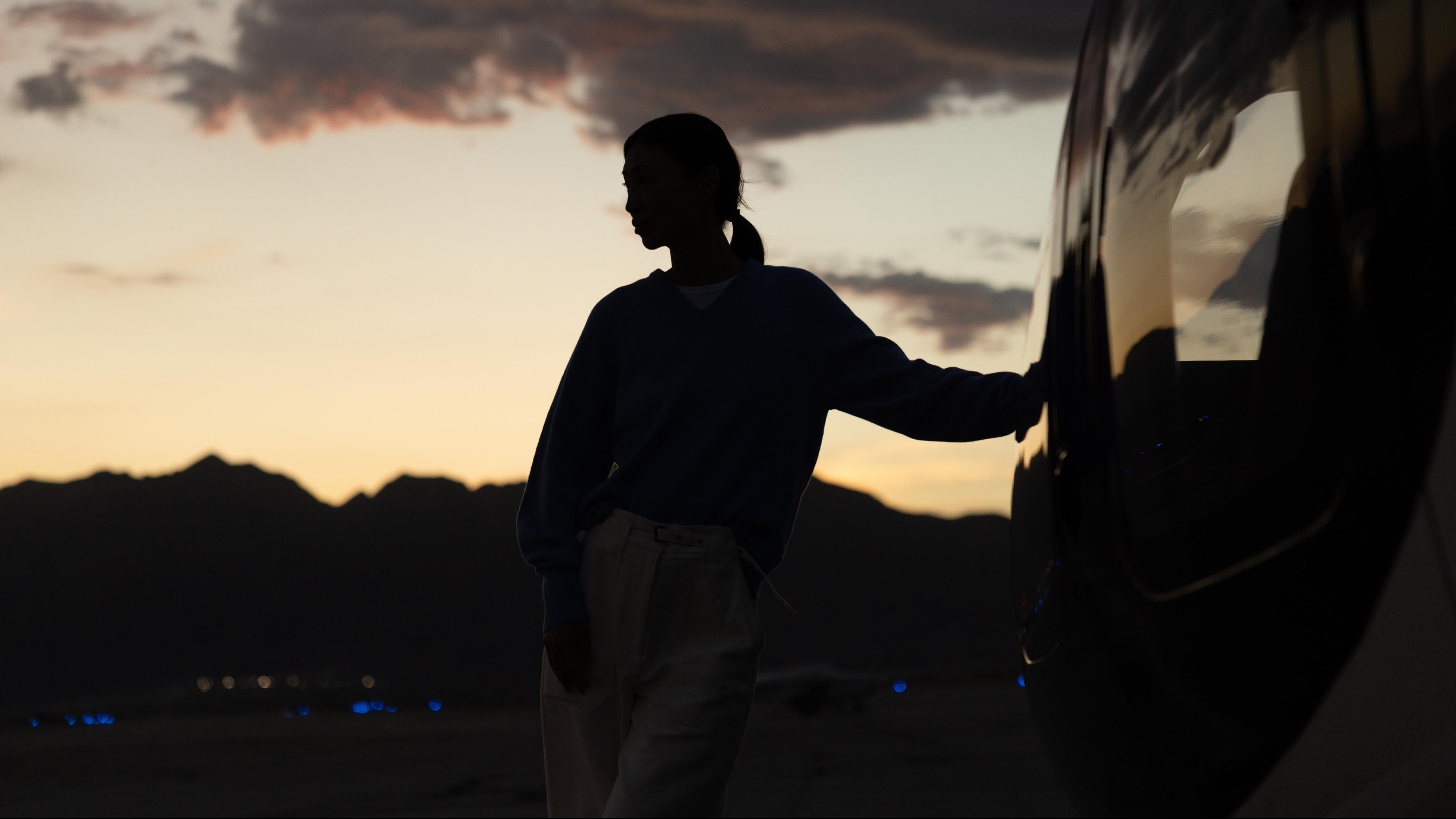
We brought the brand to life across physical and digital touchpoints—merch, wayfinding, signage, mobile app, and environments—ensuring the experience felt seamless wherever people encountered Joby. A clear, intuitive wayfinding system translated the brand into physical space, guiding people confidently through early skyport experiences.
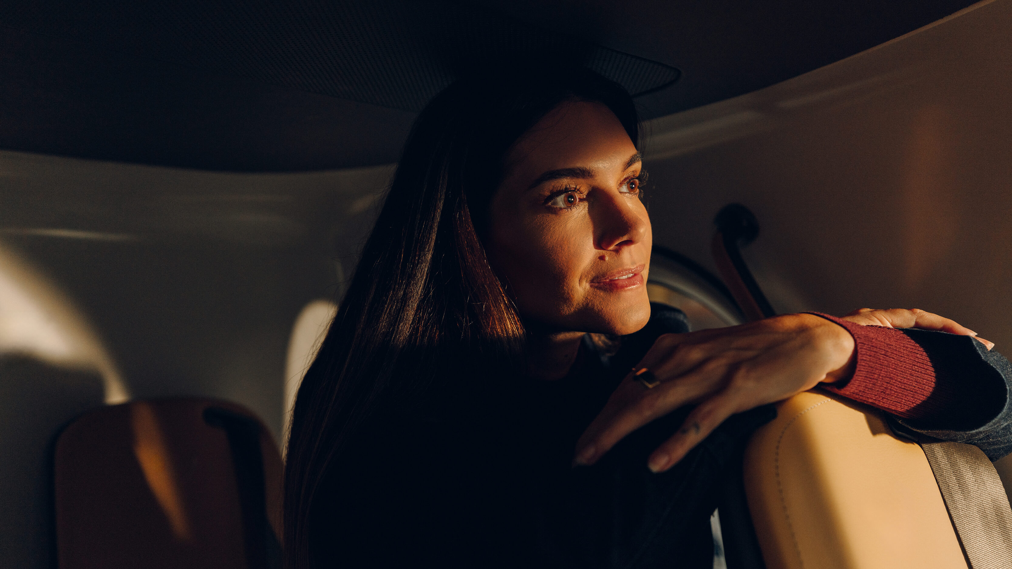
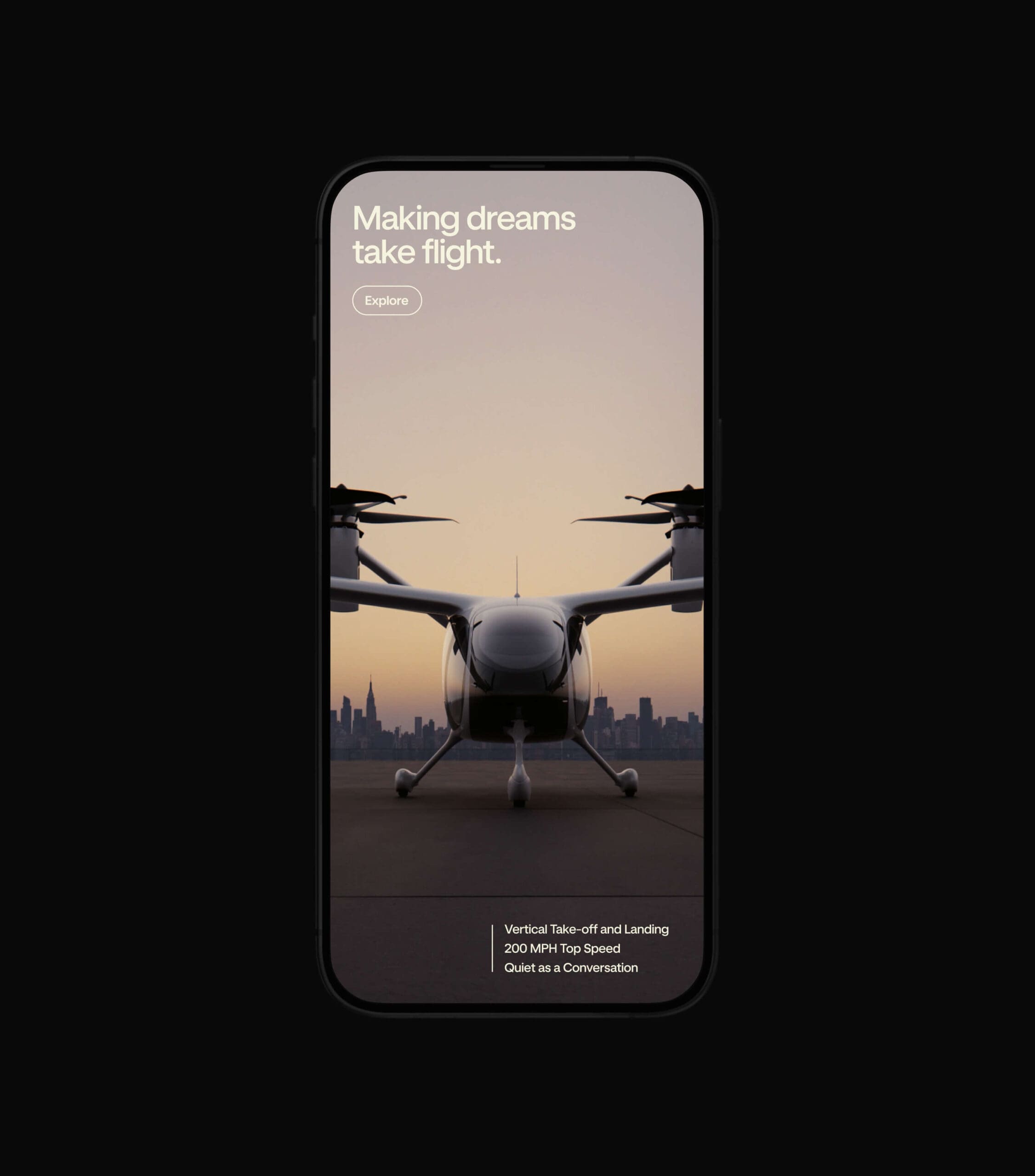
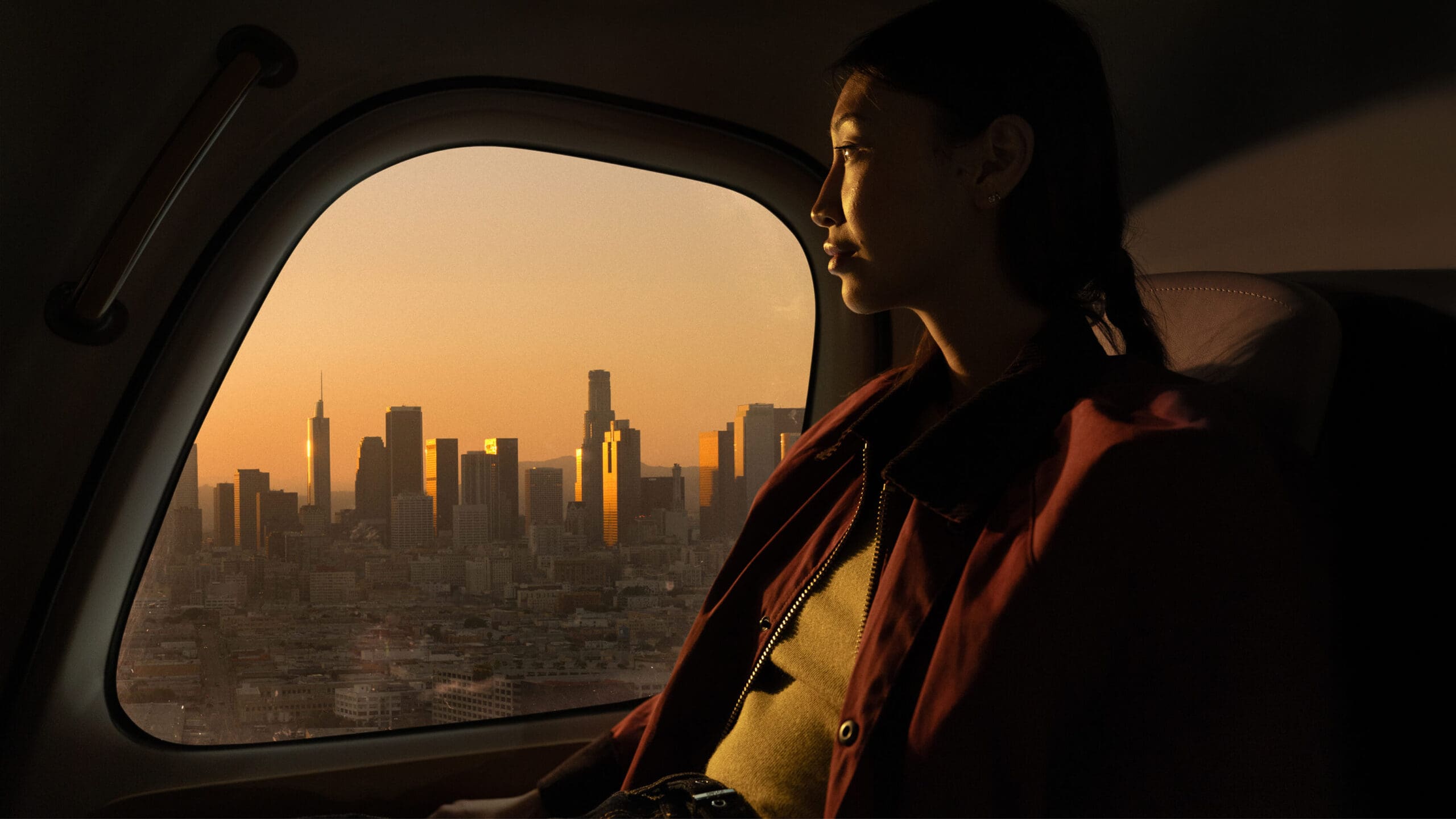
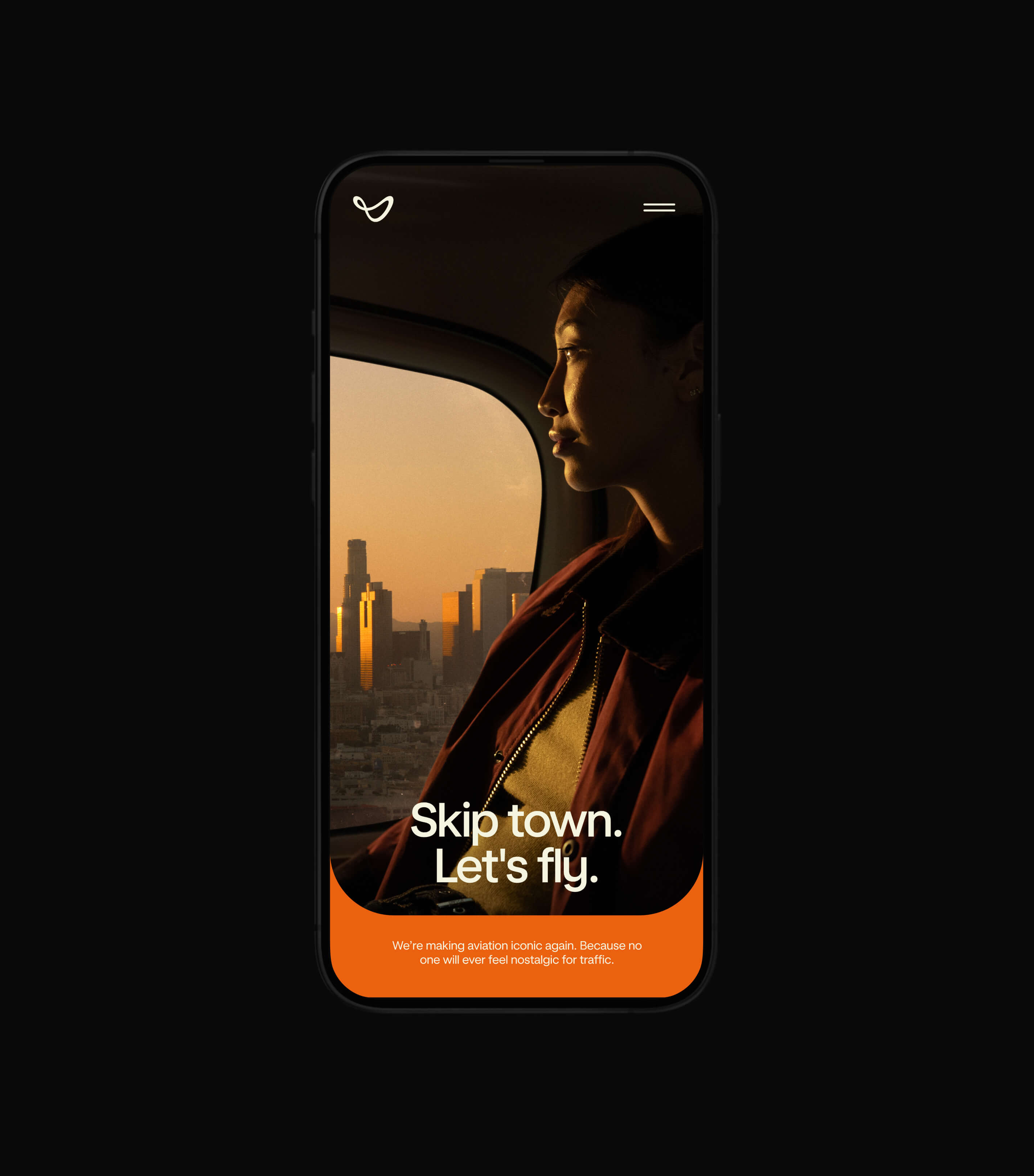
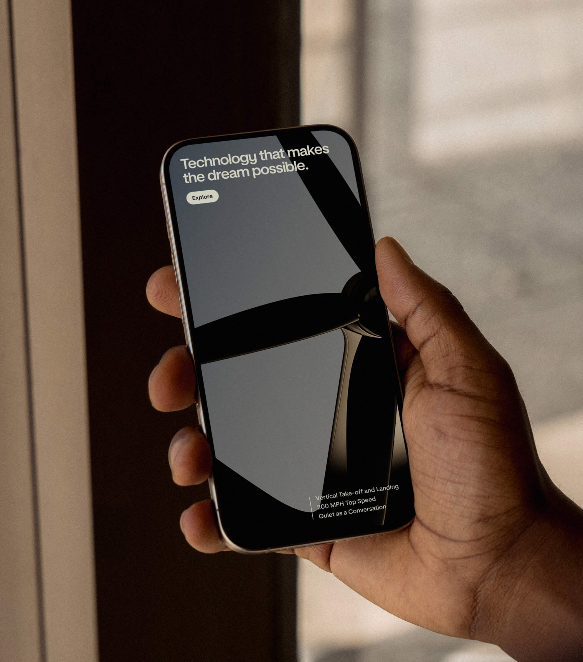
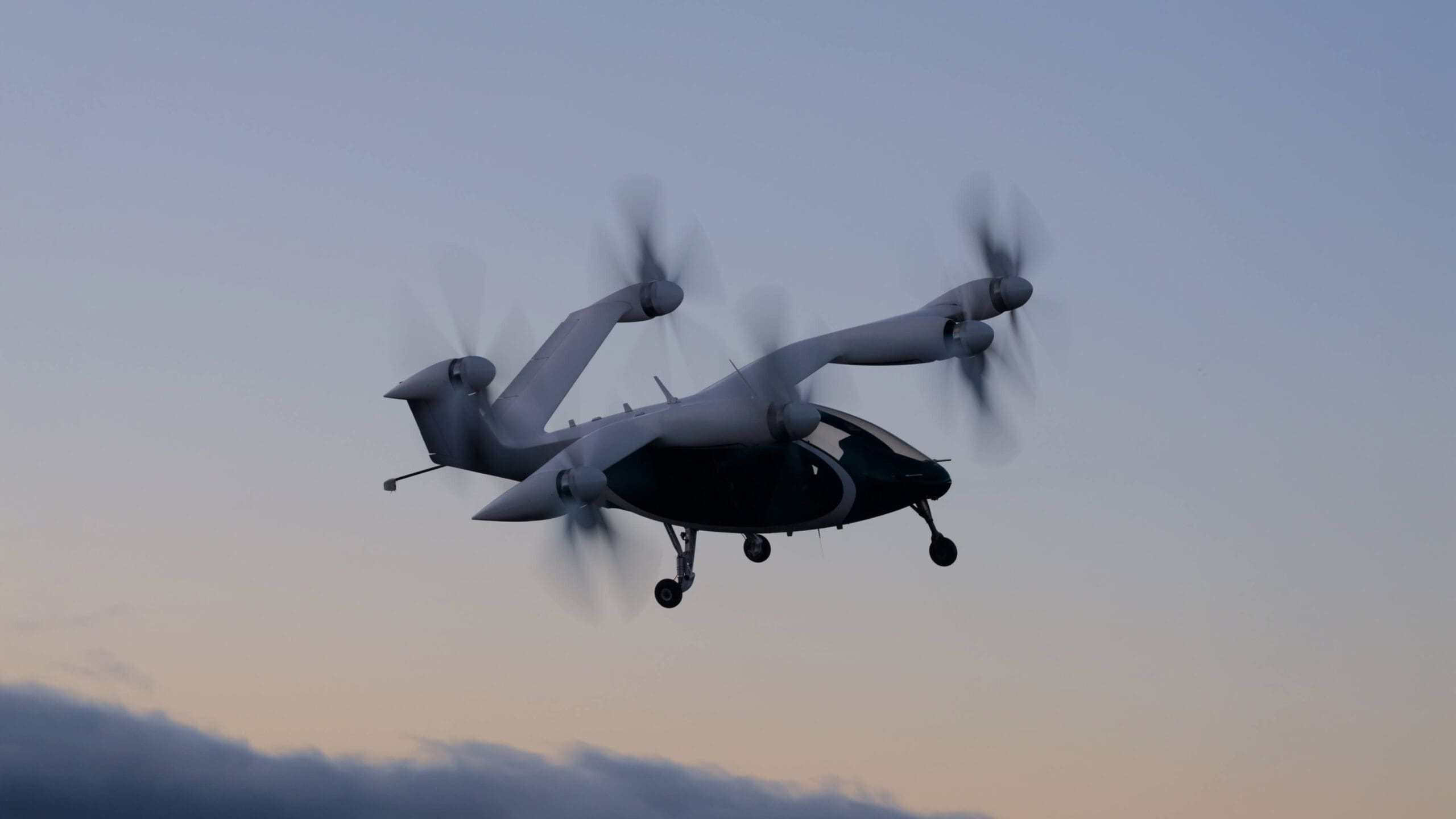
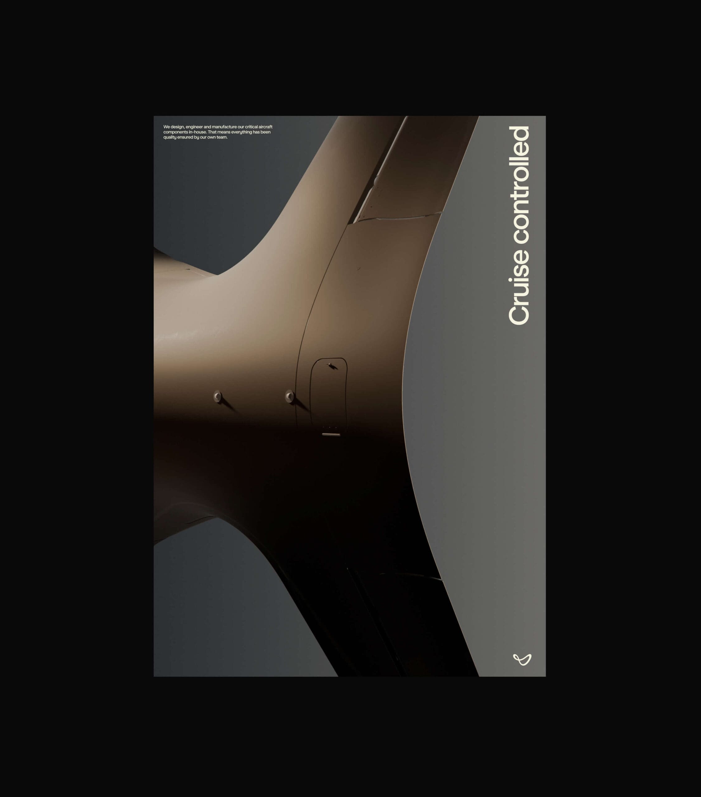
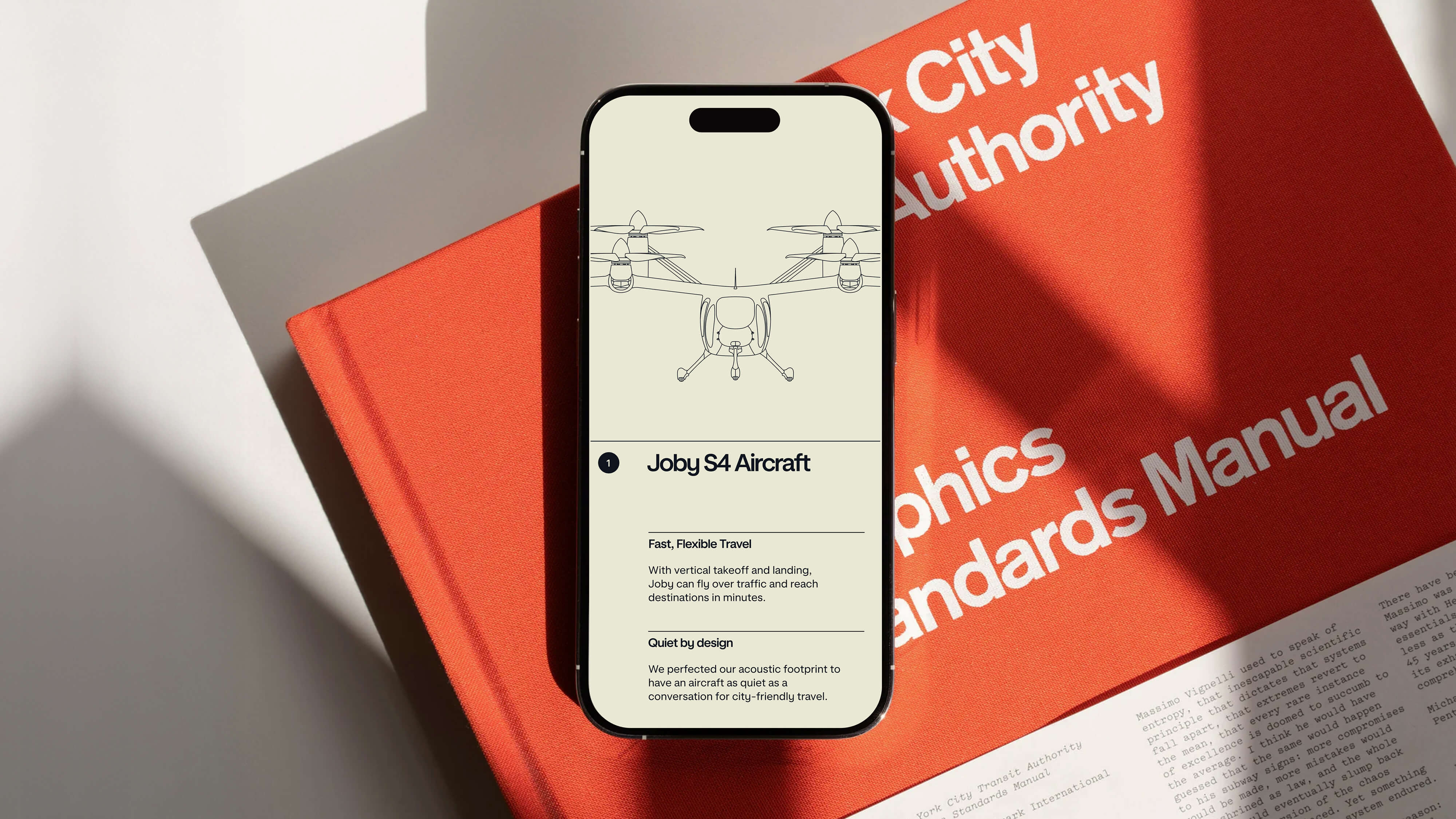
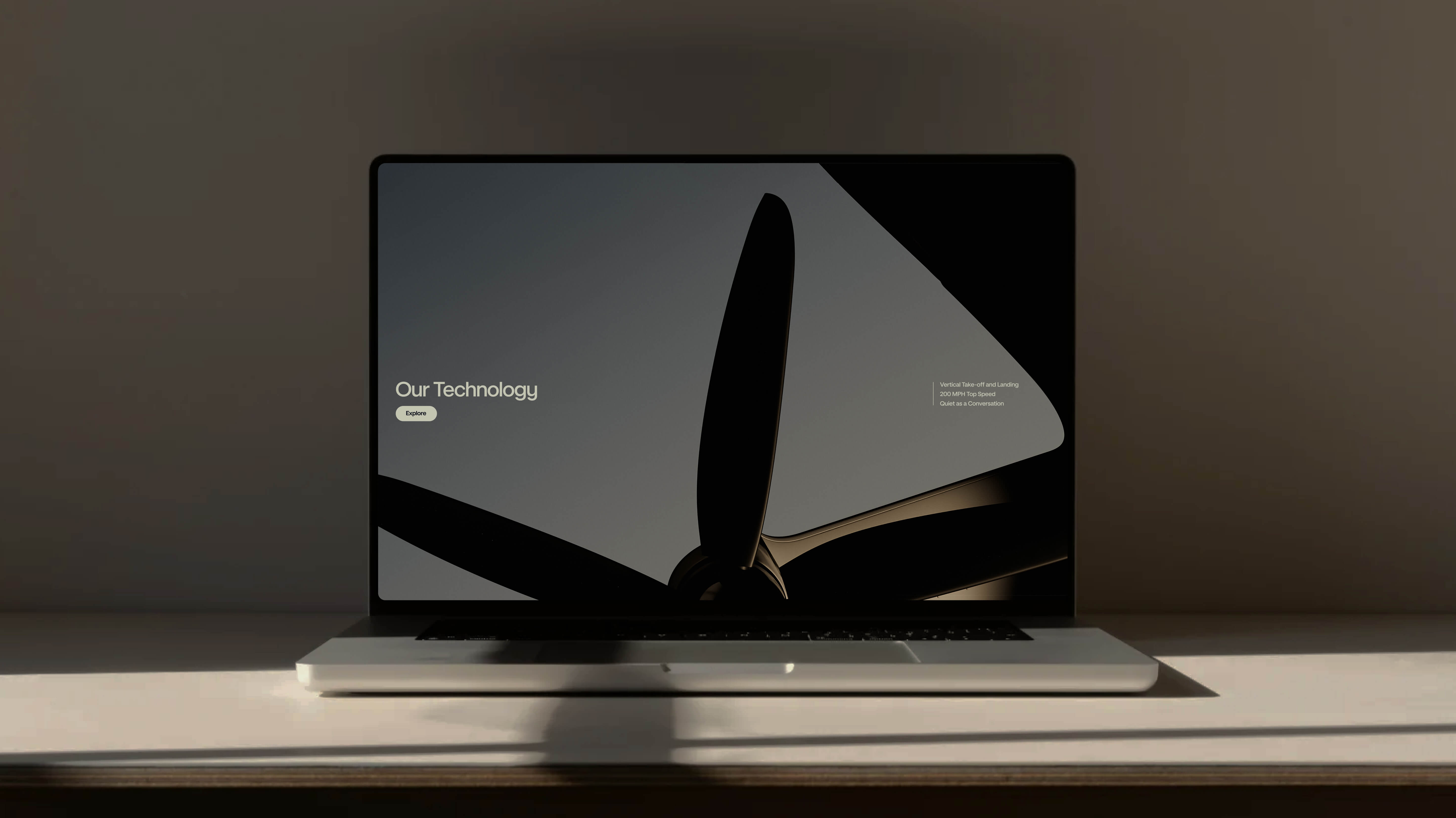
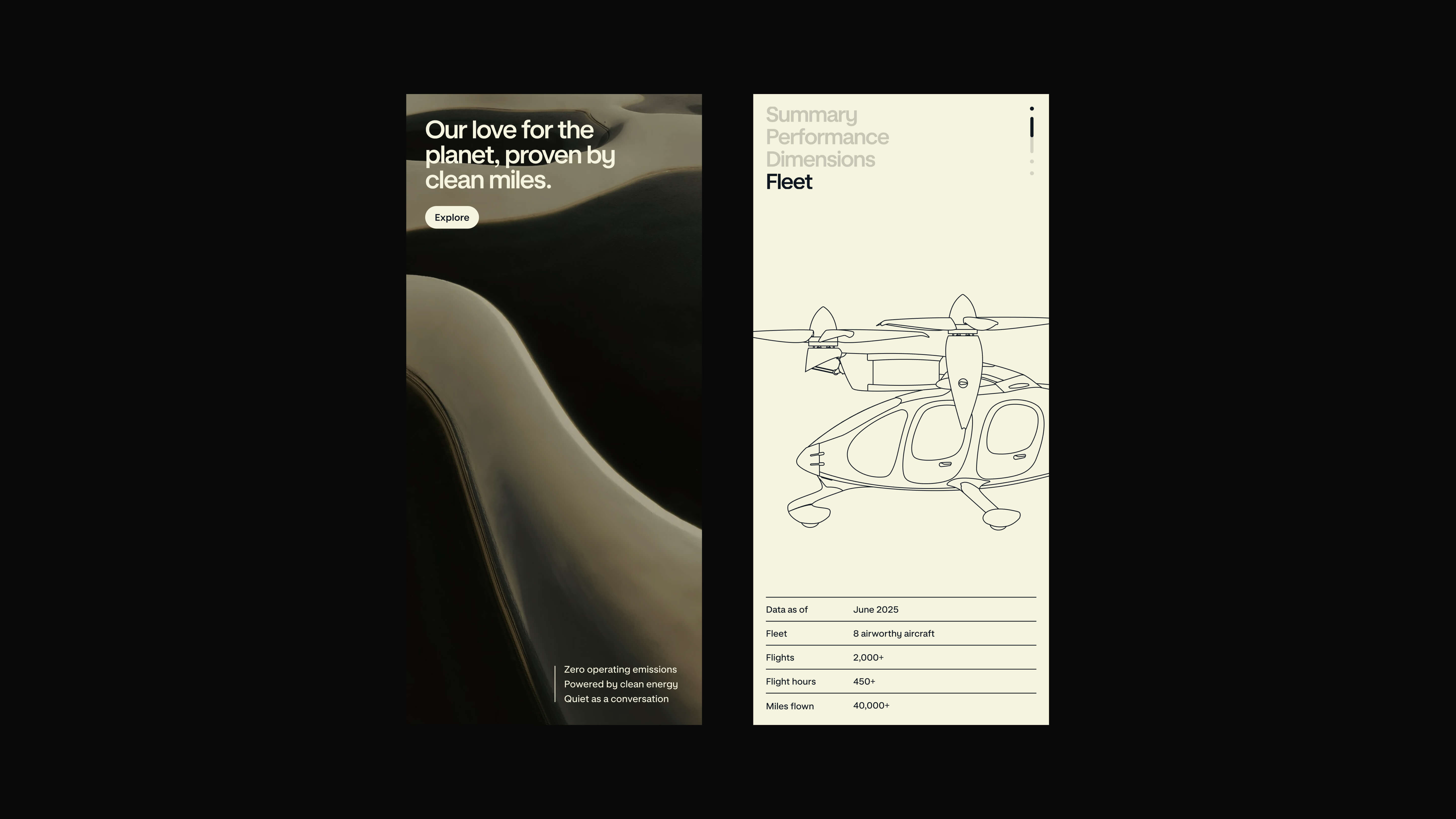
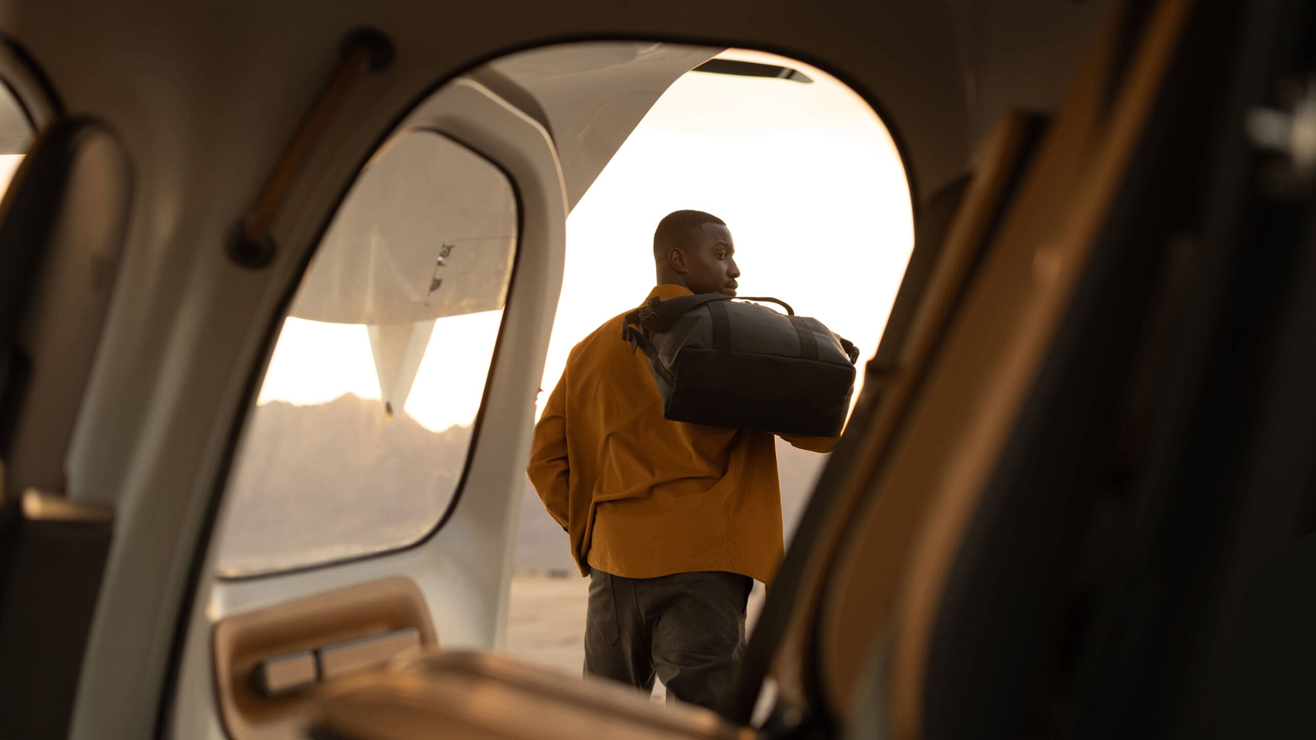
The website became a central expression of the dream. Designed as a multifaceted experience, it reintroduces Joby through motion, color, and interaction—photography suggests liftoff, typography rises and recedes like ascent, and bespoke micro-interactions echo takeoff and landing. Signature visual devices, like the “Smile,” carry the warmth and curves of the aircraft into the digital experience, animating as users scroll.
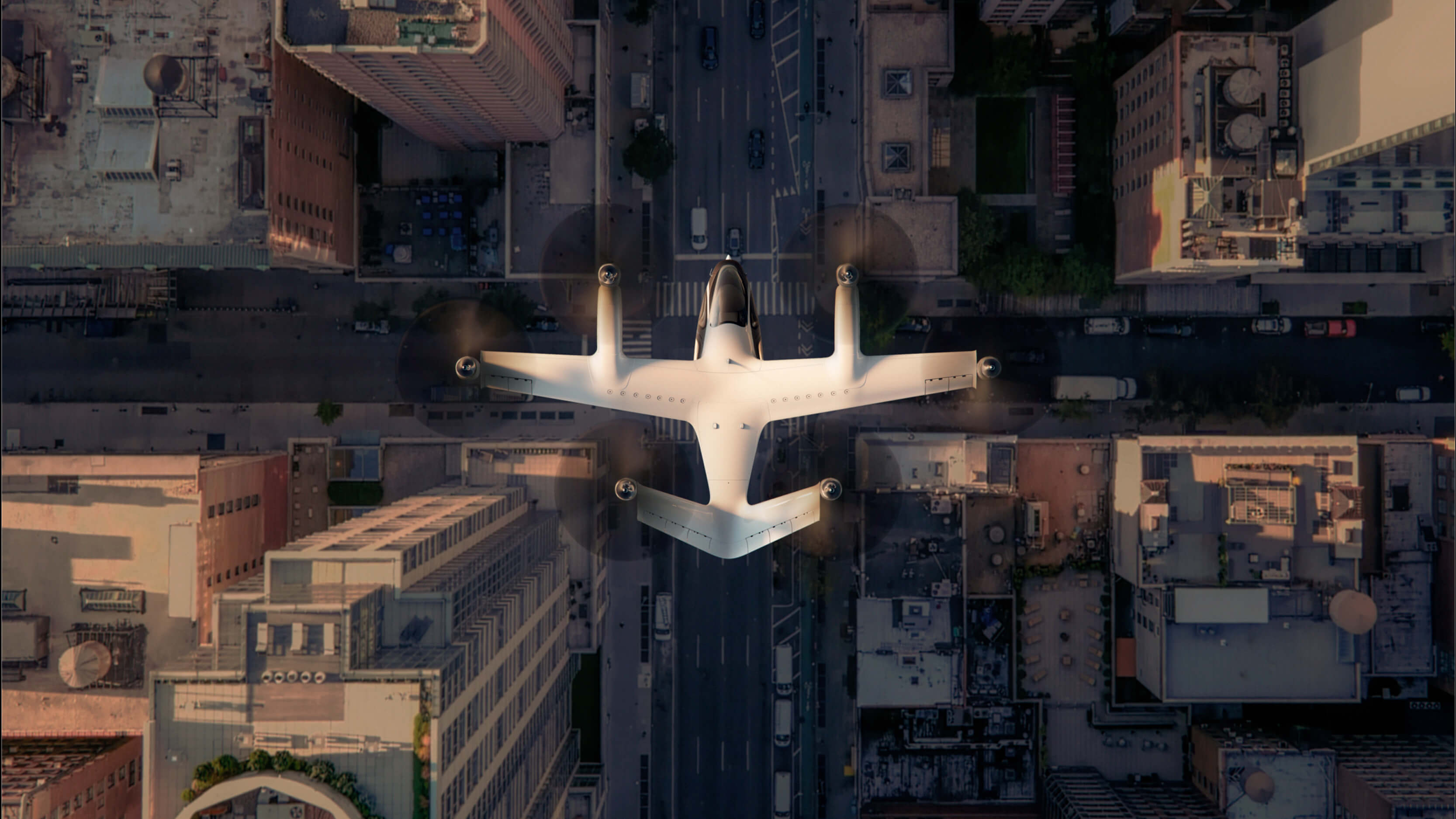
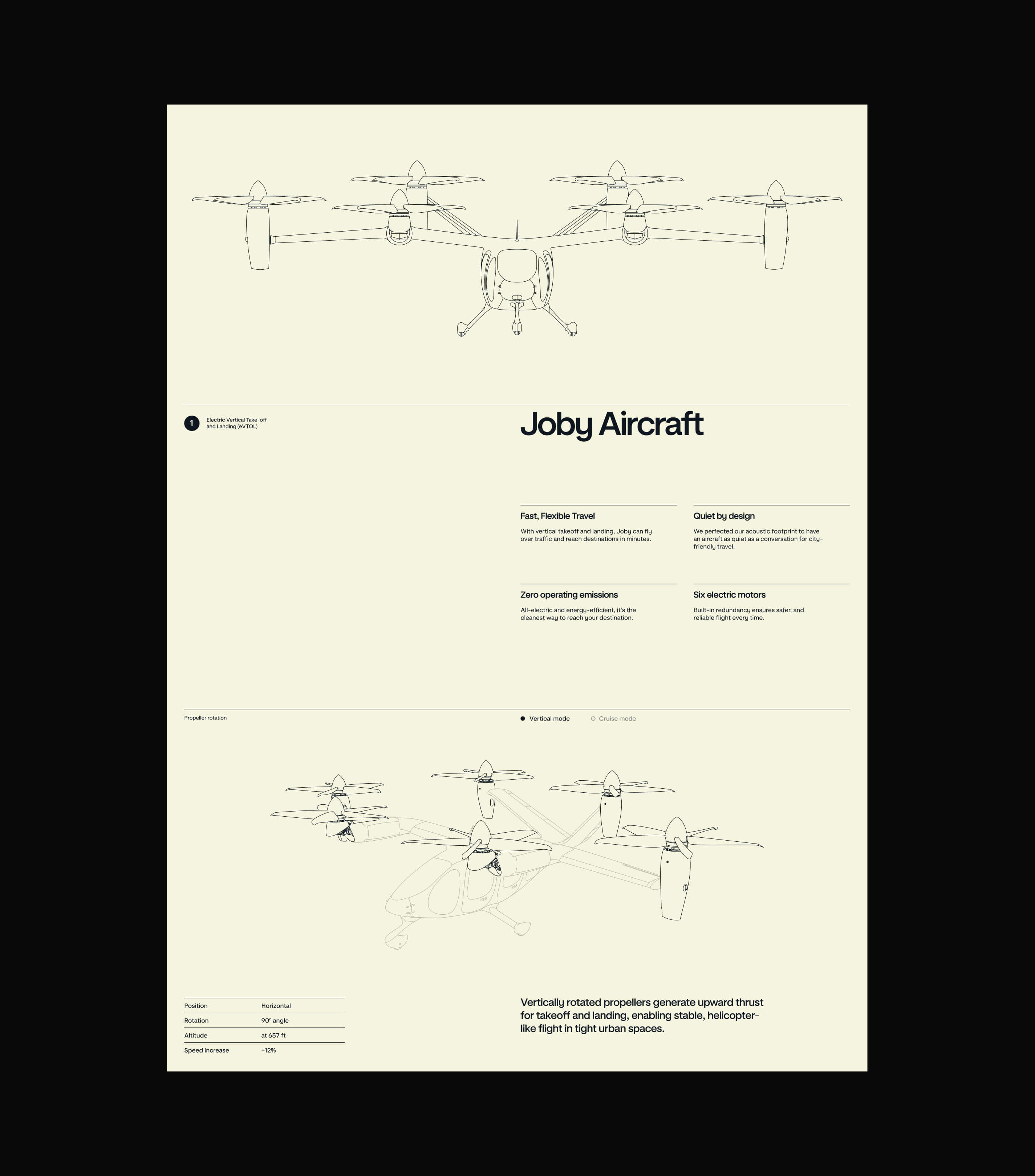
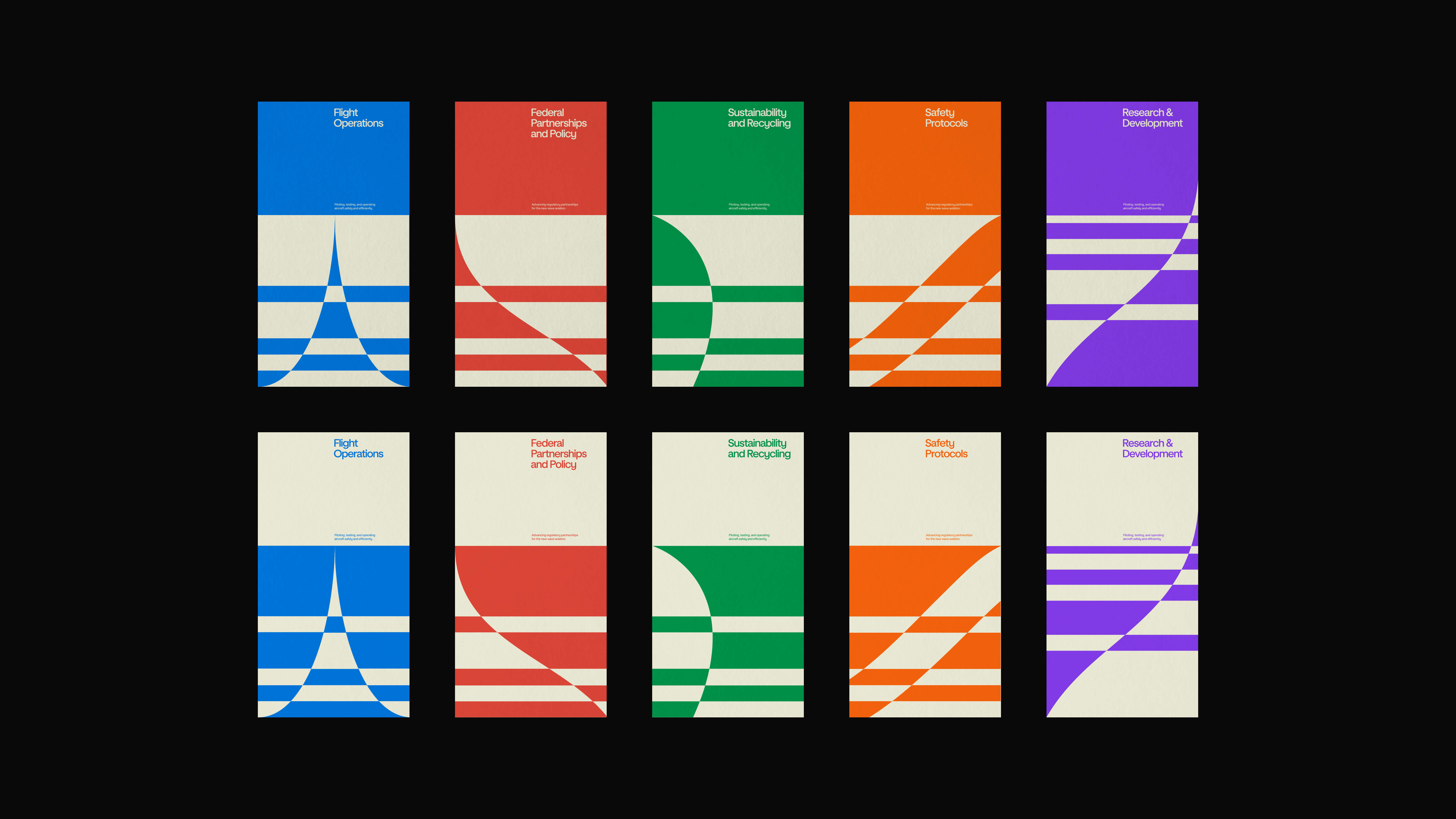
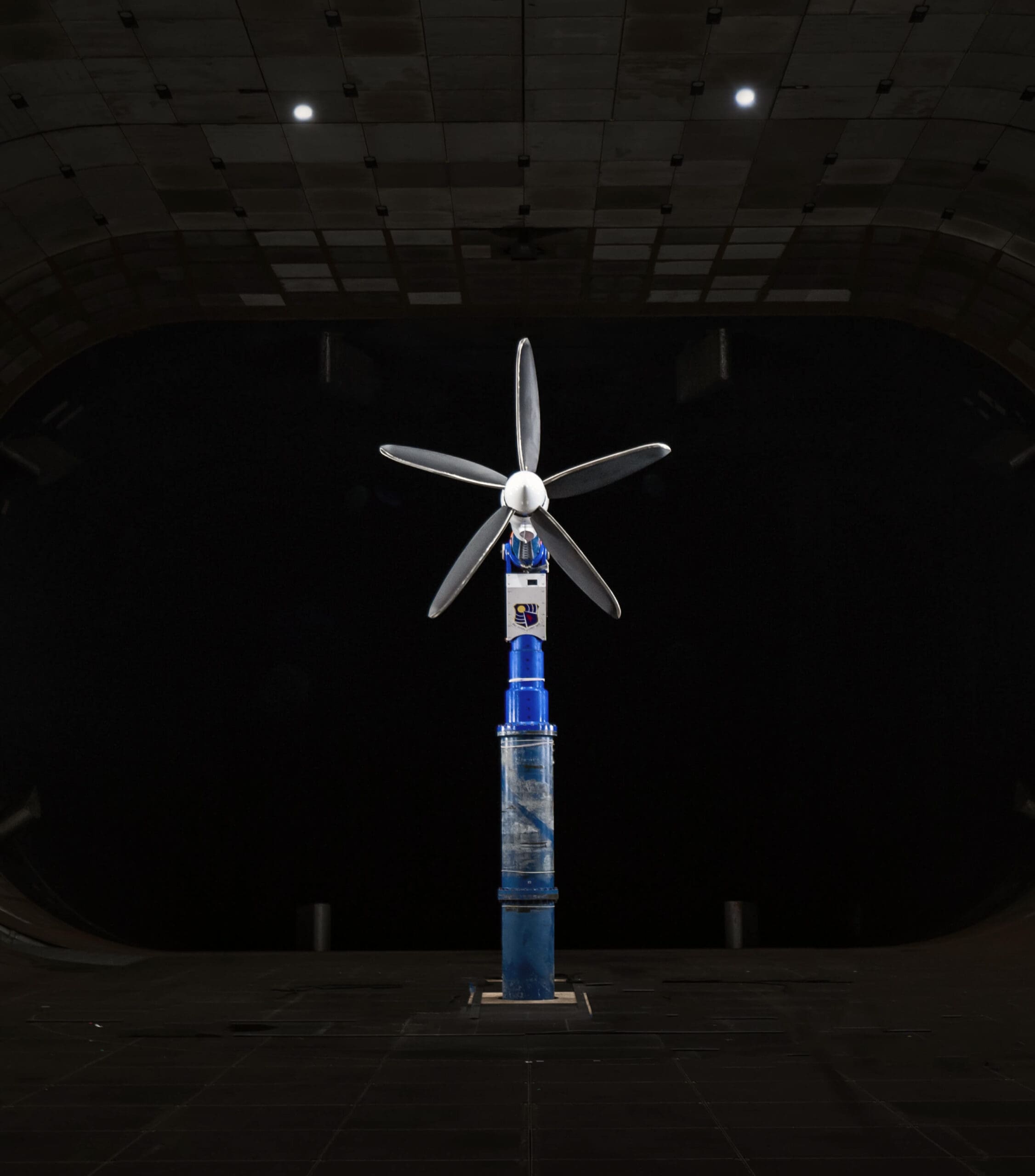
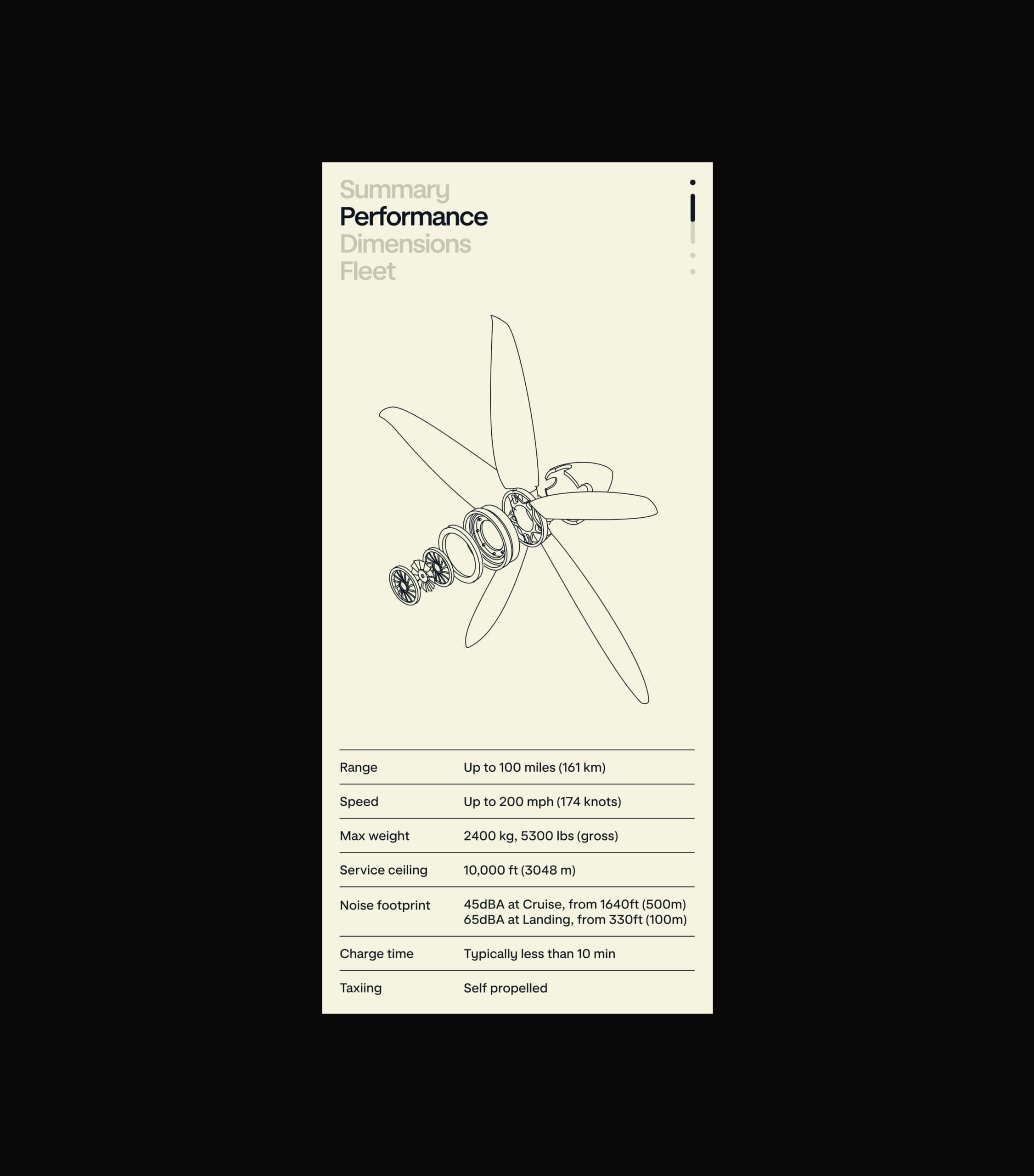
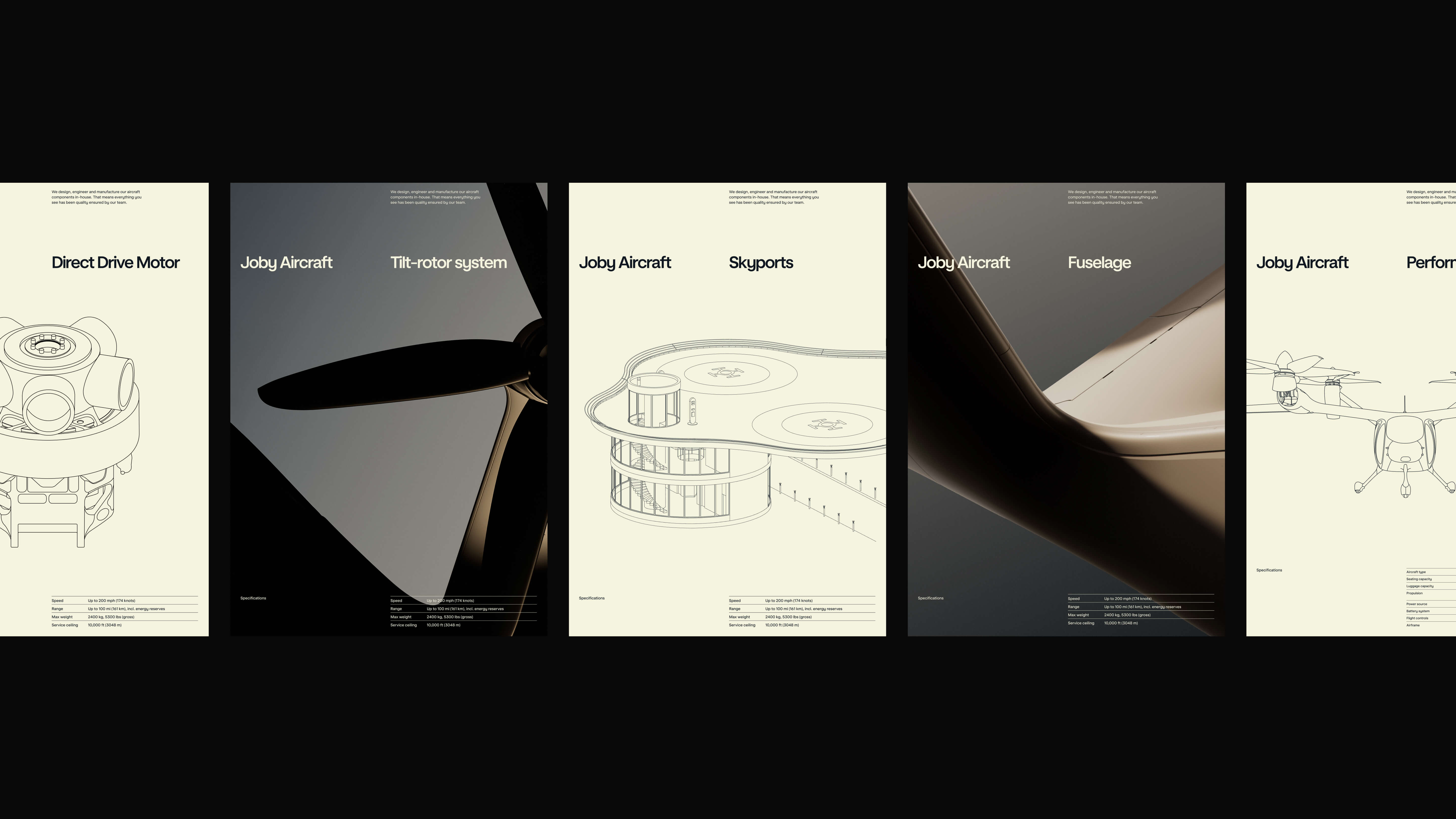
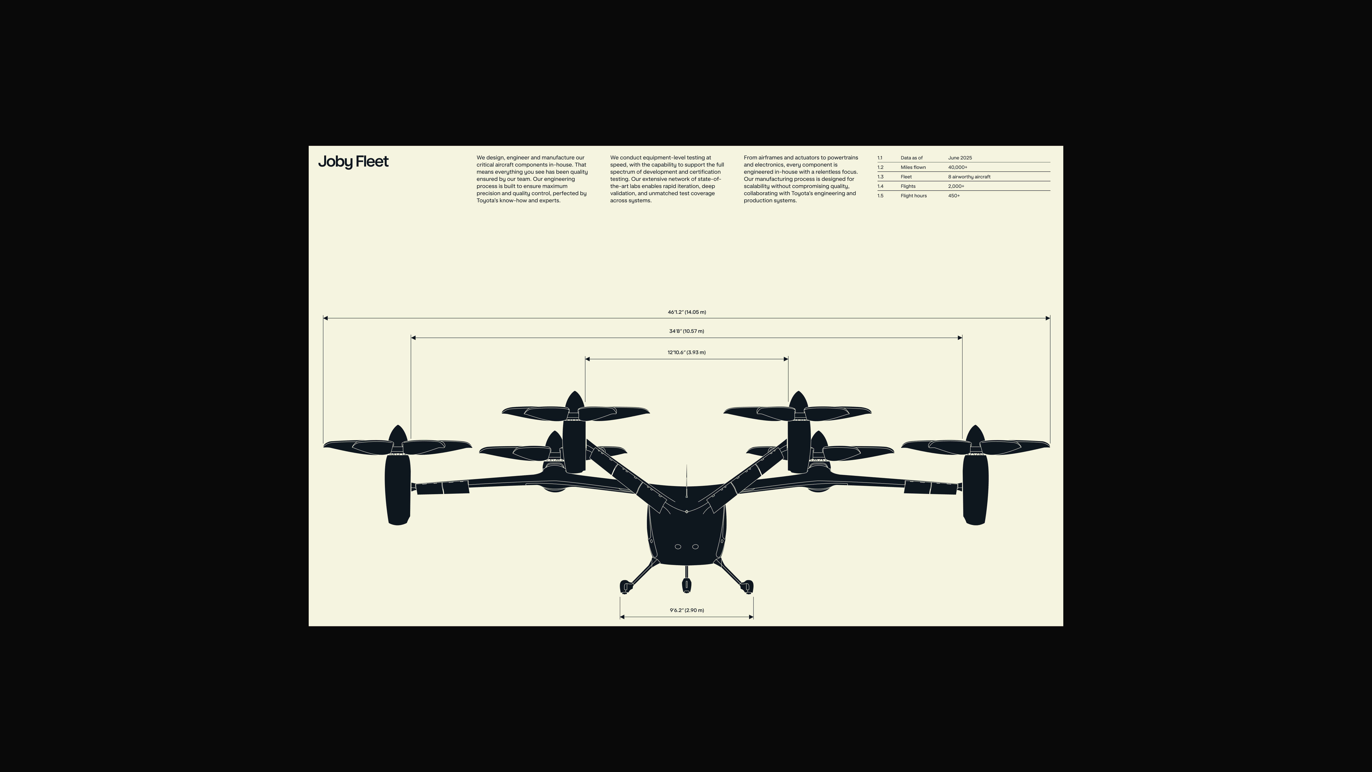
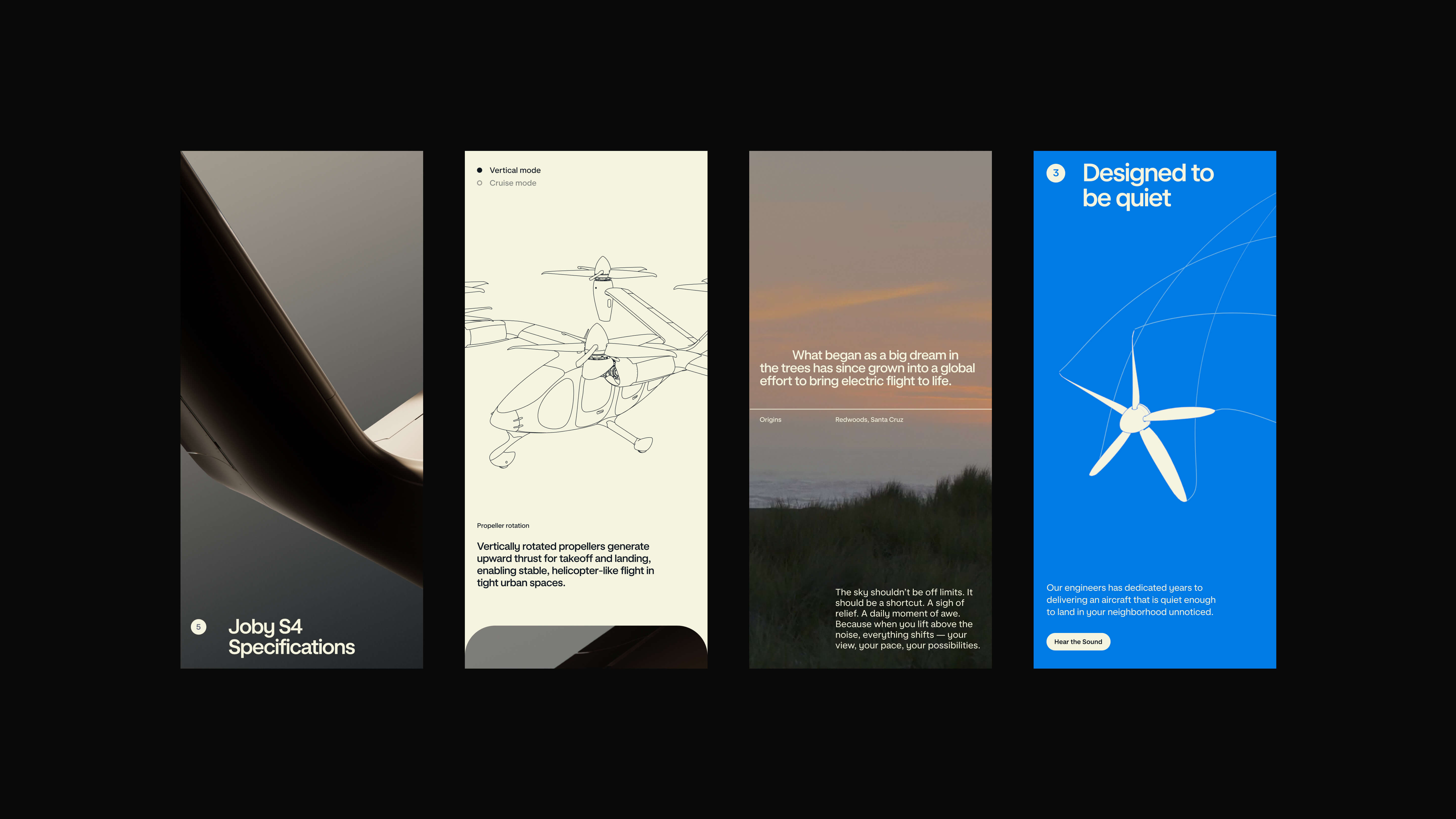
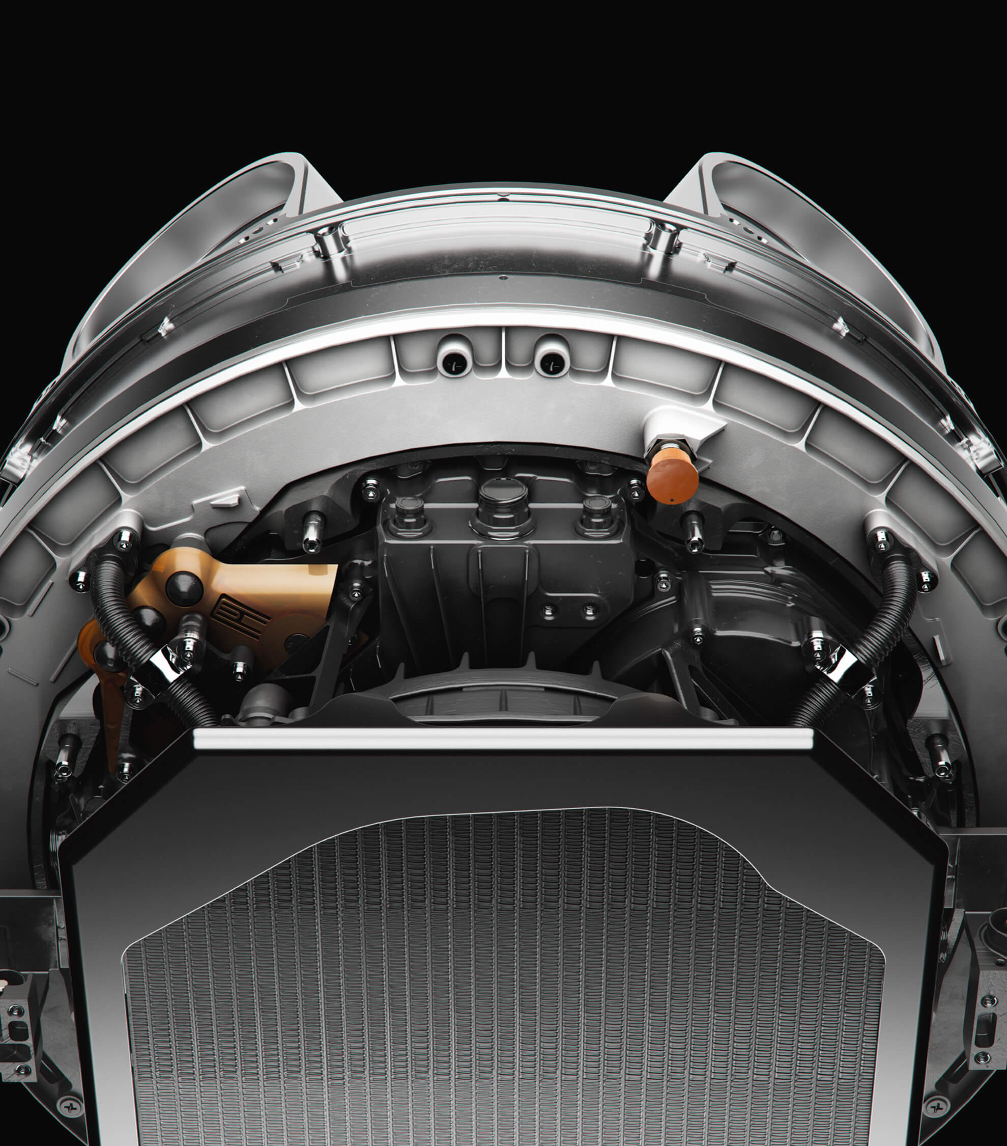
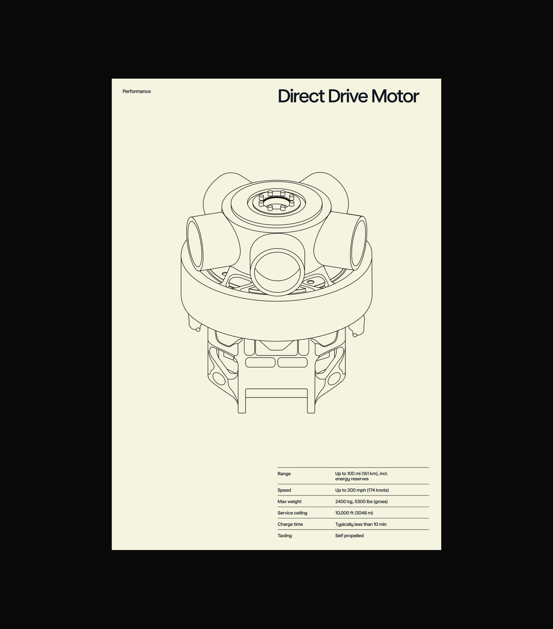
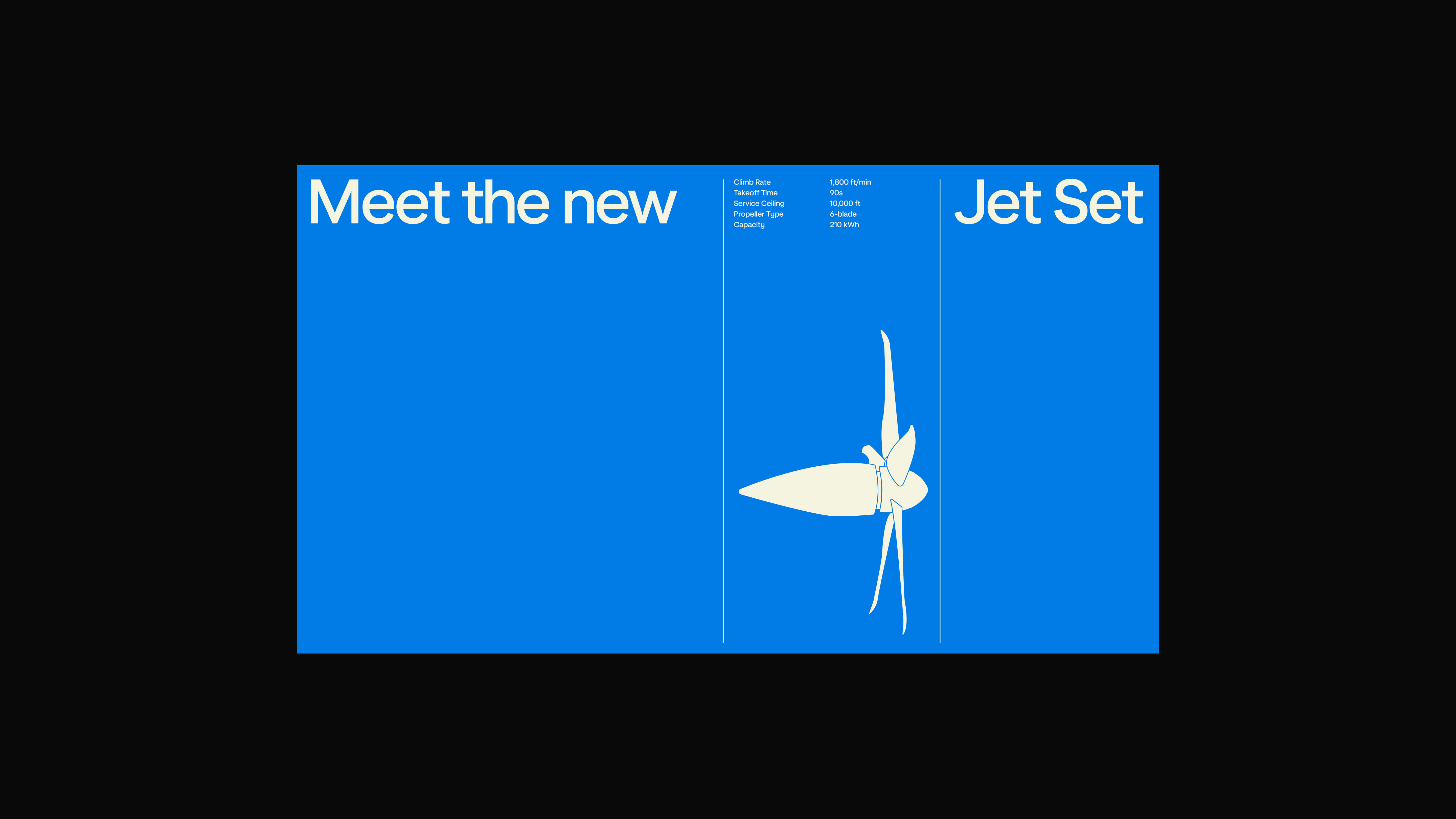
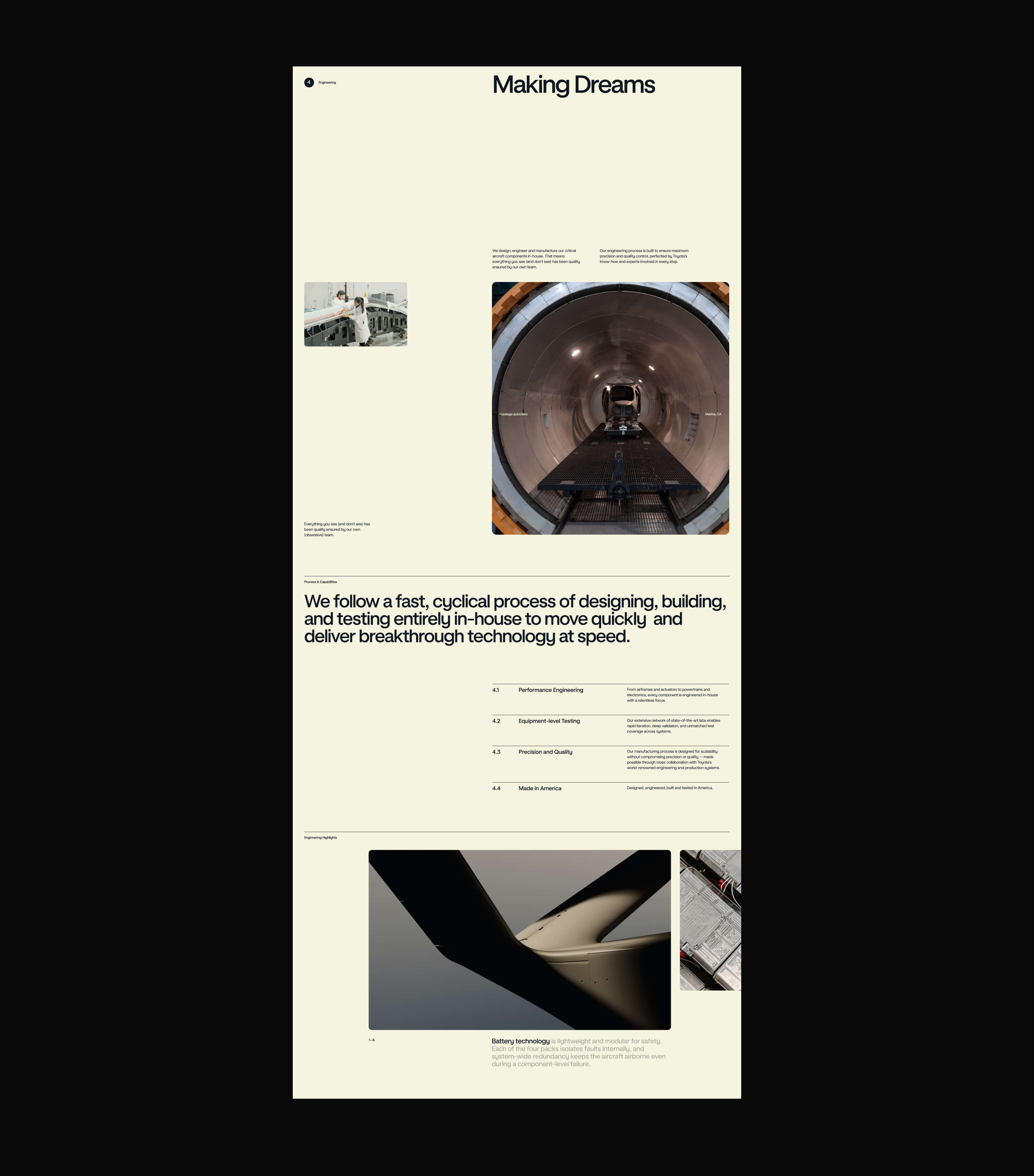
To bring depth and precision to the brand’s motion and technical storytelling, we partnered with INK Studio to execute a suite of high-fidelity visual assets. Working from the brand system, INK produced 3D animations, 3D stills, and schematic-based 2D animations and illustrations—translating complex engineering into clear, cinematic moments across digital, experiential, and communication touchpoints.
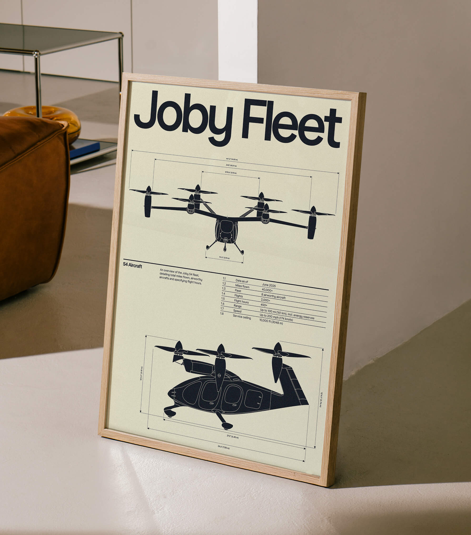
Technical diagram illustrations demystify how the aircraft works, from motor rotation to propeller configurations, while early architectural concepts envision the future of Joby’s proprietary Skyports—grounding the dream of flight in tangible, real-world systems.
Joby’s rebrand marks monumental firsts: the first consumer-facing eVTOL brand identity and the first to design proprietary passenger experiences spanning aircraft, app, and skyport.
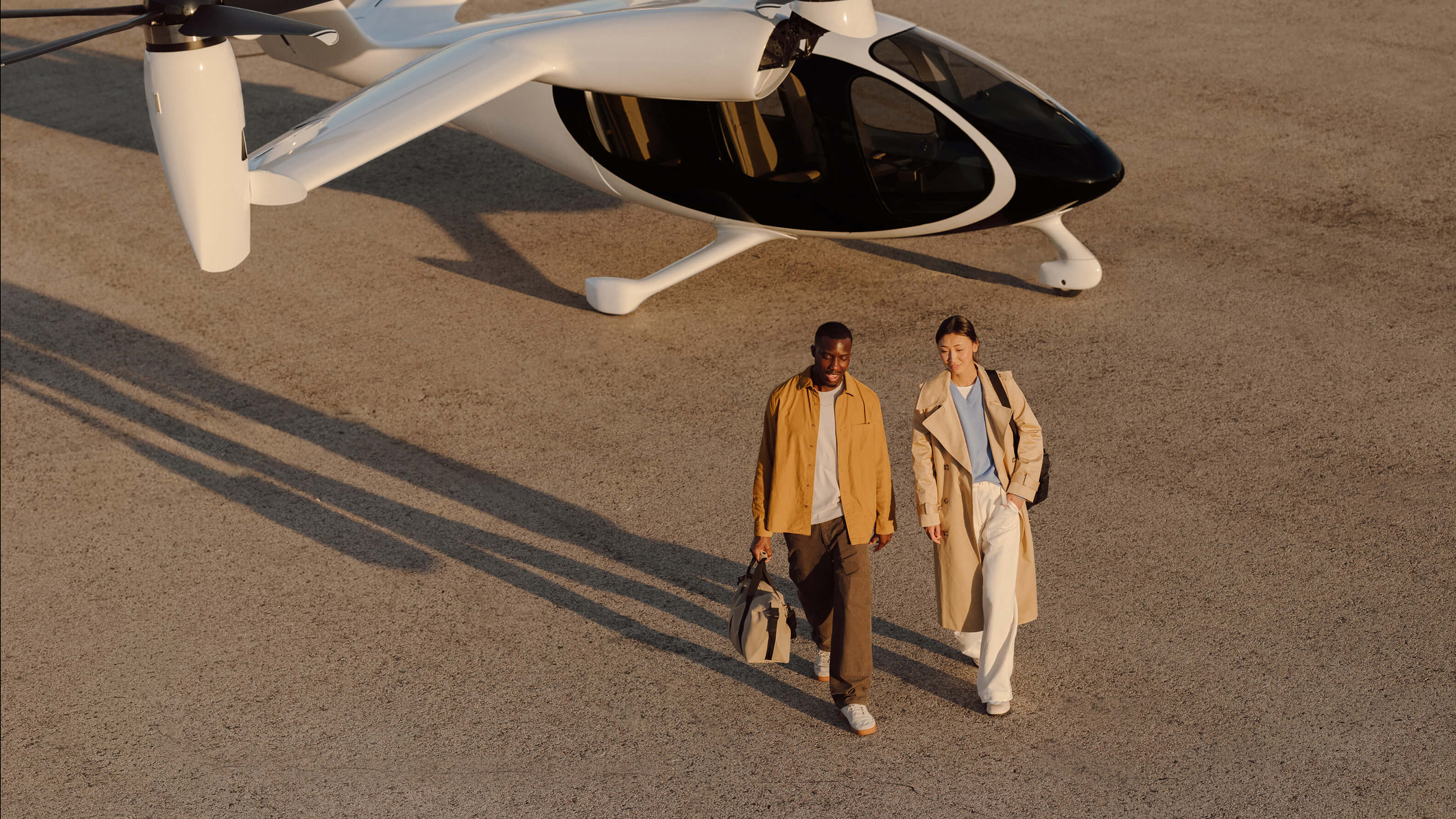
More importantly, it reclaims the emotional promise of flight—transforming a once-distant dream into an experience designed to feel optimistic, intuitive, and human again. Together, we didn’t just design a brand; we helped define an entirely new category, guided by the belief that the sky was never the limit.
The identity draws inspiration from the golden age of aviation, where design was expressive, optimistic, and human. Custom typography, developed with Family Type, echoes the aerodynamic curves of the aircraft while taking cues from historic aviation typefaces—adapted for clarity, legibility, and motion across modern applications, from livery and skyport signage to digital interfaces.
A flexible color system bridges past and future. Core blues evoke open skies and the promise of what’s ahead, while sun-washed oranges reflect Joby’s Californian roots and the warmth of early aviation. Supporting hues extend the system, allowing the brand to adapt across environments, footage, and moments without losing cohesion.
We brought the brand to life across physical and digital touchpoints—merch, wayfinding, signage, mobile app, and environments—ensuring the experience felt seamless wherever people encountered Joby. A clear, intuitive wayfinding system translated the brand into physical space, guiding people confidently through early skyport experiences.
The website became a central expression of the dream. Designed as a multifaceted experience, it reintroduces Joby through motion, color, and interaction—photography suggests liftoff, typography rises and recedes like ascent, and bespoke micro-interactions echo takeoff and landing. Signature visual devices, like the “Smile,” carry the warmth and curves of the aircraft into the digital experience, animating as users scroll.
To bring depth and precision to the brand’s motion and technical storytelling, we partnered with INK Studio to execute a suite of high-fidelity visual assets. Working from the brand system, INK produced 3D animations, 3D stills, and schematic-based 2D animations and illustrations—translating complex engineering into clear, cinematic moments across digital, experiential, and communication touchpoints.
Technical diagram illustrations demystify how the aircraft works, from motor rotation to propeller configurations, while early architectural concepts envision the future of Joby’s proprietary Skyports—grounding the dream of flight in tangible, real-world systems.
Joby’s rebrand marks monumental firsts: the first consumer-facing eVTOL brand identity and the first to design proprietary passenger experiences spanning aircraft, app, and skyport.
More importantly, it reclaims the emotional promise of flight—transforming a once-distant dream into an experience designed to feel optimistic, intuitive, and human again. Together, we didn’t just design a brand; we helped define an entirely new category, guided by the belief that the sky was never the limit.