Keyes
Giving a legacy brand a new lease on life
-
Industry Real Estate
-
Services Brand Strategy, Verbal Identity, Visual Identity, Packaging Design, Website Design, Website Development, Creative Production, Social Identity, Persona Research, Deck Design
Project info
Challenge
A well-known name in Florida real estate, Keyes had 100 years under their belt — and needed a brand that had the same amount of staying power. In addition to looking and feeling every bit their age, they had trouble staying consistent across touchpoints, both aesthetically and tonally. Our challenge? Give them guardrails to guide them, a beautiful new look to propel them forward, and a digital presence they could be proud of.
Solution
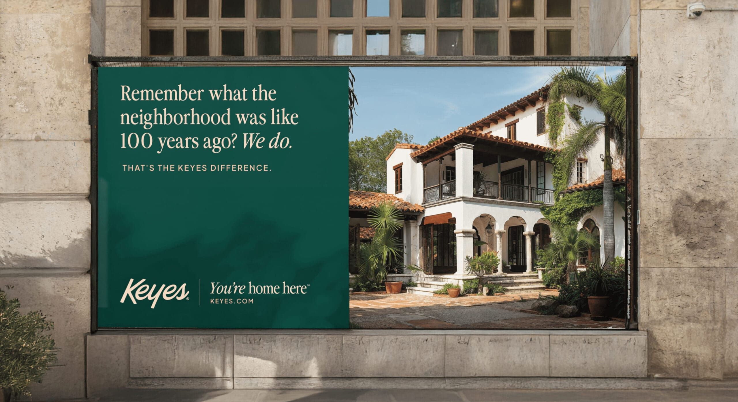
Starting with strategy, we landed on the archetype that could fully embody the Keyes experience — the Heroic Caregiver. The perfect combination of compassion and courage, this archetype accepts any challenge and strives to make others feel at home. With our emotional territory mapped, we moved on to messaging where we created a robust tone of voice guide to help them communicate more clearly and effectively while staying on brand, every time.
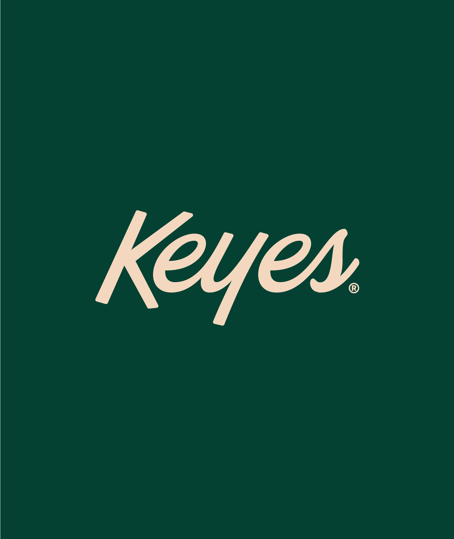
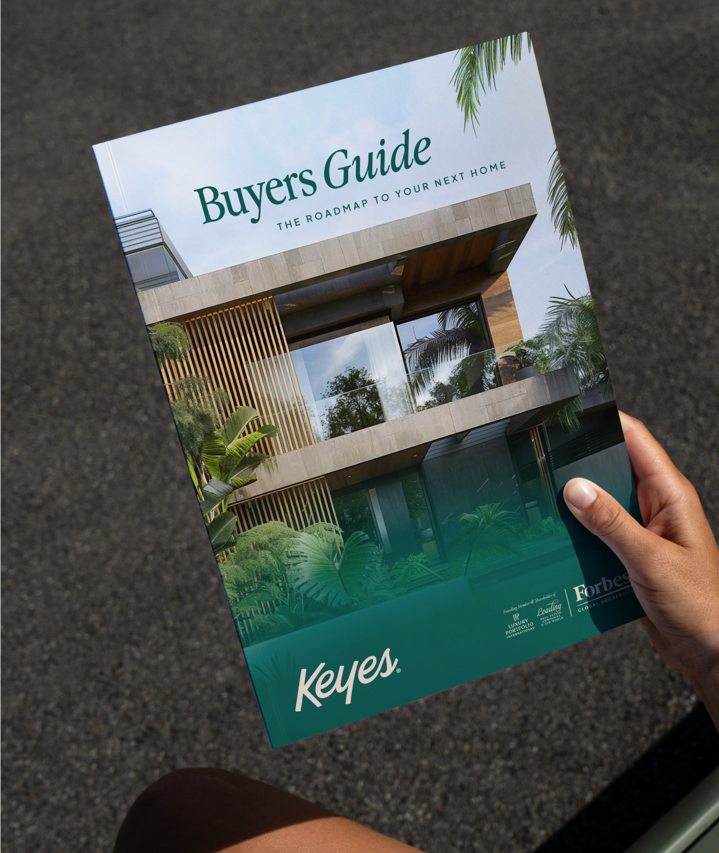
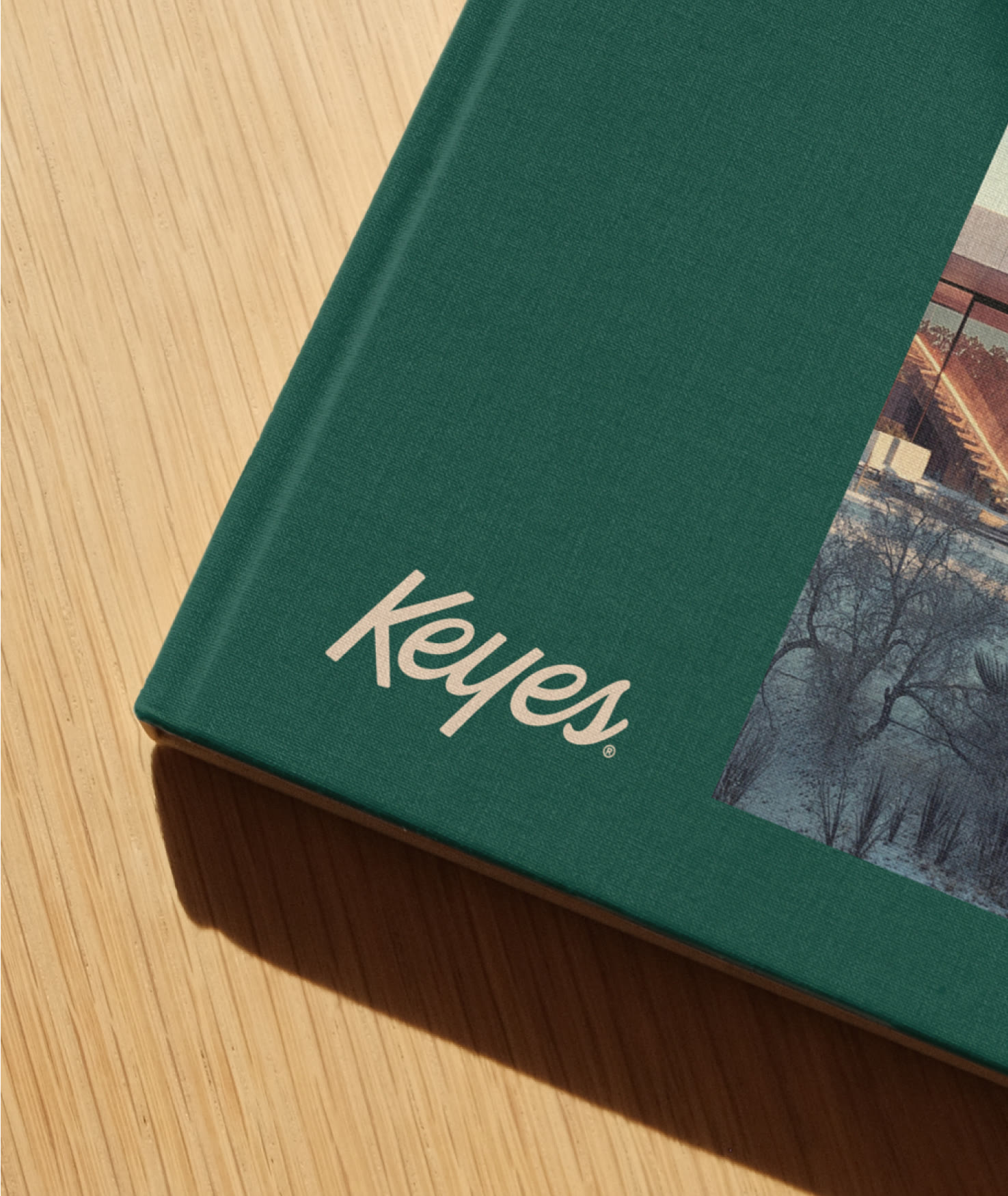
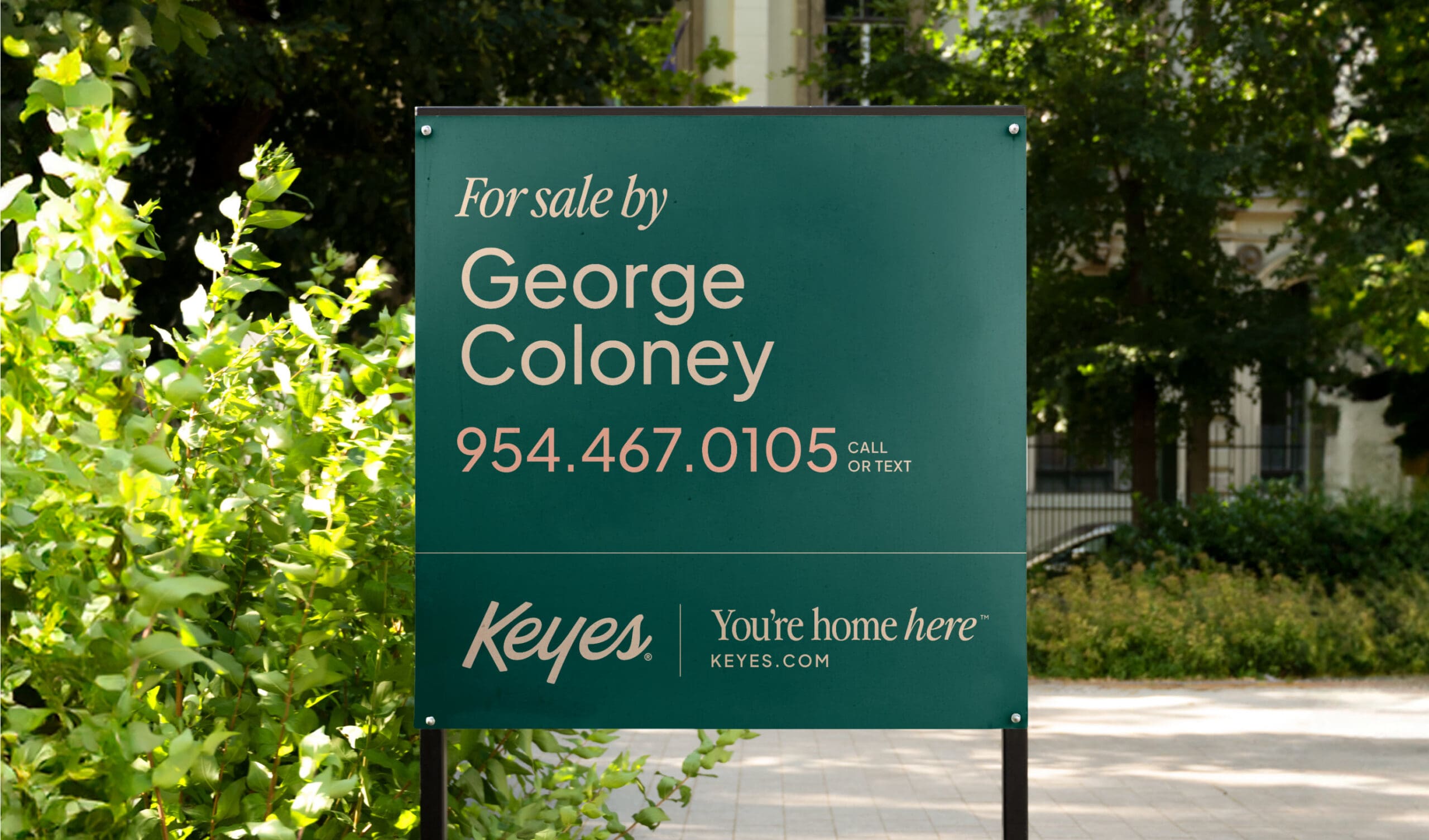
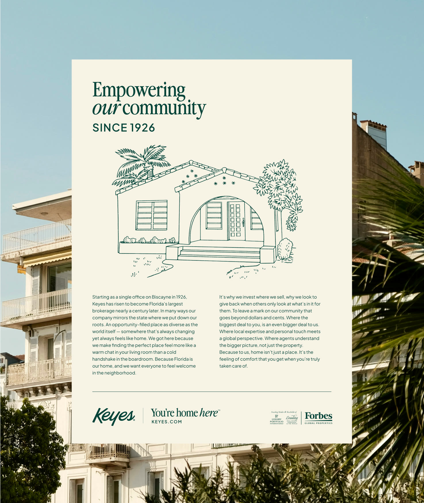
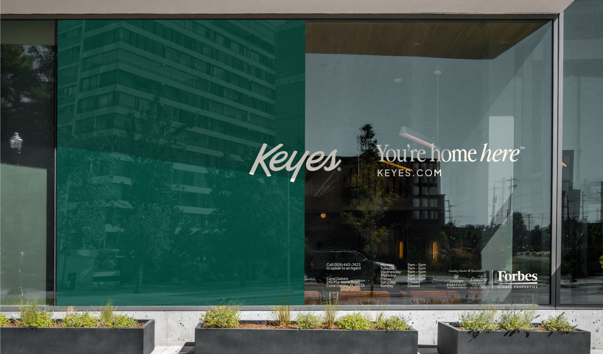
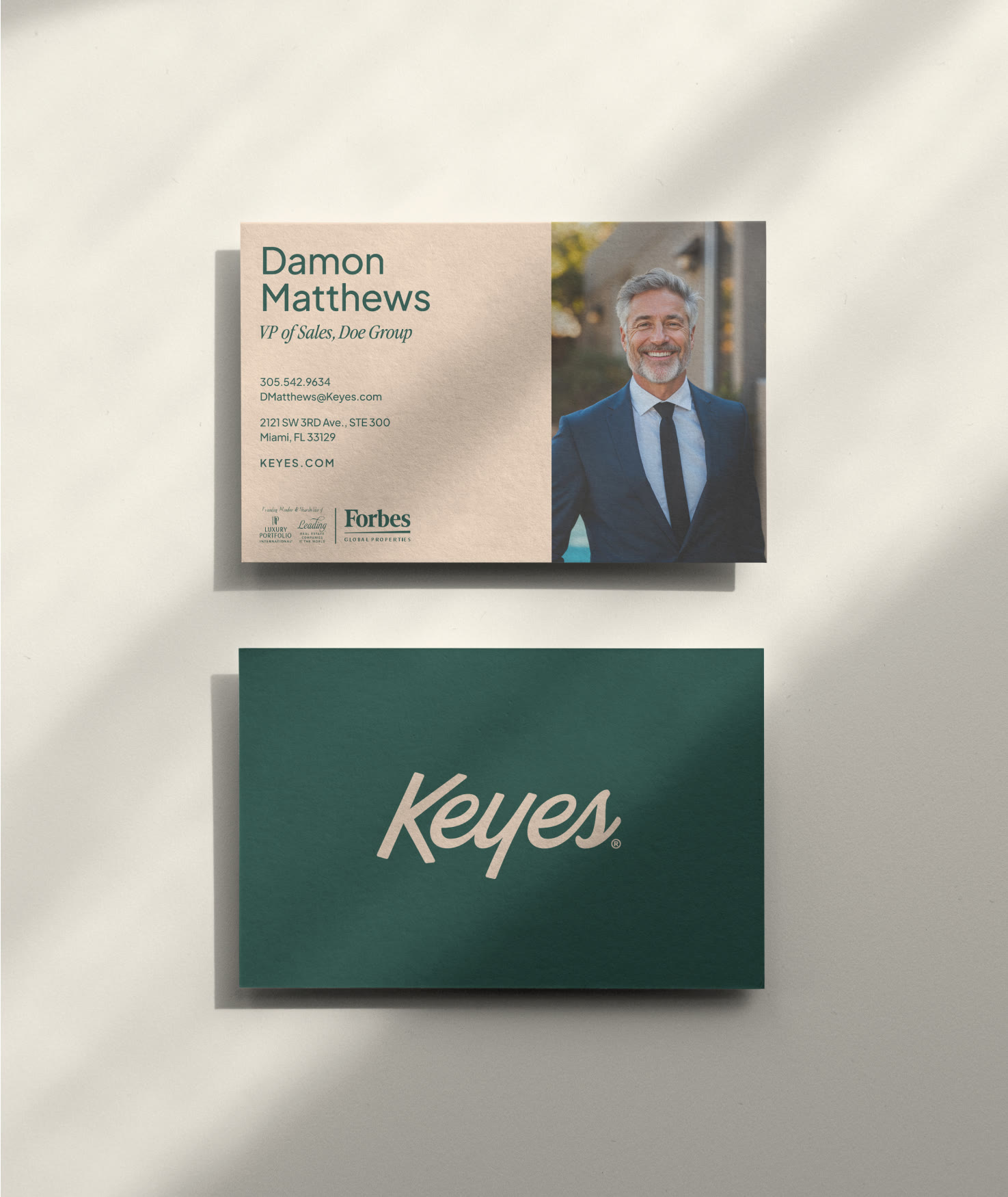
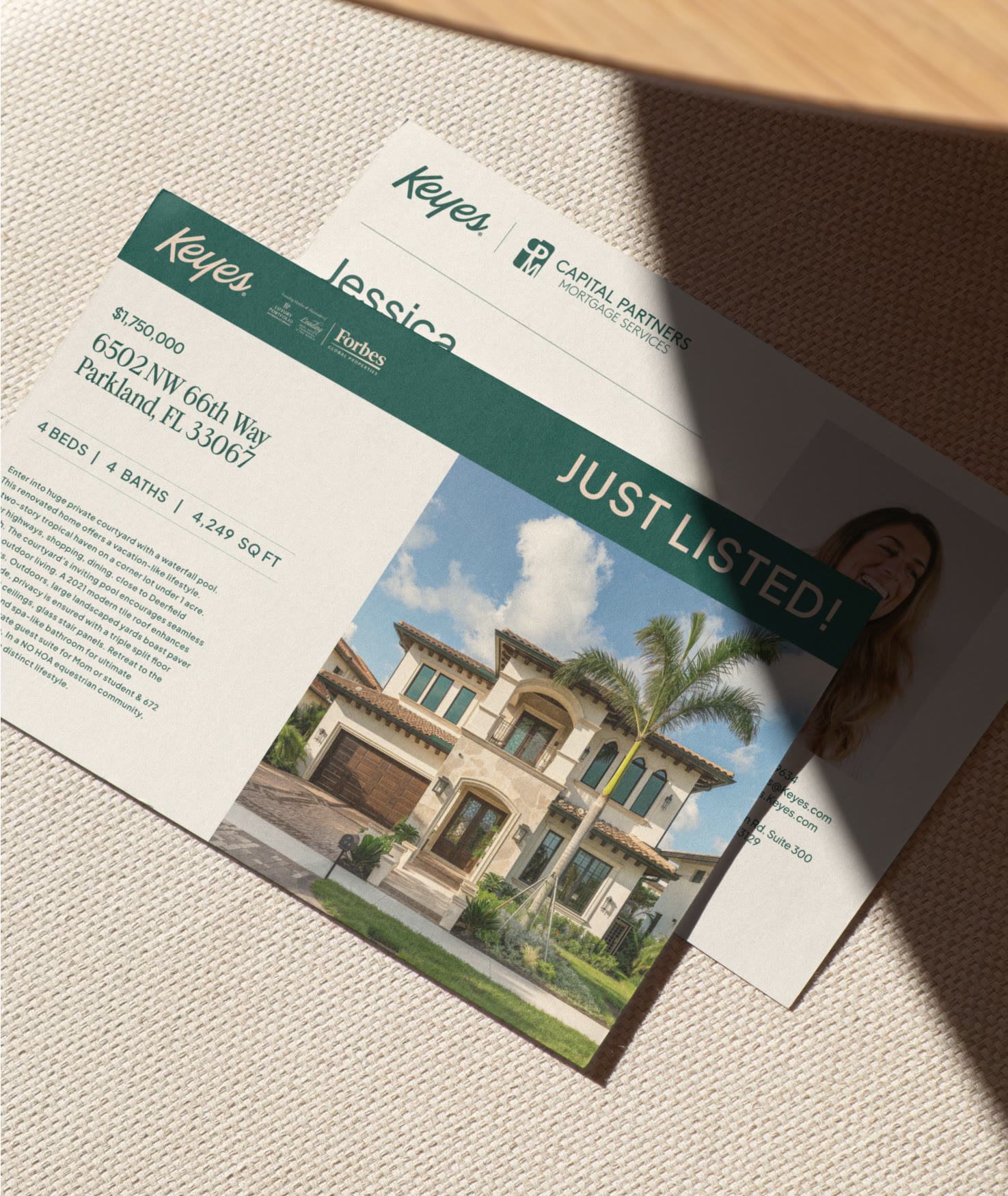
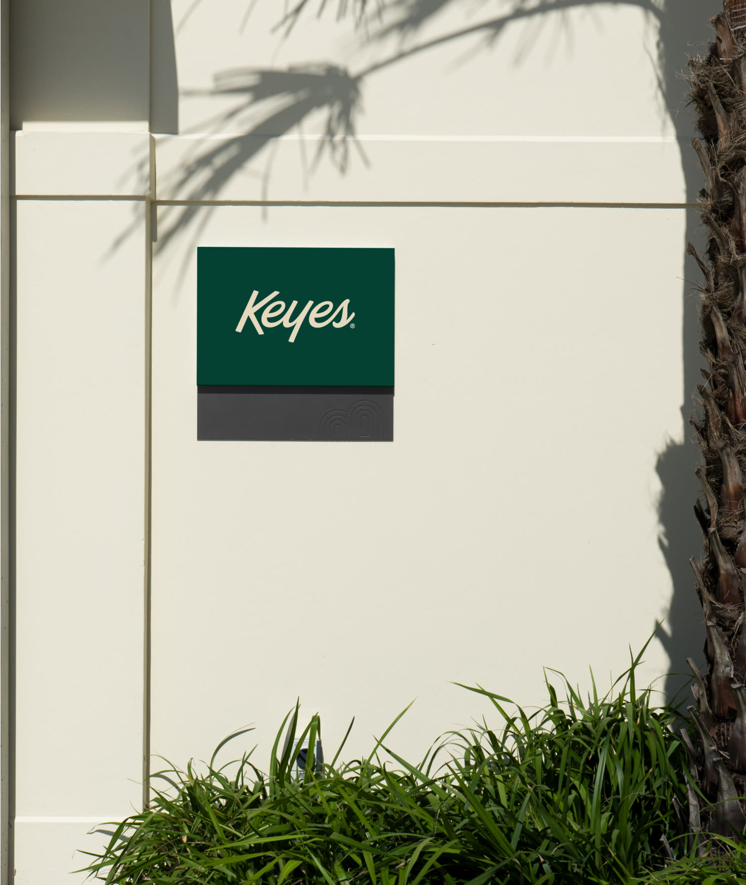
Next, it was time to bring the magic to life. Armed with pieces of the original Keyes brand, we went vintage with a clean, fresh modern twist. The logo was reimagined from the original Keyes logo, circa 1926, and the color palette was classic Florida — with Everglade Green and Miami Sands leading the way. Finally, we brought it all together with custom illustrations of the spots locals know so well.
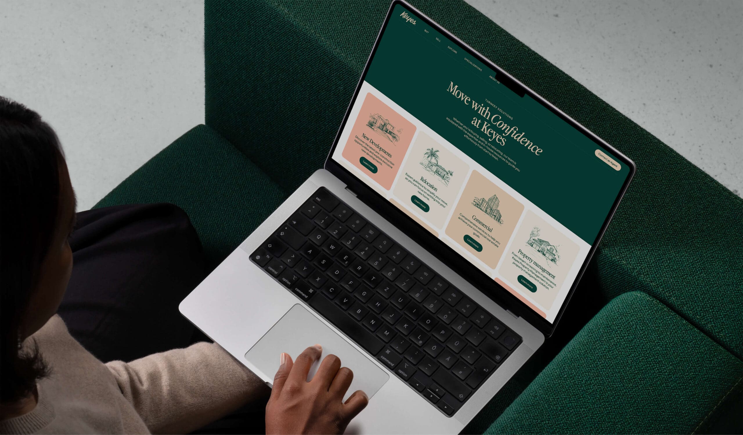
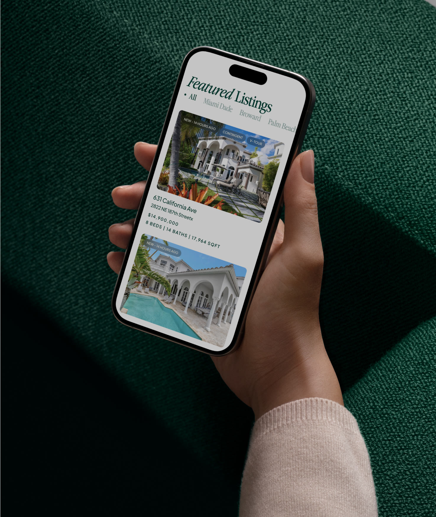
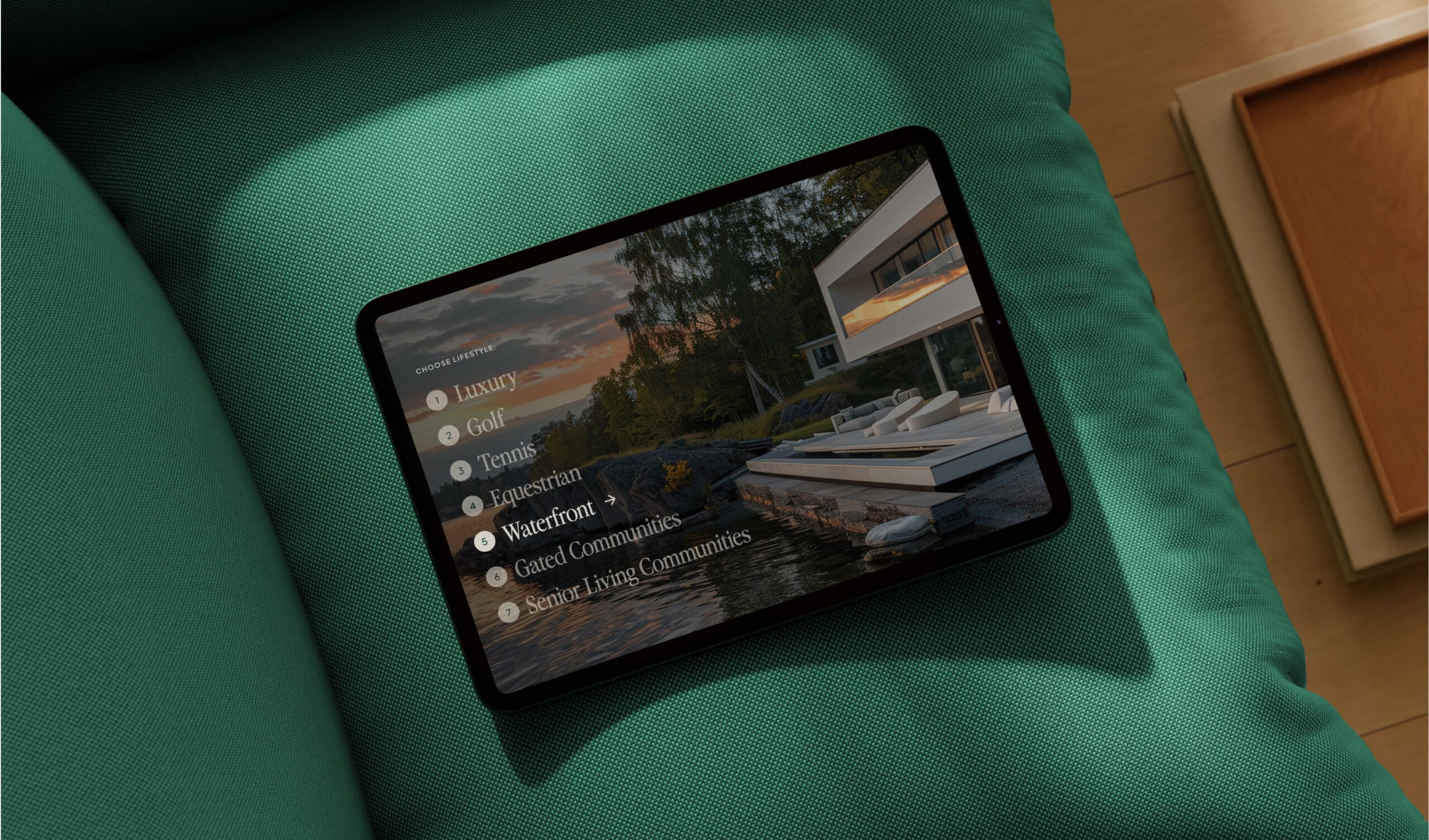
In a final (big) push to bring it all together, we created a brand new website. In an effort to bring more brand cohesion, we used a templated-based approach that could be carried over to Illustrated Properties, another company under the Keys umbrella. This allowed for each to have a unique feel while making development and future site maintenance easier across the board. Despite working within the design limitations of complex real estate-specific systems, we managed to build a site that felt as strong as the strategy and as fresh as the visual identity that led the way.
Now cheers to the next 100 years.